
In the age of social media, email marketing, ads, and stories, there’re a lot of places where people can get a feel of who you are and what you do.
The problem is that, except for the posts you publish, there’s not much control over your social media account. Algorithms change, features get added and removed, and making sense of metrics like engagement, reach, and impressions are most often complicated and hard to link to actual sales.
Not to mention all the love-hate relationship with social networks and the contrasting approach people have with these services. When everything about the world is in one place (entertainment, cold facts, fake facts, donations, events, interest groups, and much more), none gets the needed attention. It’s just harder and harder to make a choice, so you end up scrolling, pushing the like button here and there, and exiting.
Your website is the place where you have the most control. You decide how each page looks, how products are showcased, and the purchasing experience you want to provide.
Think about it as your digital house. You have the keys, you take the garbage out, you clean up the rooms, you cook, you have fun, you let your friends in. It’s a level of authority that comes with both responsibility and rewards.
It’s often easier to rely on the “default setting” of some of the systems you use and miss showing to the world what makes you different.
Your website is also where people expect to get clarity around what you do, how you do it, who you are, and what you stand for. It’s the place where all those touchpoints connect and make sense in the mind of your visitors.
Having control also comes with the responsibility of offering a consistent customer experience. That means that you must make sure that the experience you offer your customers every step of the way, before and after purchase, is consistent with who you are and how you want to present yourself to the world.
Due to the complexity of the systems needed to create an online website and shop, you might often fail to provide the consistency your customers expect with each interaction. It’s easier to rely on the “default setting” of some of the systems you use and miss the opportunity of using them to show to the world who you are and what makes you different.
In the following lines, I’m going to explore three of the key strategies that can help you provide your customers a consistent experience while browsing your website and learning about you.
Everything I talk about comes from my hands-on experience working with local customers to create unique websites for their businesses. In other words: I’m speaking from the tranches, not the imaginary.
Focus on building a single digital home
These days, there are specialized solutions and services for just about everything. There are services for showcasing your portfolio (like Behance or Dribbble), selling your creative work (e.g., Etsy), showcasing and delivering your food (e.g., Uber Eats, Doordash), writing about what you’re passionate about (e.g., Medium).
Using specialized services comes with advantages — most of the time, they do one thing, and they do it great. You’ll be confident that, for very specific needs, those services made all the possible optimizations to help you get started in no time.
The problem is that all of these services are disconnected from your website and offer cookie-cutter solutions that make it hard to stand out.
Sure, uploading and linking to your portfolio on Dribbble is easy, but that means it will look the same as thousands of others, and it makes it harder for people to get in touch with you. Sure, you can direct your website visitors to purchase your work on Etsy, but your product page will also advertise other creative people’s work, slimming the chances of making the sale yourself. Not to mention all the changes Medium has gone through the years and how you can suddenly see your content gated behind paywalls.
Using your website in a mix with external services is exactly what breaks the consistency your customers are looking for.
Instead of seeing the same design and learning everything they need about you in one place, they are asked to switch platforms and get tangled in their specific flows—and probably getting lost and forgetting why they visited your www in the first place.
Who can guarantee that, once they end up on Dribbble, Etsy, or Doordash, they won’t see something or someone else that catches their eyes and makes them forget all about you?
If you are not convinced, here are a few reasons why you should think hard before using such services:
- You don’t have control over how you present your work, market your products, or share your stories — these services are created to fit large groups of people and come with big constraints.
- You don’t have access to data about your customers or followers — being able to communicate with those who choose you over others and getting to know them is extremely valuable for improving your work, gathering new insights, and connecting with your tribe.
- You don’t own your work — you can’t export those hundreds of reviews if you want to shut down your Etsy account, and your Dribbble or Medium followers are real as long as you keep using those services. All that work goes nowhere if your needs change and those specific services don’t fulfill them anymore.
- You are outsourcing your core — you should be the one controlling who can read your content, the way they can purchase your product, and how your portfolio should look like. Relying on third parties makes you susceptible to whatever changes they will enforce without having a voice.
The benefit of having everything under one roof, aka on your website, allows you to provide your fans and potential customers a one-stop-shop for everything related to you. You can have a place to tell your story, one to showcase your portfolio, a shop to sell your work, and a blog to keep people in the loop and share your vision and thoughts all within the same roof.
WordPress is such a tool that can adapt and grow at the same time as you. It allows you to add or remove functionality depending on your needs. With the right WordPress theme, you can control every step of your customer’s journey on your website, and you’ll be the one deciding how your story is presented to the world and who gets to read it.
A good example is DE CERAMICĂ, the website of a creative ceramics studio created with Rosa2, our WordPress theme. There, the two sisters behind the brand manage to talk about who they are, present their ceramic collections, share the past projects they’ve worked on, promote different workshops, and have a successful shop where they sell their handmade pieces. With everything under the same umbrella, they can control every part of the experience.
Show yourself in all interactions
When you have a website, there are many places where people come in contact with you. Some pages and channels are most visible — like your home page, about page, blog posts, you name it.
Others, like newsletters, product and portfolio descriptions, order emails, contact form submission messages, are less “noticeable” but can often prove essential in offering a consistent customer experience.
In the past year, we helped a few local creative entrepreneurs build a digital presence. During that time, I noticed people tend to perfect the visible parts of their websites but fail to identify and adapt the other, more hidden parts to who they are and how they want to present themselves to the world.
If I were to compare (again) your website to your physical home, it would as if you were only taking care of the front lawn, the garden, the white picket fence, and the car standing front and center, while ignoring the way things are arranged inside, the light from each room, the comfiness of your couch. It would be best to balance these two since they are part of the same universe.
This duality creates a place of inconsistency and a broken experience for your audience and customers. For example, people get used to seeing someone jolly and fun on Instagram and get the same feeling when reading your about page, but the fairytale ends when it comes to the actual purchasing experience.

It’s the third time I mention the About page, you might as well know that we wrote a separate piece on how to create an About page that strikes a chord.
They are met with a boring product description that doesn’t speak to who you are. Once they place an order, they see a blunt thank you page and a series of automated emails filled with preconfigured text generated by the eCommerce service or plugin.
As you can tell, this disconnection between how they see you on other channels and website pages versus what their post-purchase experience is does nothing good for building trust, loyalty, and attraction towards you and your business.
If you think that making these things “sound” more like you is complicated, you could not be more wrong.
If you want to create a consistent customer experience from the first visit to the post-purchase review, you need to customize each touchpoint to match your writing style and tone of voice.
I know that product descriptions need to inform people, order confirmation emails must provide details about what was ordered and next steps, but there’s also a lot of playing room left uncharted.
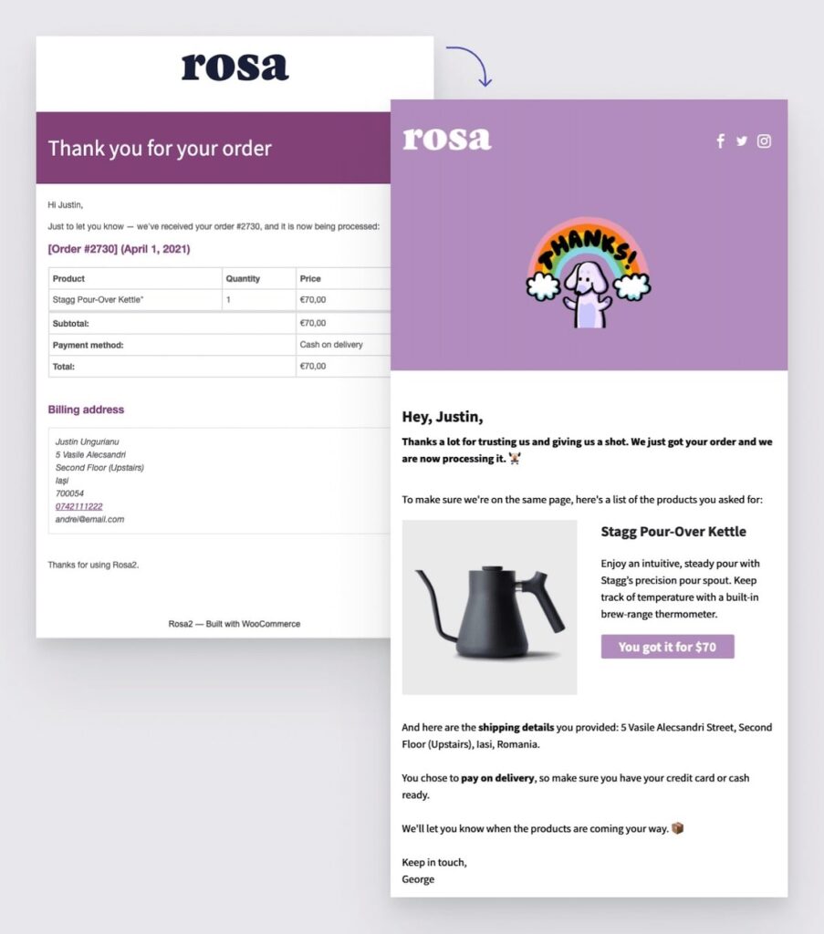
Bring your personality into the subject line with a catchy line and an emoji, delight people with a Gif with your happy face when they place an order, make them feel special when that confirmation email comes in by sharing your gratitude for their trust. As long as you are true to yourself and how you communicate is in line with how you regularly do things, the possibilities are endless.

If you struggle with finding your writing style, we have an ebook that teaches you how to express your ideas in writing, capture emotions by writing the way you’re talking and be more human in your communication. Give it a shot.
If you are not sure what those touchpoints are, I recommend simulating a few browsing sessions and purchasing flows on your website. Put yourself in the shoes of your visitors and write down every pre and post-purchase touchpoint.
Next, think about how you can connect the dots and make everything consistent with how you usually talk, write, and present yourself to the world. Find the opportunities to mix the must-have information with what makes you stand out.
No matter where you communicate with your customers (blog posts, product description, email newsletters, order emails), keeping the same writing style and tone of voice can make a lot of difference in your customers’ eyes and get you closer to repeat purchases. Even if something as ordinary as sending an invoice can have a bit of your personality and delight your customers.
Fully embrace your look
There’s one final stage left towards offering consistency — your visual identity. I know this subject does not come in handy for everyone who doesn’t have experience in digital design or communication, but have no worries; you don’t have to go that deep.
To be consistent on all fronts, focus on using the same fonts and colors from your website everywhere your audience comes in contact with you.
I’m sure you strive to achieve a certain look with each blog or social media post, so I suggest you start emulating that look in other places.
Often, when using multiple services and when people have to switch platforms to complete a task (like checking out your shop on Etsy), they will see a disconnect in the design (the look and feel) and have a broken experience.
By having everything is under one roof, for example, using WooCommmerce with a compatible WordPress theme, you get rid of the confusion and can be in control of how everything looks and feels at every stage of the browsing and purchasing process.
Colors help convey certain feelings and make people associate you with pleasant emotions, so you must use them to offer your customers a consistent visual experience.

If you have trouble choosing the right color and font palettes for your website, you can select any of our WordPress themes that come with Style Manager—an intuitive system that lets you pick between pre-defined palettes or create your own. See it in action below:
Tackling this area is similar to what I described above. Go through all the places your customers encounter along the way — website pages, blog posts, shopping cart and checkout page, newsletters, automated emails, etc., and write down where you need to make improvements.
Making design decisions is a complicated task (that’s why we have a WooCommerce Add-on to style your shop automatically) so, to make things simpler, focus on two main areas: fonts and colors.
You will feel more empowered to keep working on the website if you get those two done right from the start. From my experience of working with local businesses, I noticed over and over again that this is one of the first steps they need to make to continue progressing: matching the colors and fonts with their branding system.
Therefore, take those two elements and apply them to the areas not covered yet. You will be surprised about how big of a difference these small teaks can make for offering a coherent experience to people who choose you.
Now, let’s recap the main actions needed to offer a consistent customer experience:
- Keep everything under one roof — avoid specialized services that direct customers to different websites where you lack control over how you present yourself and where future changes can affect your core sales, presentation, and communication channels.
- Keep the same tone of voice and writing style — show yourself in every page, product, email, or message your customers get by matching each interaction to the way you usually talk and write.
- Keep visual consistency across all channels — start with colors and fonts and apply them across all the different touchpoints your customers interact with along the browsing and shopping journey.
In the end, consistency comes from being true to yourself and the values you believe in. If you do that, you’ve done most of the work. All that’s left is to pay a bit of attention to the areas where your customers come in contact with you and make sure you adapt them to fit your narrative.
I know the steps I detailed seem like a lot of work, but the beauty is that once the pieces of the puzzle fall into place, customers will be able to see your true self in everything you do. And that’s priceless, right?


Start the conversation