
Quick navigation:
- How to chose the right colors when you create a website?
- How to mix colors in a way that makes sense for the digital field?
- Two reasons why is it important to know we perceive colors differently
- Exercise: how to figure it out which colors fit your website
When building a website, no matter the reason: for showcasing our work, for telling stories about our passions, for presenting the NGOs we’re part of, there is one particular question that arises at some point.
Will the colors I choose be perceived by my audience the way I understand them?
Or put in a more cheeky question: are you feeling the same color as I’m feeling? To be on the same page as your audience, let’s take a look on how humans choose colors that pleases them and then see how you can get the best out of them for your digital presence.
I know that there are plenty of so-called solutions out there when it comes to choosing the right color palettes for your website. However, I dare to say that most of them are unreliable, taken out of the context, and quite superficial in terms of the outcome you will get.
Read further to take the first step in understanding the psychology of colors, and its impact on both our perceptions and the way we interact(online and offline as well).
How to chose the right colors when you create a website?
Let’s start with short psychological explanation to be on the same wavelength and make the most out of it.
First of all, color preferences tend to change as people age, most of them based especially on interactions and experiences that involve a certain color.
For instance, during childhood, you have little memories that could build on our perception of color – you are a blank canvas, so to speak. What else could you rely on more than on your body, to be more exact, your eyes? Not much.
Therefore, the young you is more attracted by colors that stimulate your eyes. Explaining it in a more nerdy way, that might have to do with color receptors(cones) in our eyes: warm colors, from red to yellow, and tints of green are triggering stronger signals because of these cones’ sensitivity and distribution.
The idea is that the more experience-based feedback that a person receives about a particular color that is associated with a positive experience, the more the person will tend to like that color.
Psychology Today
Second of all, if it were only to take into consideration the physical effects that light has on people, we would end up liking the same colors – but we’re more complex than that, and that’s where psychology kicks in. In the end, the beauty lies in these differences, and we can take advantage of that when creating a website, but not only.
As you grow old, memories and experiences start adding up and shaping your personality. Imagine all the things you’ve been through and how they impacted your inner-why. From the first love to the first job, from that holiday at the end of the world, to the weird yet delicious food you ate and kicked all your senses, all these are now part of who you are.
Therefore, while living these experiences, it is near impossible not to deal with color, and the context in which they appear (pleasant or distasteful) is essential in modeling your preferences.
With other words, color is not just a matter of choice, its implications are far more important, and you should be aware of them because it will help you amplify or damage a digital experience entirely.
Let me guide you through several examples and share more about how colors define your perception and the lens you see the world.
Ready to move next?
Let’s assume you were raised near the sea and you remember yourself playing next to the water. In this specific case, you are definitely more prone to like blue because of the recurrent pleasant memories it built up in you. There were dozens of moments where you enjoyed the water, spend time in it, and created an emotional attachment.
On the other hand, if you interacted with blue in a different medium, let’s say an extended stay in the hospital, and there were blue lights around, it might not be in your top preferences if the reason you were there wasn’t a fortunate one.
Our brain is wired in a way that wants to keep you safe and far away from the bad memories that caused you all kinds of anxieties, dramas, frustrations, etc.
Thus, we might as well say that your preferred color is a summary of some experiences that you enjoyed.
Photographers, for example, are able to convey a lot of feelings through color and the way they work them together. A good photographer though does not rely on color alone – composition, candid pictures, lighting and shadows, backgrounds all play a crucial role in photography.
More so, given that they know that colors can get perceived differently you’ll find that most photography themes actually feature monochrome shots, to bring out the best qualities of the artist without requiring the color to have a direct impact.
Did you ever hear a photographer saying that somebody’s photos has a lot of green or brown in them? I did. They are not delusional people; they just have a different perspective on colors and can see them beyond what’s visible.
All this information is not an opinion made overnight, and it is covered by data, plenty of discussions with our customers and designers. Read further to learn how to choose colors wisely.
How to mix colors in a way that makes sense for the digital field?
Some people know their favorite color from the start, and they’re happy with that – easy-peasy for them. Maybe they do not have the best arguments to support their choice, but at least they are consistent. They stick to those colors in everything that defines them, even though that does not mean that they overuse it just for the sake of showing of.
Others might need a reversed approach: how do I describe myself, and what colors are associated with my traits?
As you can notice, this approach is quite challenging since it’s harder to be more in touch with yourself and able to understand your choices on a more profound level.
However, there are solutions out there. One would be color dictionaries: a list of colors and their meanings – go through all of them, read their descriptions, and stop at the one that fits you. Write down, why do you think it matches you. Be genuine and sincere and see if it really sounds like you or you are trying to fool yourself.
This may not be far from what’s true to yourself, but seem flawed to me because of the following reasons:
- They are still written by people – people that also have their own unique, different experiences about moods like calm, energizing, powerful, passionate, joyful, secure. They might overlap with yours, but slight nuances can shift the perspective.
- They are based much more on how our body reacts to certain colors – and ignore an essential factor: each individual’s past experiences that shape color perception and can sometimes overwrite physical reactions. In a way, this is covering up the uncertainty of color interpretation and the risk that the author might be slightly biased when creating the color dictionary.
So, instead of looking outwards to what other people are writing about colors, why not go inwards and see what is actually cooking inside you.
Find those experiences that you found enjoyable, then search for some innocent and straightforward cues in your memories: objects, landscapes, people, scenes. Of course, it’s a subjective approach, full of possible flaws.
At the same time, it’s far more authentic than copycatting others and relying only on what specialists say.
These themes easily evoke discussions without end, since verbal reactions to the associations with color differ vastly from person to person.
Josef Albers, Interaction of Color
We worked quite hard in this area and developed a customization tool named Style Manager. It is an intuitive interface directly integrated into your Dashboard that helpsyou choose between different color palettes and fonts or simply create your own.
We put our best design knowledge to create this advanced system in a way that helps you achieve visual consistency across the website, but also offers you some freedom to match your branding requirements.
However, we limited the options quite a lot because, from our eight years of developing WordPress themes and helping a community of 60,000 people to create outstanding websites, we noticed so many useless flaws people make.
Therefore, we put together a list of constraints that make sense for our customers and facilitate them to make fewer mistakes and achieve better results.
Here’s what Bruno, a food blogger and videographer told us about Style Manager:
I like that Pixelgrade already suggests combo of colors and variation about the intensity. Because my project organically changes together with my content and taste, this tool is exactly what I need to achieve the best result in a short time keeping control of all the features (border, fonts, background, page sections etc).
Bruno, blogger at HyGveg
Choosing colors when creating a website should never be a random option. Further, I’m going into what you should consider when having this mission to achieve.
Two reasons why is it important to know we perceive colors differently
As argued until now, you associate colors to pleasant emotions that experiences feed you. What about the others? They surely have their own, different moments tied to specific feelings. That means that color perception could also be slightly changed (recall the example with the sea, and the hospital mentioned earlier in the article).
Then how can you be sure that you’re feeling the same color as your audience? Is there any guarantee that you will get the cues of my website that I am bubbly and energetic just because I use orange and pink? Yes and no. Let me tell you why.
As abyssal as the gap between you and your visitors seems, there are still common grounds in our color perception systems. If it weren’t for these, we might as well roam around ignoring colors and interacting with our environments based on our other senses. That’s not the case.
Here are two fundamental arguments to keep in mind:
1. The physics of our eyes is, to some extent, the same for most of us
The optics behind our eyes is rock-solid science that humans “speak,” excepting those who suffer from color vision deficiencies (in which case we’ll have to find other ways through which we can express ourselves and be understood).
Up to a point, red will still trigger a more intense impulse in your system. These similarities help since with a website you are going to attract different people’s attention, so it’s nice to know that we still have things in common, such as the raw data about how our eyes work.
2. Our experiences won’t ever perfectly match, but they can overlap
Even if we like to think that every place we dwell in has it’s own spirit and uniqueness, we can find elements and events around us that are common with other places other people live in.
The green of the woods might make us both feel energetic if we’re outdoorsy people, but it doesn’t have to be the same forest you roamed through while a teenager. You’ll still have a base audience that is valuable to you because the experiences you both value also have some typical colors attached to them.
So, as much as each of our color preferences are modelled by what you experience through your life, you can still bridge the (not so big actually) gap between us and the others.
Are you ready to put in practice all the above and bring your website to the next level in the digital field? Let’s do it.
Exercise: how to figure it out which colors fit your website
A fun way to pick a color that suits you is to put your memories on the table, just like photographs: your favorite outfit, your favorite place to relax, a screenshot from a movie that moved you, a place you liked during childhood.
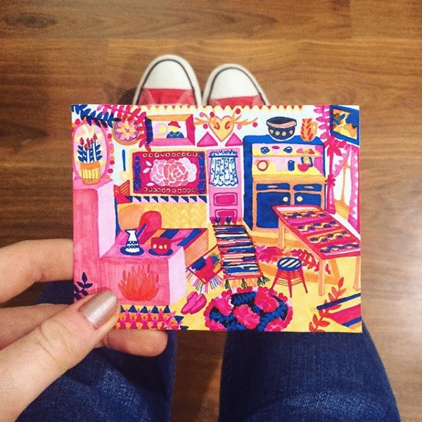
From the photographs, I take to my favorite shoes and my grandma’s carpet which I adore since I was little: pink and yellow are the colors that tingle my heart. – Ilinca Roman
Take actual pictures of them or even draw them. Put them together on a table or open them all at once on your computer screen.
Extract at most three colors (to keep it simple), isolate them from the photos. Look at them and ask yourself questions as:
- Would you want to see these colors around every day?
- Would you wear them for a month?
- Would you like those colors in your house or surroundings?
Catch yourself saying “yes” too many times, and you have a winner. If not, search on, play around, keep discovering.
Now let’s sum up everything you learned about colors and their importance when creating a website that will shine out there:
- As social beings, we are in a constant search for approval from our peers, and the color is one way we send signals, then wait to see if anyone“hears” us as we are. Yet again, it seems that we can’t have it all because of how we build our color preference systems.
- It would be too hard and energy-consuming to find the color combination that goes straight to the feeling you want to convey to all the people that will interact with your website. Just imagine interviewing them all and asking, “What color makes you feel empowered?”. The list of colors you’ll get will be diverse, but in that list, you’ll also surely find the one that makes you feel empowered.
- Take the “shortcut,” be true to yourself, and pick the one that hits your chord first and see afterward with whom it resonates? In the end, we enjoy having around people that are on the same wavelength as us, and we get the best synergy from these types of connections.
- As for reaching a much broader audience, it is much of an innocent gamble that we play in the realm of colors, even if we want it or not.
I encourage you to always start from your inner why, your intrinsic motivation, and build up from there.
Choose the colors that make sense for who you are, what you want to achieve with your digital presence, and make sure you do that consistently. In the end, visual coherence is something that we all love and appreciate since it only touches pleasant emotions, right?


Start the conversation