
Quick navigation in this article:
- A little background on how we do things
- A better, saner way to create websites
- Constantly evolving tools for an integrated experience
- Bending the new editor in our way
- An opportunity that lies ahead
- Meet Rosa 2. Making our vision a reality
- All-new site building blocks
- Customize the design to match your branding
- Everything you need to create an online storefront
When times are changing, you either adapt and evolve or get left behind. We like staying ahead, pushing the boundaries of what is possible both from a technical standpoint, but more importantly of what you can achieve that you previously shied away from.
It’s no easy feat, definitely not for the faint of heart, to take a wildly successful WordPress theme and make it even better. Especially when nimble, small businesses rely on our ability to know the ways of the web and help them put up a digital facade to strengthen their brand and bolster success.
A little background on how we do things
If there is one thing that has permeated just about everything we created at Pixelgrade throughout the years, it surely is the courage to own our share of responsibility as product makers — really own it, down to the minute, often overlooked details. A large part of this responsibility rests on our ability to first accurately understand and describe the customer problems we aim at solving, and then draw the proverbial “line in the sand” between the product areas where it is best we make the decisions and those where the customer is in a better position to know better.
This distinction has often set us on a collision course with the “market’s default expectations.” These were, and still are to a large extent, somewhere along these lines: create a product with more options than anyone but us can handle; shamelessly promise that you can create any website you can imagine; back that up by designing tens of eye-candy demos; you buy feeling confident that this product is the best bang for your buck, ever.
This is the story every multipurpose WordPress theme and page builder plugin is betting on. To make things “better,” services like Squarespace, Wix, or Webflow, to name a few, further reverberate this promise. It is only a matter of time before anyone googling for ways to create a beautiful website for their business gets on board this bandwagon.
All would be swell if everyone creating websites would be decent designers and well-versed developers. Clarity and consistency would be maintained across every page, and complex interactions between various elements would be confidently resolved. All those tools would be put to good use. This is not where the world wide web is at, nor where it’s going — quite the contrary. Thankfully, we managed to “democratize publishing” and empower almost everyone to claim a piece of the web.
The promise of “the only WordPress theme you will ever need” (or variations along this line) is maybe enticing, but undoubtedly false and deceitful. Such a theme (or page builder) is quietly dumping all the decisional responsibility on you without first asking if you have the skills to handle it — only true professionals have them. Furthermore, to make sure there won’t be any complaints with regards to a lack of flexibility, the options provided are nothing less than a visual coding environment. It seems your “unchained creativity” better come fitted with design and coding skills.
We want to prove to you that there is a better, saner way to create websites in general, and WordPress sites in particular since that is what we play with at Pixelgrade.
A better, saner way to create websites
You must have heard the tagline “Our way is better than theirs” painstakingly often. We have too, but sometimes modesty needs to give way to plainly stating the actual state of things. We genuinely believe we can offer a better way to create the website your business needs with the tools you can actually take full advantage of.
Our way starts with solving actual real-life problems that business owners encounter when aiming to put together a website. This forces each of our themes to stay focused on specific niches, even if the codebase can handle a higher degree of flexibility.
We prefer to sacrifice potential product reach than to increase the cognitive load you need to handle. Life is complicated as it is for an entrepreneur. There is no reason building a site adds up to that.
Next, our way aims at maximizing what you already know. We consider you are reasonably knowledgeable of what WordPress has to offer out-of-the-box when it comes to editing and managing your content. We build on this familiarity so you can jump right in with minimal learning involved.
Finally, we prefer to hide away any extra complexity that is not central to achieving your goals. The WordPress ecosystem has its established ways of doing things, but not all of them stem from a user’s need or concern. Strangely, some cater more to developers than users, owing to the developer-focused beginnings of WordPress. We have the experience to recognize such shortcomings and gently get them out of your way whenever possible.
By now, you may ask: OK, this all sounds reasonable and a little bit idealistic, but what have you actually done differently than others?
We’ve done plenty. We haven’t found this way of building products recently. It’s been with us pretty much from the beginning, eight years ago; we just needed the experience and clarity only time can provide.
Constantly evolving tools for an integrated site-building experience
A couple of years back, we’ve started crafting, and continually refining, a set of tools and systems, each focused on a specific aspect of a customer’s journey to their desired WordPress website. We add new ones as WordPress evolves, and our customer understanding gets sharper.
For anything related to your purchased products, their recommended plugins or demo content, their documentation, and any customer support questions you may have, we provide the Pixelgrade Care plugin. We want to help you remain close to your content and not lose focus or time.
A fundamental, but distinct need of anyone crafting a WordPress site is changing the theme styling to match their personality and brand. To solve this crucial need, we created the Style Manager system (provided by our Customify plugin). Getting to the predictable and straightforward customization experience we proudly offer today was a real saga, one that deserves a few more details.
Any premium WordPress theme is bound to provide a set of options for changing layouts, colors, and fonts. Our themes make no exception. But not all theme options are created equal: layouts sizing and small decorations are pretty straightforward; colors and fonts may seem similar, but are far from it. You need to be able to adjust colors and fonts while retaining the overall logic and consistency of the design you fell in love to start with.
It’s no fun seeing your site’s design slowly fade away with each stylistic change you make. Albeit well-intentioned, you reach a point where you either quit and switch themes or retreat to the “safety” of the demo content. For us, this is a failure on our part, and we don’t fancy failing. To solve this challenging problem, we had to figure out a way to provide smarter color and fonts controls that would be aware of the theme’s overall design constraints and automatically make changes in line with them. Talk about a mouthful, but that is the nature of the problem.
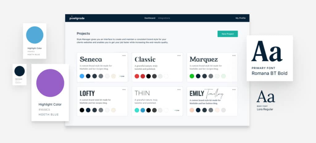
We are proud of the current state of the Style Manager that abstracts specific color or font controls, replacing them with lists of carefully imagined Colors Palettes and Fonts Palettes. You can still reach out and change the base controls, but we are confident you won’t feel such a need.
Bending the new editor in our way
Starting with WordPress 5.0, users had a completely new block editor at their disposal. Despite all the controversy and push-back leading up to that release, the Gutenberg editor (sort of a nickname for the block editor) came with big promises: “a streamlined editing experience across your site […] more flexibility with how content is displayed […] a more consistent treatment of design as well as content.” The entire Gutenberg project consists of four phases, with work underway on Phase 2. More big promises are on the horizon.
We respect and appreciate the boldness of the entire Gutenberg project. We would love nothing more than to succeed in making due on those promises. In the current state of things, when you peel away all the PR efforts and look at how editor blocks work and evolve, corners seem to have been cut at all the wrong places. At least, corners that we care about considering the way described earlier.
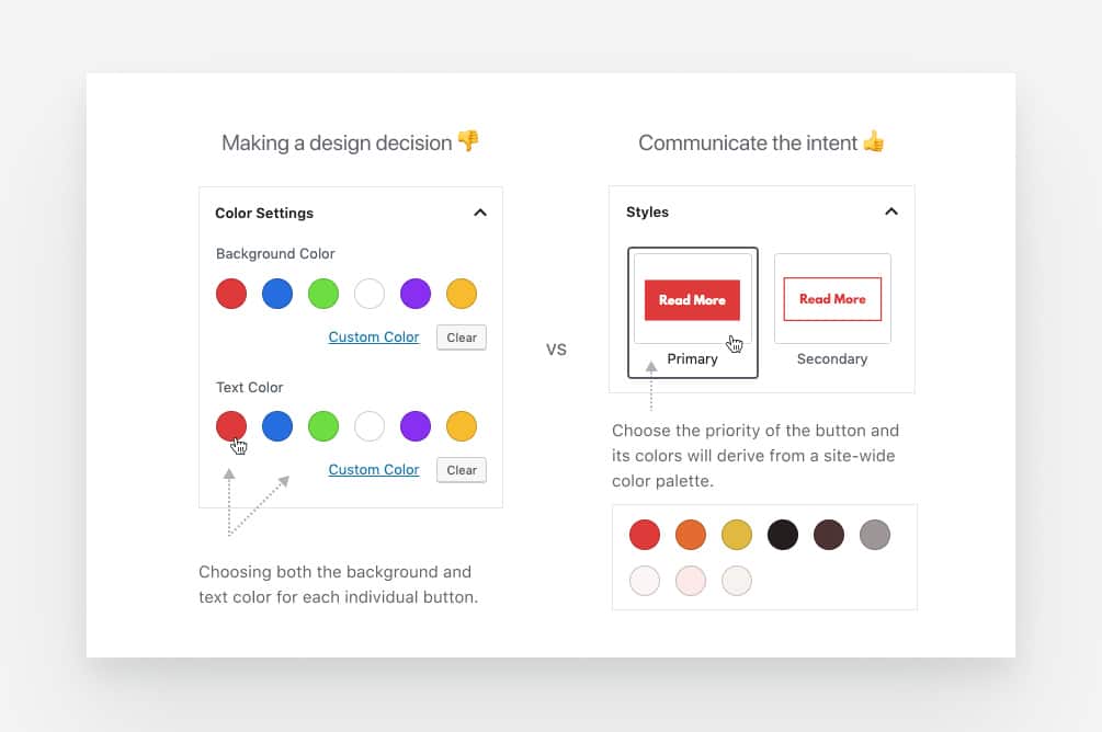
In their current state, bundled WordPress blocks mix content, layout, and styling with disconcerting ease. Exactly opposed to the way we believe it is best for keeping design consistency across posts and pages. You get to make too many decisions on a block by block basis, decisions that have no place in a content creating context. You are in a different mindset than the one required to step back and look at the overall look and feel of your site.
Furthermore, the blocks system is pretty much oblivious to the fact that a site needs a design system in place if we are to cater to regular users, not professional designers that are capable of “holding” such a system in their heads (with difficulty). Take, for example, a simple button: it is now far easier to insert one, but why are you prompted to choose its colors and not your real intent like primary or secondary button?
An opportunity that lies ahead
However, we are a pragmatic bunch. We saw the editor’s shortcomings as an opportunity to make a point (again) and showcase how we think that things should play together in the future of building websites. We decided to take our best selling WordPress theme — Rosa and rebuild it from scratch to fully integrate with the latest version of the Gutenberg editor, and then some.
It was good timing as it is a five-years old theme and it is starting to show. No matter how many updates we released (over 45), the backward compatibility promise and code legacy are real show stoppers when you aim to take advantage of the latest technologies and tools.
Staying true to our way, to overcome the challenges of building everything with blocks as elegantly as possible, we set out to add a new focused tool to our set: the Nova Blocks plugin (nova as in astronomy, hence the names of various blocks).
This WordPress plugin holds all our newly created editor blocks, plus any behavioral alterations to the editor experience. Every block is imagined with the sole purpose of providing just the right amount of flexibility while seamlessly connecting with the overall design of your site.
So instead of ending up in a lose-lose situation where you needlessly go back and forth between the high-level view of the Customizer and individual posts or pages, we provide a win-win experience where predictability and consistency come naturally.
Now let us show you how everything we’ve talked so far comes together in the new Rosa 2 theme.
Meet Rosa 2. Making our vision a reality
The initial Rosa theme went out of its way to make the most out of what WordPress offered at that time, without resorting to complicated page builders or custom workflows that would lock-in user’s content and make for a steeper learning curve.
Despite certain friction points, we were all too aware that people wholeheartedly embraced this simpler way of building a business website. To our enjoyment, other theme authors got inspired and followed suit — everything is a remix after all.
“I’m so happy with my Rosa theme and the Pixelgrade team. I hesitated to get this theme because I’m not working in the hospitality industry, but I’m so glad I did because it works really well with my business and I get compliments about my website all the time. I’m not an expert at websites, but it was super easy to do that I did it all by myself.” — Mia Morrison
The new block editor brought within our reach the possibility of making our vision a reality to a much higher degree. We jumped at this opportunity and reconsidered every workflow in this new block-based context, all the while careful not to end up with a more complicated solution. Rosa 2 is the result of this journey.
We are confident it manages to retain everything so many loved in the first iteration, while significantly improving the overall design and editing experience.
For starters, the buttery smooth parallax sections intertwined with your content and images are even easier to build and manage. Gone are the subpages each with a hero and some content with shortcodes. Now you can build an entire multi-section page in a single page, just like you would expect. Thanks to the power of the block editor, you can easily add new parallax-based hero or slideshow blocks wherever your message requires it.
Owing to the possibility of encapsulating pieces of functionality as editor blocks, we could eliminate the reliance on page templates — one less thing to worry about. Contact, pages with no title or pages featuring a slideshow are not needed when you can have a simple Map or Slideshow block.
Due to some very recent developments in Gutenberg, we were able to pull off something quite remarkable: you can fully build your site header and footer with blocks like the menu or logo block.
These are just the highlights of the features and improvements that allow Rosa 2 to help people create successful sites just like its predecessor. If you want to dig deeper into each feature, follow along — you won’t be disappointed.
Learn more about Rosa 2
Check out the best-selling restaurant WordPress theme, reimagined for the new Gutenberg editor.
All-new site building blocks
While everyone can have fun and build all sorts of blocks just because it’s easy (kudos to the Gutenberg team), few have our experience of assisting a considerable number of users, regularly talking with them, learning their struggles and extracting the necessary insights to iterate even further.
👋 Rosa has over 13,000 customers, making it the overall #1 selling restaurant WordPress theme. The accumulated knowledge gives us the confidence to believe we can make it even better.
We examined how those customers go about building their sites with Rosa, extracted the relevant insights, and made proposals for each block required for a smooth experience. All this knowledge is now embedded in a set of building blocks that you can mix and match to create all kinds of pages.
Here is a brief overview of the most important blocks available in Rosa 2:
The Hero block
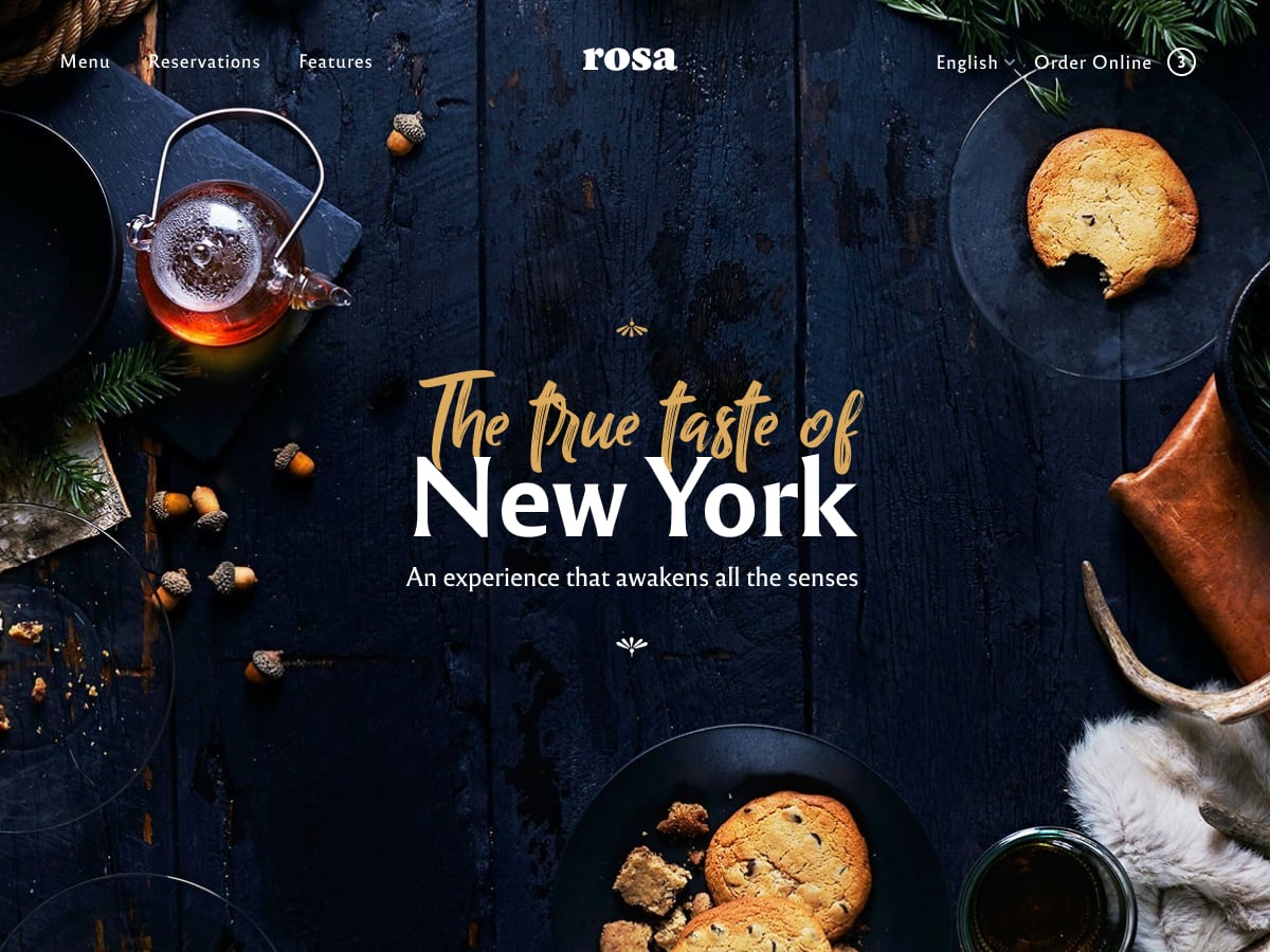
This is usually the first thing your visitors see, making it a great spot to get them acquainted with your brand or value proposition. Controlled by a smooth parallax scrolling and featuring a fullscreen background image or video, this is the perfect place to make a great impression and capture your visitor’s interest.
To learn more about about the Hero Block, check out the details in this guide.
The Media Card block
Often a message is more readily remembered if complemented by a matching visual. The Media Card block helps you manage such areas with ease.
Use it to display media objects, like images or videos, alongside short pieces of content. It could be anything from a portrait image accompanying a summary of your About page; a visual promo for your project and some lines about it; or a testimonial from a client along with its photo to build trust.
You can change the media position (left or right) and create further emphasis by adjusting its styling options — all in line with the overall theme design, of course.
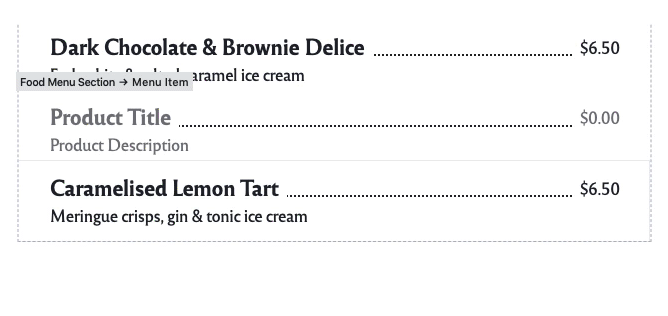
The Food Menu block
Just about any restaurant, coffee, or tea shop owner wants to showcase the food menu on their website. Having an intuitive way to manage a decent size menu becomes crucial. That is why we just had to design a custom block editor that would handle the complexities and edge-cases our customers demanded over the years while keeping things in line with our way.
Use the Food Menu block to display a list of food or drink items available at your venue — it’s easy-to-use and flexible to make it suitable for all your needs. There is no need for breaking the user experience with the old-style PDF files.
The Food Menu block is optimized to automatically add the required structured data to your website — the rich snippets that appear in search results and help you rank it more appropriately (SEO concerns… checked).
The Map block
The food industry is physical; someone needs a place to prepare and serve the customers with the fruits of their passion. Displaying your location on your site becomes a no brainer. The Map block is just the tool for the job.
Showcase an interactive Google Map with a location pin of your venue. Place this block on your Contact page or at the bottom of your Front page, making it that much easier to get your customers on the front door.
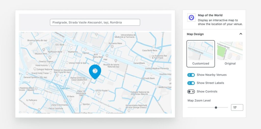
You can customize the map styling with your site’s colors and hide nearby venues to avoid any distractions from competitors.
The Slideshow block
Use this simple block to display a gallery of images in a single, coveted space. It helps you keep your visitors immersed and willing to discover more about your venue.
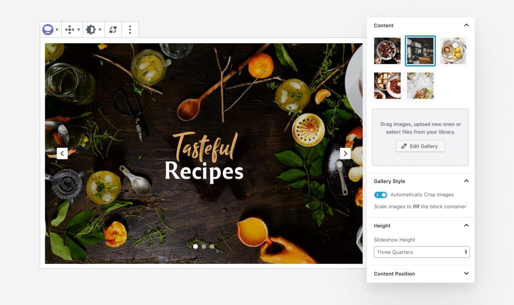
It has a very smooth sliding transition between slides to help with the overall impression.
The Announcement Bar block
Put this block to good use by featuring a message across the top of your site and let everyone visiting your site know about that all-important event.
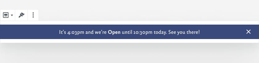
Whether you have an announcement for a promotion or a custom update to make, it’s one of the easiest ways to get your visitor’s attention.
There are a few more blocks to help you with crafting each page on your website, but we will let you discover them on the go. 🤫
Customize the design to match your brand
As promised when we described our way of building websites, we genuinely care about the simple, yet bold idea of having a consistent website. This is where our Style Manager is paired with Rosa 2 to ensure such a visual consistency, automatically, or automagically if you will.
We have integrated Style Manager into the core of Rosa 2 achieving a seamless transition from managing your overall site style to offering individual block controls connected to it.
Put your experimenter hat on and see what the set of custom Fonts and Color Palettes can do for your site. Use them with confidence in conveying the right visual message to your visitors.
An online store designed to fit your needs
When you are ready to dive into the world of eCommerce and push your store fully into the digital realm, Rosa 2 will be there all ready to assist you at every point. It integrates beautifully with the most popular eCommerce WordPress plugin, WooCommerce.
Rosa 2 perfectly aligns each shop section with your brand style and makes the entire buying process consistent across the board. You will find out that setting up an online store doesn’t have to be so complicated and cumbersome. We have taken care of as many concerns as we possibly can, leaving unto you the things only you know and can decide upon.
That’s it for now
This is the thinking behind and what Rosa 2 has in store for its users. We hope we managed to prove to you that we deliver on our promise of providing a better way to create the website your business needs.
The new theme is easier to use while maintaining it’s initial simplicity and edge that made it famous. Check out Rosa 2 today!
PS: Rosa 2 is a whole new product that is not backward compatible with the previous theme. While we don’t provide an automatic migrate process, replacing Rosa 1 with Rosa 2 should not be a difficult task, albeit some manual work is involved:
- content from each page and subpage needs to be recreated using the new blocks, replacing shortcodes with their corresponding blocks;
- use multiple heroes followed by content in a single page to replace a parent page and its children;
- readjust the styling to match your previous look and feel.
If you’re an existing Rosa customer, please check your email for an exclusive loyalty discount.

Start the conversation