
Quick navigation:
- A brief history
- The first steps forward
- Giving it a shot
- Something still seemed a bit off
- Pushing the boundaries
- We found a solution that fits our needs
The web is a wonderful medium, buzzing with information and connections. The web is also a very dynamic, interactive medium that, unlike the printed page, can and will be accessed from all sorts of devices. Web users get to easily adapt the web to their daily lives, making it part of their existence.
Sadly, this heart-warming, seamless experience doesn’t trickle down to us, the people building the tools of web builders. In fact, we end up with an ever-increasing problem on our hands.
Every working day we take this problem and hammer at it, from all sides, but there is one basic (under)side that gets the better of us: the screen size. Simple as it seems, the screen’s size tends to wander off heretically with variations in physical size, pixel density and aspect ratio. Some of these can be simply ignored since you must always consider the trade-offs in trying to cover every possible scenario.
Leaning on Pareto’s tried and tested principle, trying to cover 80% of use cases with 20% of the effort would be a good start.
In what follows, I’m going to focus just on one specific struggle that I’m sure many people doing web development faced. It’s the pursuit of that elusive implementation that delivers consistent typographic hierarchy across devices and offers a top reading experience on any device. If such a thrill is your cup of tea, join me. If not, I won’t mind, promise.
A brief history
Over the years, the web design community came up with various patterns for solving different layout or UX challenges on small screens and there are a plethora of available resources online to help you decide which route to take for your specific use-case.
The choice is never simple since you are constantly assessing the attractive, easy way (like using the hamburger icon to toggle navigation on small screens) and a more creative solution that’ll hopefully be better suited to the current problem-domain.
Typography is one of the cornerstones of designing and developing a web interface with a crucial role in making it usable, hence successful. You strive for readability juggling things like font size, line length, leading and the actual typeface, while making sure you provide structure and hierarchy to your content.
The real challenge is to keep all these properly in-tune and consistent across different screen sizes. This is a problem still in search of that one solution to rule them all.
The first steps forward
Initially, designers have overcome this challenge by creating high fidelity designs of the interface for the most common screen sizes, followed by developers who would make sure that the implementation accurately matched the design for each and every one of them.
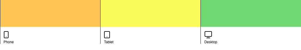
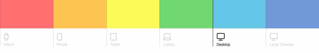
Those common screen sizes would come to be known as breakpoints since those were the places where the layout broke and needed to adapt. Usually, people would settle for just three designs: one for phones, one for tablets, and a third one for desktops.
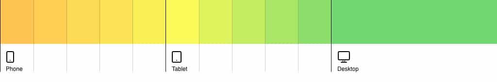
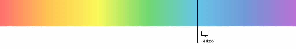
Roughly around 2010, media queries gained wide support in most browsers and people in the industry were handed the challenge of creating one interface that would adapt to any screen size. In hindsight, hand-picking some points on a continuous spectrum of sizes seems like a very rudimentary solution. Much like trying to draw a rainbow with only three colors. It was a necessary stage nonetheless.
Carrying the habits of the past, designers took the familiar path and created static mockups (due to available tools at the time), did the math on paper and handed them over to a developer for implementation. There were actually two to three static designs on different screen sizes: one for mobile, one for tablets and the usual one for desktops.
Despite designers’ best efforts into crafting good-looking mockups, each one of them felt disconnected due to the huge black holes left between those points. In reality, it was up to developers to figure out what happens in-between. Developers had to swing it, as best they could.
Giving it a shot
One of our earliest attempts at overcoming these technical limitations took place during the creation of one of our first commercial WordPress themes called Fuse. This took place back in 2013 when viewport units were slowly being introduced in the CSS specifications — we took them as experimental since browser support was still very scarce.
With Fuse, I tried to mimic a fluid font size by using Sass (CSS with superpowers) to generate a lot of intermediate media queries and font sizes between the mockup breakpoints. We were quite pleased with the results, knowing full well that we took on increased complexity and codebase size for a perceived notion of fluid typography.
Despite being discontinued meantime, shipping Fuse was an important milestone for me, as it was one of the first times when I felt we were really pushing boundaries at Pixelgrade and I was really proud of my work. Today, looking back, I don’t feel the same excitement — I was just trying to draw a rainbow with 50 shades of green. It was an important, personal, stepping stone nonetheless.
Fast forward to 2015, many people were experimenting with various paths toward a proper way to handle adaptive font sizes. From Sass generated CSS to fully-fledged JavaScript solutions like FitText and FlowType, you had plenty of ideas to choose from and fit into your project.
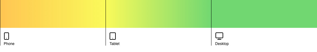
More so, viewport units were now supported in most browsers with fallback solutions for the ones that lagged behind. More experiments followed and, soon, fluid typography descended from the realms of theory into a tangible notion, with a rather simple proof of concept to boot.
There wasn’t much to it but it worked. You didn’t have much control over the final values and you employed some weird calculations to ensure a certain font-size value for a specific screen size. What mattered is that things were moving again — fluid typography had momentum.
All that was needed was a couple of developers to start bouncing around some ideas and prototypes, and, after some iterations, Mike Riethmuller came up with a solution that satisfied most of us.
In this article published on CSS-Tricks, Geoff Graham further explored Mike’s implementation and even created a Sass mixin to get rid of duplicate values and simplify the code. Job done! It felt like fluid typography was firmly added to our tool belt of solved problems — on to the next. Well… not quite.
Something still seemed a bit off
Even though it didn’t appear to be anything wrong with the implementation described above, there was still something bothering us, at Pixelgrade, with regards to the way in which we designed and implemented responsive typography in our products.
It was related to the fact that we, and seemingly everyone else, were stuck in the same old mindset: designers defined font sizes at every breakpoint for every element on the page and developers just had to make it happen.
It felt like a lot of unnecessary, repetitive, and tedious work because we needed to define at least one pair of start-end values for every element on the page. However, most of the time, with very few exceptions, the minimum values were the same. Also, we realized that a maximum value wasn’t actually needed since content should adapt if “screen real-estate” was available.
Intuitively, it seemed things should be a lot simpler than what pixel-perfect mockups and consequent code made it out to be. If font sizes on small devices are pretty much the same and there is no use for a maximum value, all we needed was a design snapshot at a certain screen-width and code should take care of the rest.
Pushing the boundaries
Around 2016 we started working on an internal tool called Typeline whose sole purpose was to take care of spacings and font sizes on small devices. It would have a small configuration with some constraints for font sizes in general, and a list of breakpoints at which we would like new sizes to be generated. After that, when it came to typography, we could focus mainly on the desktop version while Typeline would take care of the rest.
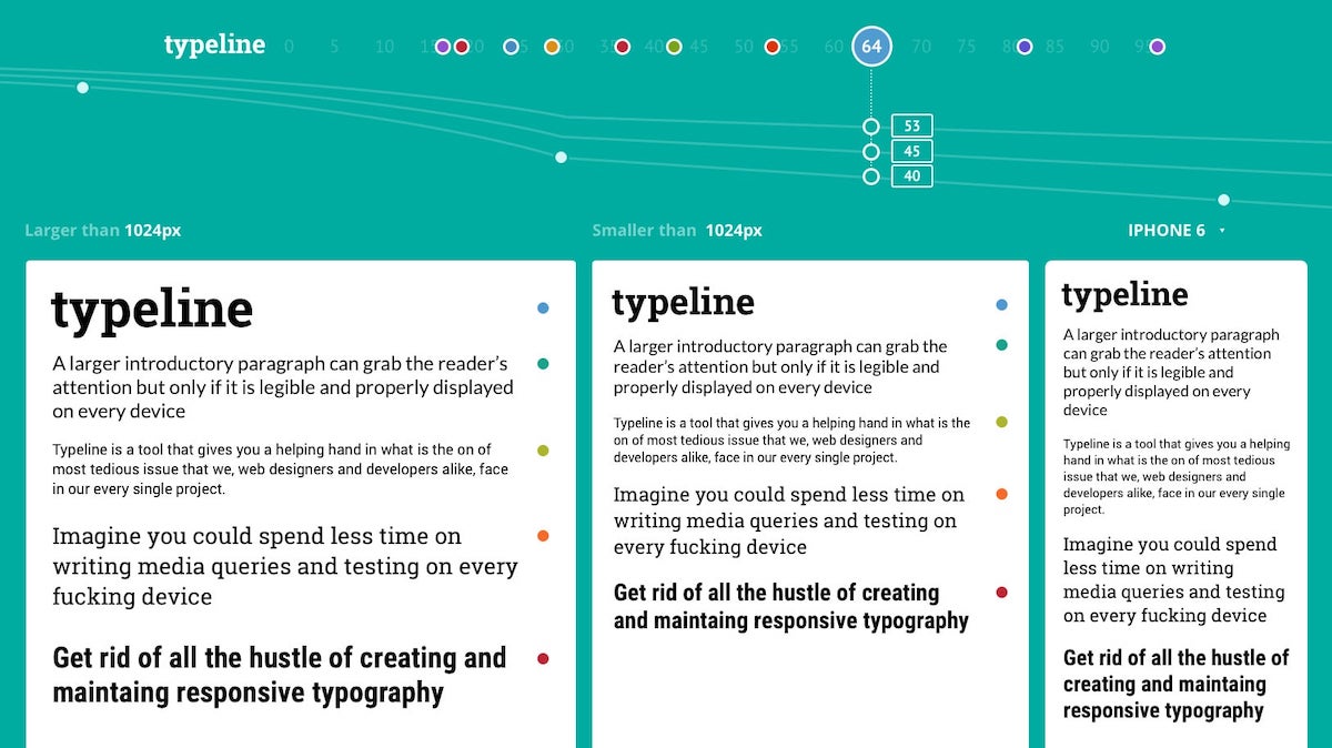
If you are interested in the technical details, hop on to the Smashing Magazine blog and check out this article where Jake Wilson describes in depth a very similar implementation.
Typeline served its purpose really well, being an important part of most, if not all, of the WordPress themes we’ve released since its inception. All was not without downsides though.
One such drawback was the increased complexity of the implementation. We had one common configuration file and multiple versions of Typeline implemented in Sass, JavaScript, and PHP for various tasks and use cases.
Unsurprisingly, some of our new colleagues had a pretty tough time understanding how everything came together. At times, they related to the Typeline set up as a black box — a far cry from the simplicity we had in mind at the start.
The second thing that bothered me sprung up rather recently and it had to do with the fact that we still relied on breakpoints to declare new font sizes. Even though it’s just an implementation detail, these were the same relics I advocated we needed to get rid of. Things have come full circle, and not to my liking.
For some time, an idea that a simpler and more elegant solution may be possible kept lurking in my mind. CSS custom properties was a direction yet to be explored. Even though they were first introduced in the CSS specs around 2016, the fact that IE11 won’t ever support them deterred me from trying any fancy stuff.
We found a solution that fits our needs
The goal of this struggle was not to engineer an overly complicated solution to a rather simple problem; even less so to impress our peers. We simply found some pretty big flaws in our design and development process and I wanted to do something about it.
In 2019, I set myself up to find a solution akin to the times we live in, based on the experience we gathered in web development. The requirements were pretty simple:
- font sizes should be declared only at one specific screen-width;
- we would infer the size at any other width automatically;
- all other initial configuration would be kept at a minimum.
The implementation would rely on CSS custom properties and viewport units. It won’t need any JavaScript to work and it would preferably not need any preprocessing either.
What followed was probably the most interesting part of this whole journey. I had a lot of fun experimenting with CSS custom properties and learning new things about them. One of the craziest things I discovered is that you can actually solve equations in CSS — I couldn’t envision this a few years back. This boosted my confidence and allowed me to overcome any obstacles that came my way. I could see the idea in my head turning into reality.
Everything came through quite nicely and the final result exceeded all my expectations. The proof of concept I was looking for coalesced into as a very solid solution. So solid in fact that I was confident enough to use it in our latest WordPress theme, Rosa 2.
For consistency, let me circle back to the rainbow comparison I was making earlier. The way fluid typography works in Rosa 2 is quite simply like this: we pick our favorite color, draw a line and then all the other colors are automatically generated.
Here’s a quick demo on Codepen that you can check out to get a feel of how this concept can work in practice.
Progress made by the web development industry and fast-paced adoption of new technologies allowed us to enhance our processes and the quality of our work to often surprising results. We’ve managed to make such leaps long before any design software would hopefully provide something to mitigate our struggles. Pixelgrade, as a web company, has gained agility and efficiency, while I managed to find new reasons to be proud of my work.
If all this sounds interesting and you want to chat more, I would love to get in touch. You can drop me a line at [email protected] or on Twitter @razvanonofrei.
More on the subject
If you want to gain a deeper understanding of fluid typography, I believe the following resources are good starting points:


Start the conversation