Mono-Chroma Field
The recurring problem
A brand needs a page to feel like one unmistakable object, but repeated section treatments fragment its identity into interchangeable bands.
Context
Use this when a single color relationship can carry the site's voice across content, media, rules, and chrome without sacrificing hierarchy.
Forces
- One field creates memorability and continuity.
- Long pages still need chapters and changing intensity.
- Contextual color must survive every nested component and state.
Therefore
Treat the whole page as one chromatic room. Establish a single alignment axis, glue the major fields, and make hierarchy through scale, density, rules, and media rather than changing backgrounds at every chapter.
Known expressions
The resolution is a field, not a frozen form. Start from what the situation asks for.
- 01
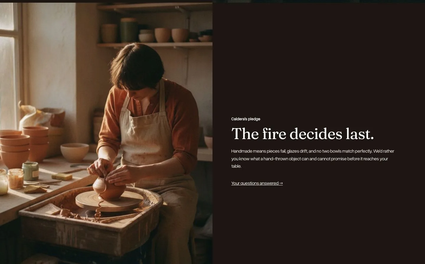
A saturated page whose header and footer dissolve into the same field.
- 02
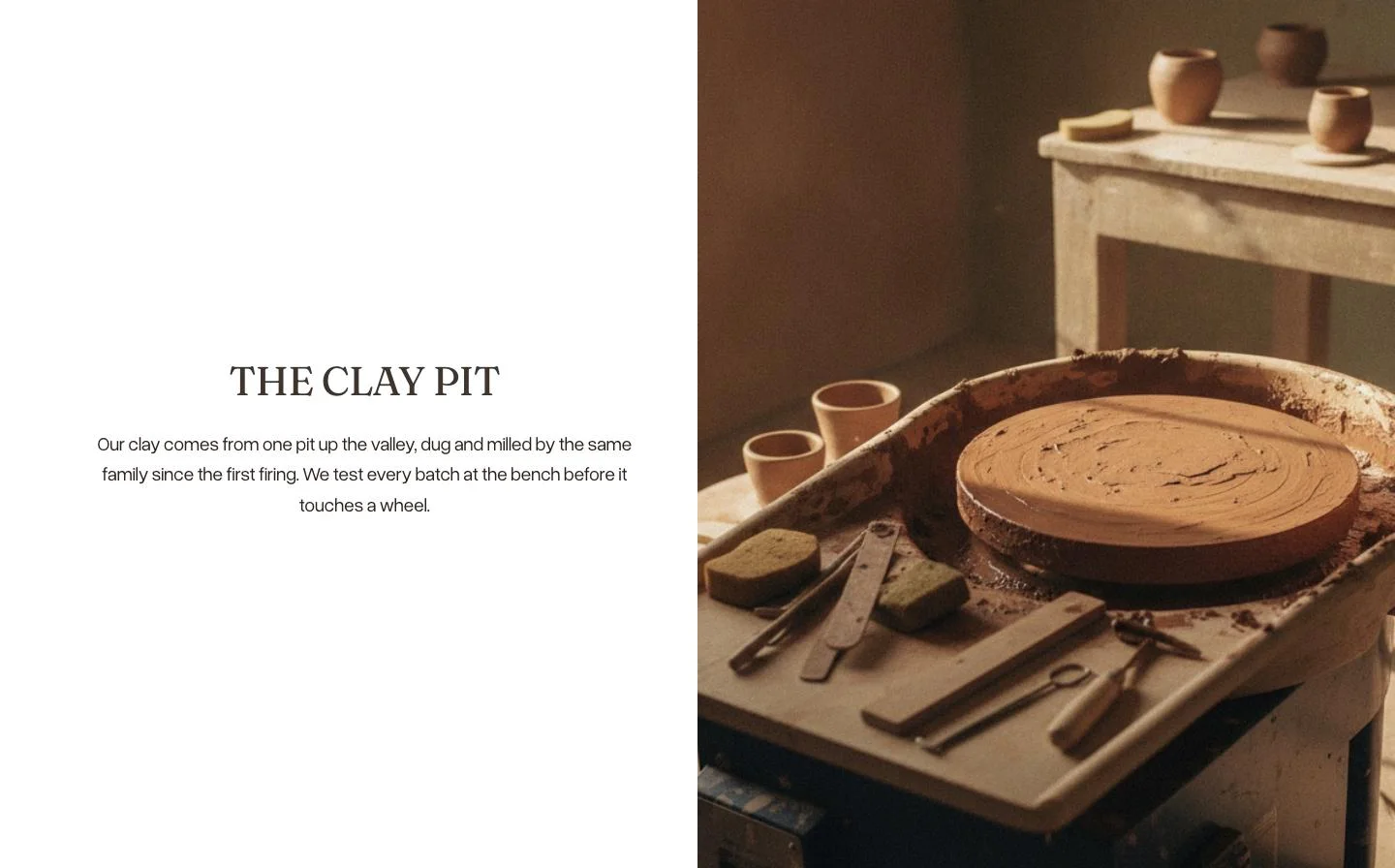
Thin rules and square media creating chapters without new colors.
- 03
A late crescendo in which typography grows while the field remains constant.
Watch for
- A descendant component falls back to an unrelated surface color.
- Identical color becomes identical intensity, leaving no chapter rhythm.
- Contrast is spot-checked rather than verified across every text role and interaction state.
Evidence
2 reviewed contextsOne deep reviewed application and one adjacent tonal study support the idea. A distinct second expression is required before promotion.
Last reviewed: