Customizing your Header
The header is the first element every visitor sees when visiting a website. It’s also one of the main ways anyone interacts with the website since it’s usually the gateway to the essential parts of your website content.
When loading the starter content of Felt LT, you will start with a header that has at least two elements: the Site Logo and one or more Navigation menus that can include items like a Search button, a Dark Mode switcher, a Cart icon, buttons, or external links.
That’s just the starting point. You can easily customize the header to match your needs. But before you do that, make sure you correctly configure the main two elements. Go ahead and:
Once that’s done, you can move to the next step.
1. Inserting different header layouts
Since Felt LT uses the new block editor (Gutenberg) and full-site editing, the settings for your header can be found by going to Appearance → Editor → clicking on the WordPress logo from the top left corner → selecting the Template Parts option → and finally, clicking on the Header template.
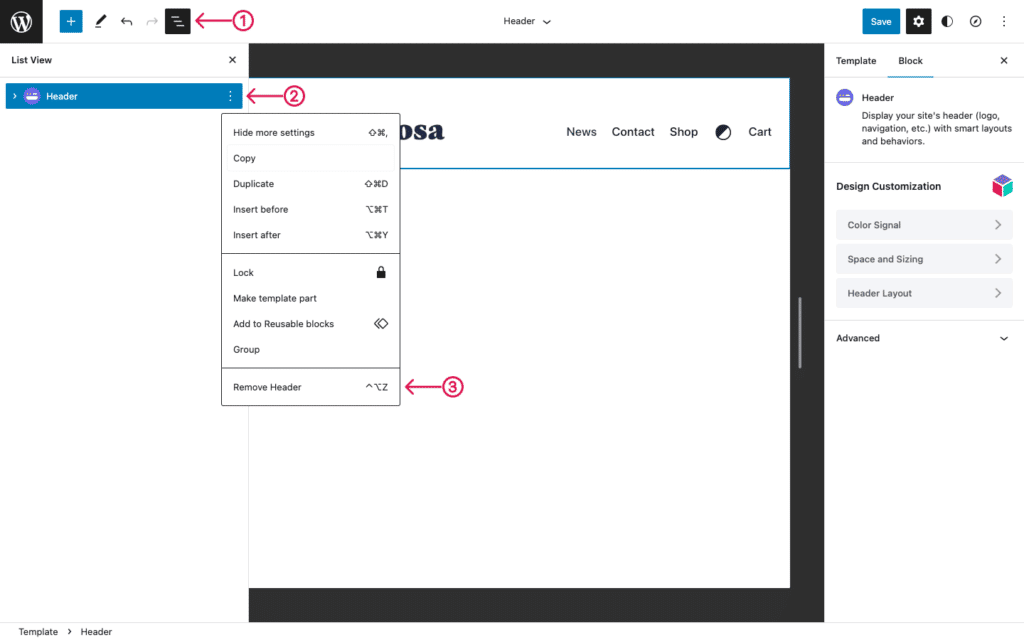
If you want to start fresh and choose a different layout, follow these steps:
- Use the List Navigation → select the Header block → click the three dots, and select the Remove Header option.
- Click the (+) button and add the Header block on the page. Once it loads, choose the desired layout. The available ones are:
- Logo left with one menu on the right;
- Logo centered with one menu on the left and one menu on the right;
- Two Rows Header with centered logo and three menus;
- Three Rows Header with centered logo and three menus.
2. Customizing the look and feel of the header
A few options will load in the right panel each time you click the Header block. The main one is the Header Layout which allows customizing important areas like:
- Header Position on Scroll: make the header static or sticky (stays visible on scroll).
- Logo Height on desktop and mobile.
- Navigation Link Spacing: adjust the space between each menu item in your header.
- Header Sides Spacing: adjust the space separating the header and the sides of the browser.
- Sticky Header Spacing Multiplier: adjust the vertical spacing for the sticky header on scroll.
Besides these options, each header and header row (you can have more than one row, depending on the layout you chose) has Color Signal and Space and Sizing options similar to what you find in other blocks.
When you’re done editing it, click the Save (or Update) button, and all your changes will apply instantly across your entire website.
If you want to read more about how to add other elements to your header or your menu items, please browse these articles.