It might look like a dream come true, but I’m confident we’ve created a solution that could help you get closer to it.
👋 Say hello to Vasco!
Vasco is our flagship WordPress theme for travel bloggers — it is carefully designed to help you create rich content that will allure your visitors to read it from top to toe. Moreover, they will come back later on and engage even more, which will make room for you to keep traveling.
Designing Vasco was a long and challenging adventure. I would love to offer you a glimpse into this journey (from the idea to the final product) to better understand some decisions we took and why I believe this is your go-to design for your next travel blog.
Research Phase
Every new project starts with the research phase. This means that before getting caught into any visual excitement, we take the time to understand the need and the desirability that (a bunch of) users are looking for. After that, we delve into various ideas and find out how we can help them overcome it.
Who is this for?
We created a solution for people who want to start switching their passion for travel into a real business. You might travel with friends or as a solo backpacker, you might go wherever the road takes you, or you could have a hyper-organized plan — any kind of traveler you might be, I’m sure that you learned many things that you wish you would have known in advance.
Unlike Current Solutions
Many available WordPress blogging themes out there advertise that, among others niches, they aim to serve the travel one too. Most of the times this is just a general statement and the solution provided is not actually serving your specific needs and requests.
While it definitely could be used by any other categories of bloggers, we essentially designed Vasco with travel bloggers in mind, and all the decisions that we made were to match their pains.
Understanding a travel blogger’s needs
Most of the time, a travel blogger who’s at the start of this career often focuses on two main things:
- Share their stories, journeys, and experiences with others
- Grow an audience to financially support their traveling experiences
Those two are going hand in hand, and each one depends on the success of the other. While both may sound merely practical and quite cold actions, the difference lies in how the blogger relates to its audience and how he succeeds in creating a brand around his personality.
When you’re growing an audience, creating an emotional connection is a must-have in order to keep momentum.
Emotional connection is made through your writing style and it can be enhanced (or disgraced) by the surrounding context which highlights the content. That’s why it’s important to be able to speak up as a whole and have consistency by choosing a design which complements your personality.
The Key Features of a Theme for Travel Bloggers
Being a travel blogger starts with being a blogger first with some specific needs dictated by the niche you are part of.
After doing our research, reading reports and case studies, analyzing industry-leading travel blogs, we figured out a list of the most important features that a theme should have to help a traveler kick-off his blogger journey:
- A distinctive design with carefully crafted elements to help you express your personality and stand out from the crowd.
- A set of conversion-focused sections that you actually need, available across the entire site (e.g., current location widget, social announcement bar, newsletter forms, sharing buttons) designed to help you nurture a loyal audience around your stories and capture their commercial interest.
- A well-researched content strategy for your Home page that is cleverly laying out the elements to promote your content to as many people as possible
- A set of layouts that let your articles breathe and take in beautiful imagery to set the perfect stage for your stories.
All these key features should match together like a puzzle and create a cohesive design to help you shine and get traction. How did we come up with an outstanding solution? Read further and discover the process behind the scenes.
Design Playground
After gathering all the necessary data from the research, we created a persona to keep in mind in order to guide our decisions:
Amanda is a millennial traveler looking to see the world and help others do the same. She’s working remotely, and she’s writing articles varying from the smallest excursion outside the city to multi-month expeditions.
Then we moved on into the sketching phase where we designed the Home page’s necessary sections, their order, and how they should interact to convey the information and stimulate visitors to take specific actions: reading an article, exploring a category or subscribing to the newsletter:

Once we crafted the strategy and the ideal scenario for a travel blogger’s Home page, we moved on to the creative ideation phase.
A Branding Concept is Born
Taking inspiration from the traveler’s lifestyle, we explored how classic motifs like postcards, stamps or vintage cameras would fit into a blogger’s digital presence. It was important for us that everything we proposed was linked to the traveler, so this was a direction that we really wanted to delve into.
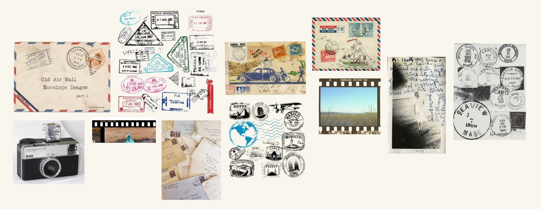
Without having the traveler firmly in our eyesight, we couldn’t have made opinionated decisions, and we would have veered further from our goal of providing a distinctive design aimed at travelers.
Ilinca is giving some insights about the exploration process that she went through in moving from a static set of wireframes to bringing some real personality to the theme:
Ilinca: “While building the wireframes and the demo site’s information architecture, it all might seem just like another theme on the wall. All this is necessary for having a basic understanding of the persona we’re building the theme for, but what would make Vasco the user’s new favorite flavor of travel blog theme?
Analogous inspiration is a IDEO design trick that clicked for me, and in the context of Vasco, I tried to get a hold on what are the objects that a traveler encounters in his universe: postcards, stamps, cameras, maps. Next thing you know, I was breaking these elements into shapes, colors, typography, graphic gestures, then mix-and-matching them and iterate as far as I could; a top-to-bottom approach so to say. It was a short walk in the shoes of our persona and a road we were confident to take while polishing Vasco.”
Next, we sketched out various elements to include those specific details and discreetly integrate them. Some gestures would fit better than others in a web context, but at that point, it was important just to put them together and analyze later.
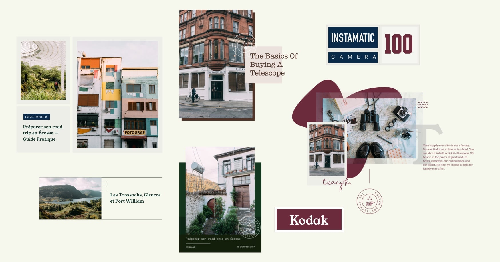
💡Something caught our attention and soon an interesting idea emerged: an overlay stamp and a series of background colors that extended over the edges and enriched the visual presentation:
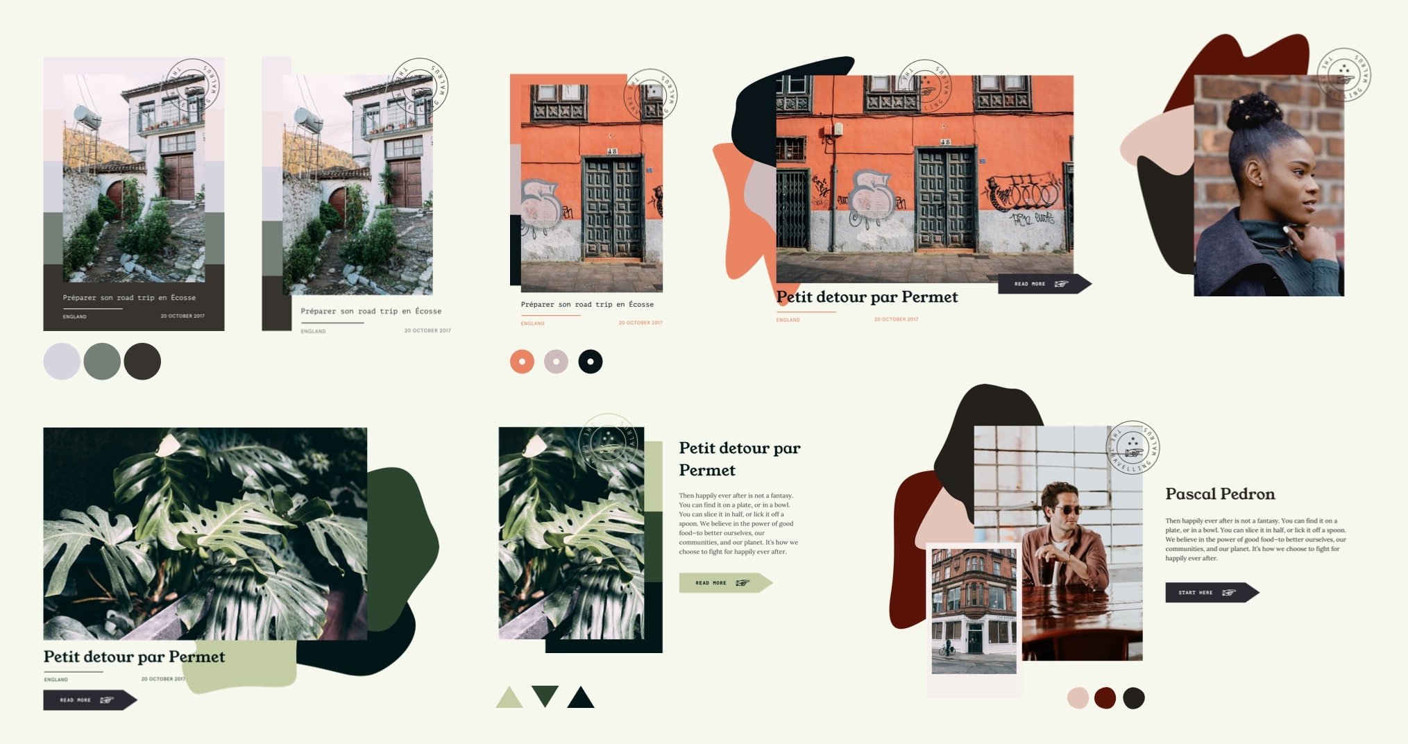
Taking this a little bit further and pushing the boundaries, we figured out a colorful combination of abstract shapes that complement the image and make it feel unique. 🤩
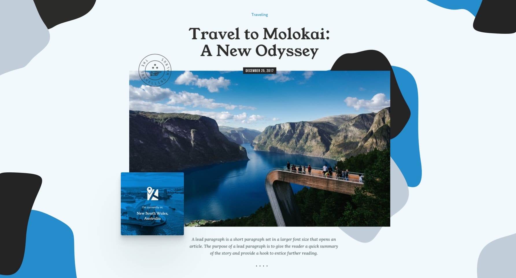
We thought that this was the kind of unique concept that we were looking for, so we needed to find ways to implement it flawlessly.
While we could have been exploring a bunch of variations, the dynamic nature of the design would not be fulfilled if we would not have moved it into the development phase to see how things were going to look in the real world.
The Implementation
No matter how good a design is, it means nothing if it is not properly executed and brought in front of real users. In order to speed up the development time and have consistency among the theme’s features, we build a set of components around the most used elements that we’re able to reuse and improve from one product to another.
Vlad, the architect behind this system, is talking about the philosophy of those components and how they help us build better products:
Vlad: “The way we think about WordPress Theme Components is much in the same way Henry Ford thought about standardizing auto parts and revolutionizing the whole industry: with a suite of standardized, well understood, tested and continuously improved parts you get the current diversity of car offerings but with the confidence that the basic functionality is there – not perfect, but dependable. You know, everyday stuff like having doors that open and close properly, a gearbox with forward and reverse, or pushing the brake pedal and expecting to decelerate. Things we take for granted nowadays.
We believe a more standardized approach to WordPress themes is the way forward if we are to constantly improve the user experience and have a more diverse offering to our customers.
It is not an easy road as it forces new responsibilities upon us in terms of constantly thinking of the larger system, of the implications each change has. Nevertheless, we are committed to making it work since it has the potential to push us forward the same way Ford did more than a century ago.
We are marking constant efforts to design the whole system as open and inclusive as possible, thus paving the way for wider adoption by the other actors in the community. We see this as the perfect win-win opportunity where Pixelgrade wins by being at the forefront, our customers and WordPress users in general win by having a reliable system at their fingertips and other theme authors win by having a solid foundation to build upon and contribute to.”
As with any of our themes, we aimed to bring something new and unique to the table— below are some of the key features we’re most proud of.
The Blobs System
It all started with a static mockup that showed a set of three blobs in perfect harmony with a representative image of the blogger. Even if the shapes looked random, their format remained fixed and couldn’t be personalized — how can we generate those shapes and make them unique for each individual blog?
Răzvan took the challenge to programmatically generate those shapes in an arbitrary manner but still offer some level of control to the user, keeping them unique. See how it works in the video below and read about some of the challenges he faced during the development of the blobs system:
Răzvan: “The first challenge was to find a way to programmatically generate random shapes but also give the user consistent results and have a simple way to store them in the database.
The second one was to find the right balance between the number of controls and the level of customization the user had in generating the blobs.
We ended up with a pretty clear process in the end: dynamically create regular polygons in SVG, translate some of their points to create some more unique shapes and then smooth out the edges using some SVG and CSS magic.”
The final result is an easy-to-use interface that you can use to quickly generate any kind of blobs you want.
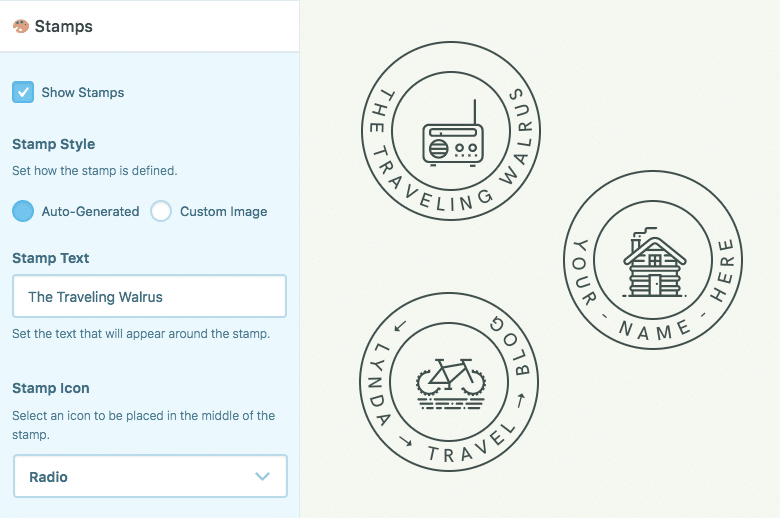
Auto-generated Stamps
Another element frequently found in the traveler’s lifestyle is the stamp applied to postcards that you send back home to the loved ones.
We imagined that this is a perfect gesture that we could bring to the digital world and use it to create an emotional liaison between the physical part of the traveling experience and your online presence.
To be even more authentic, it was important that the whole graphic element could have been generated from your name and automatically placed all over the site to reinforce that the browsing experience feels like receiving a personal postcard from you.
A Blueprint to Jump-Start Your Content Strategy
We know that while you may not be a top-notch copywriter, you still have your own storytelling approach — which is recommended for the most areas of your site. At the same time, it’s important to nail down the basics and include all the relevant information about who you are and what you’re going to do with your blog.
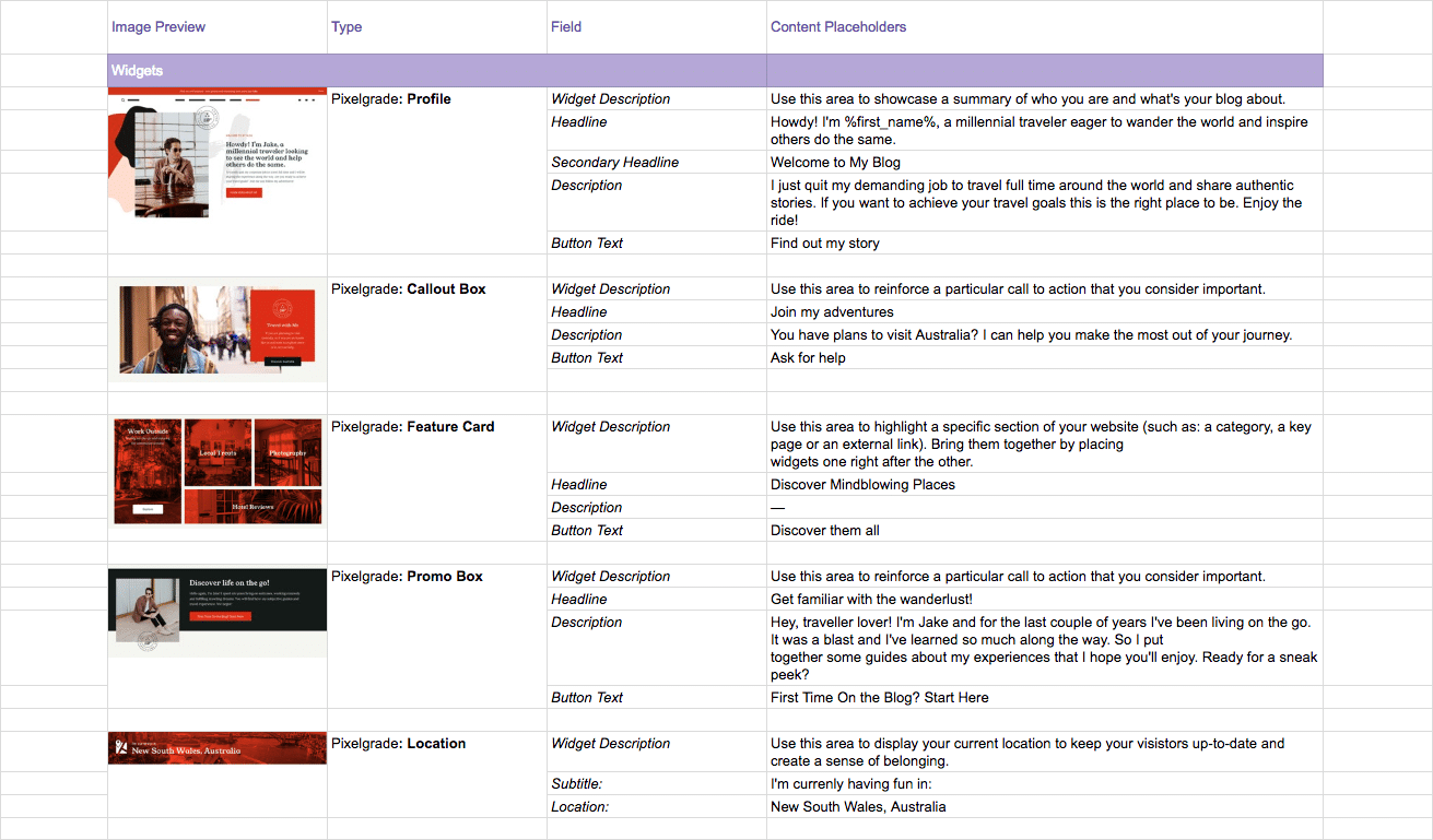
As you already imagine, we took the challenge and searched for ways to give you a helping hand on this matter. After the initial research, we worked with Oana, our digital strategist and copywriter, to create a set of default text for each block that you can freely use to kick-off your content strategy with the right foot.
As the visual assets help you kickstart and optimize the design phase of your blog, we think that the same principles apply to your content.
Oana is giving you more details about the importance and flexibility of the content placeholders that we provide:
Oana: “When I worked on the content placeholders I tried to make the most out of the micro-copy areas, without losing any of Vasco’s personality and charm. I wanted to support and highlight its great design, not over shine it.
The narrow space forced me to be both creative and straightforward, but the fact that I always kept in mind the needs of our persona made my life easier. This way, I was able to craft snippets of copy that could be easily adopted and adjusted by a wide range of travel bloggers. I genuinely cared about this kind of convenience from the very beginning.
By keeping in mind the needs of a persona traveler, I was able to craft snippets of copy that could be easily adopted and adjusted by a wide range of travel bloggers.
The key messages I fine-tuned for Vasco’s demo have one single goal: to help people have an accurate communication entry-point. They make room for travel lovers to build upon and make it even better through their own storytelling approach.
Their flexibility allows users to be authentic and consistent from start to finish, avoiding a bunch of naive mistakes that can damage the overall mojo. On top of that, it definitely leads them to create an experience that audiences of all kinds will remember and brag about.”
We will push even further into this area in the future, but for now, you have an excellent entry-point for each section of your Home page.
Conclusion
As you can see, to actually create a solid solution for travel bloggers, to go beyond the obvious, requires a lot of effort and commitment — but it pays off in the end. What follows is to see how you can take Vasco even further. Best of luck! 🤞
Fun facts
As a final note, I would love to share some naive yet funny occurrences that happened during the development of Vasco.
#1—Is it Bobo?
This time, we tried to postpone the naming challenge and focus on different areas first. We used to call it “Bobo” during the whole process, so now some of our folks are still stuck with this name. 🤷♂️
#2—Demo Guy
The first demo’s presentation we created for Vasco had an intriguing image on the Home page. We displayed a man at the bar, enjoying his drink, but the girls in the office pleaded for changing it because it had an Italian mafia vibe.
#3—Blobs Art
During the development of the blobs system, things started to get a little funky with all those shapes and their controls — and not in a bad way. Our developers got a little too carried away with discovering strange but beautiful shapes that could be generated with numbers. Ahhh…the beauty of maths.
Start the conversation