This article will walk you through how we improved the WordPress comment system to help us and our customers generate engagement around the blog posts (and thus get more comments on the website).
The insights shared come from our hands-on experience in building a new Conversation System both for our website and our customers (delivered via Rosa2). This endeavor is part of our effort to be our own clients—use the products we create for us and the other way around by using the features we deliver to our customers.
Here’s a list of the areas we’ll be covering:
- Creating a plan to generate engagement
- How we improved the current WordPress comment system
- Going the extra mile by maintaining a healthy community
- Get access to the Conversation System we built
Let’s get to it.
Creating a plan to generate engagement in the comments
For all of our existence here at Pixelgrade, we didn’t have a comment section For all of our existence here at Pixelgrade, we didn’t have a comment section enabled on our blog posts. At first, it felt like we were missing a great opportunity to generate exciting conversations on our website. Still, as time went by, we realized that without a clear direction and goals, we could end up confused and frustrated for not getting the “right” results.
So, we took a step back and did some introspection to figure out what counts as engagement for us. Otherwise, there’s no way we can actually know if we are on the right track or not.
Here are the starting points:
1. Understanding our audience
It all started with big efforts in understanding the people choosing our products and reading our blog. In the beginning, we dived elbow deep in customer data—what pages are they visiting, where do they spend time before making a decision, what blog posts get their attention.
We then went a step further and had a few dozen video calls and online surveys to discover their experience of using our products, interacting with our customer support team, and reading our documentation articles and blog posts. On top of this, we did countless interviews (published on our blog) to understand more about their interests, background, and the actions that led them to us.
Another action was to take a closer look at our analytics. We began by determining what articles people are reading and where do they spend most of the time. We asked ourselves questions like, “Who is reading this article? What do they do? Why have they looked for this information? What problems are they trying to solve by reading this?”
This way, we managed to understand if the audience we write about is willing to contribute or not. It might be that our content draws people who are there simply to get informed and then move on (e.g., a product review post). Until we got a better feel of how our audience was looking, we didn’t focus on why things were not working out.
This process also helped adjust our content strategy to attract the audience we seek—a more engaged one, eager to pitch in and join the conversation.
It was clear that we want readers interested in more than just our products. They should be people who care about who they are doing business with, look for similar values, and identify with our way of doing things. Plus, they are not here for quick and easy tips; instead, they seek trusted advice from real experiences and a lot of trial and error.
2. Setting clear goals to measure the impact
It’s crucial to understand what counts as an engagement on the website and what type of interactions we want to encourage among our (and our customers) readers.
The easy thing to do is focus on the number of comments and then get bummed out when the numbers are not there. But what if all you get is the typical “great post!” comments? Are they enough? Do they count as engagement or conversations?
A like can’t go anywhere, but a compliment can go a long way. Passive positivity isn’t enough; active positivity is needed to counterbalance whatever sort of collective conversations and attention we point at social media. Otherwise, we are left with the skewed, inaccurate, and dangerous nature of what’s been built: an environment where most positivity is small, vague, and immobile, and negativity is large, precise, and spreadable.
Like compliment by Frank Chimero
In general, generating these types of comments should not be the final goal. Although people have good intentions and express (in very few words) their appreciation, they bring little context and value for readers who come across them. This limits the interactions and the possibility of kick-starting a conversation.
When it comes to our website, we knew that we had to figure out a better way to encourage people to go beyond a three-word comment; otherwise, we might as well stay away from enabling the comment section.
Success meant getting people to write longer comments and share their personal experiences or takes on a subject, enticing others along the way to participate.
If you’re considering enabling comments to your website, think about what counts as a success for you. The number of comments? The number of contributions to your content? The conversations generated between members? The content suggestions that you get?
There are no wrong answers, but they play a significant role in measuring your success and how you temper future expectations.
3. Limiting the initial scope
What if people could like the comments of others? Or what about social logins? They do seem like a simple alternative since most people have at least one social media account. What about a filtering system to easily skim through content. Sounds great, right? No. None of the above. Not yet.
In this stage, we needed to focus on what matters—getting people to join the conversation in a meaningful way. We didn’t need any bells and whistles or complicated systems that would eventually prove challenging to implement and make us stop before starting.
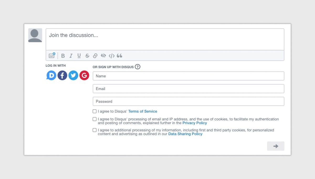
We applied the KISS principle (keep it simple, stupid) and decided that the need for those extra complicated features will be re-evaluated further down the line. We didn’t want to use something just because we’ve seen it somewhere or other people are doing it.
Instead, each time we think about adding things to the comment system, we go back to your drawing board and ask ourselves how those new additions can help us or our customers achieve their goals.
Improving the current WordPress comment system
Every WordPress website comes with a default comment system that provides the basics – a comment form, a name and email field for identification, and a way to display comments.
But if we want to truly want to get people chatting on our website and those of our clients, we need to go a step further than that.
While researching online on what can help us generate more conversations, we found that most advice does not tackle the basic principles of what gets people talking and interacting with each other.
The current information barely scratches the surface and, often, offers generic advice—be original, be interesting, create value—huh?
Let’s go through a few improvements that go a long way in generating real talk in the comment section.
1. Organizing the (comments) information
A comment section has a good amount of elements from which it is built: from author, avatar, and body content to published date, reply and share links. Without carefully putting together each of them in a coherent manner, it’s easy for the reader to get lost through them. Good design can help.
Providing a clear hierarchy helps the user read the content easier and increases the chances of getting him into the conversation. By hierarchy, I’m referring to the order in which the reader notices the elements, and that can be influenced by the styling and position of the elements.
Most of us scan content in an F-shaped pattern, focusing on the top and the left side of the section. Considering these kinds of facts, we aimed at placing and styling the main comment elements exactly where the user is looking first.
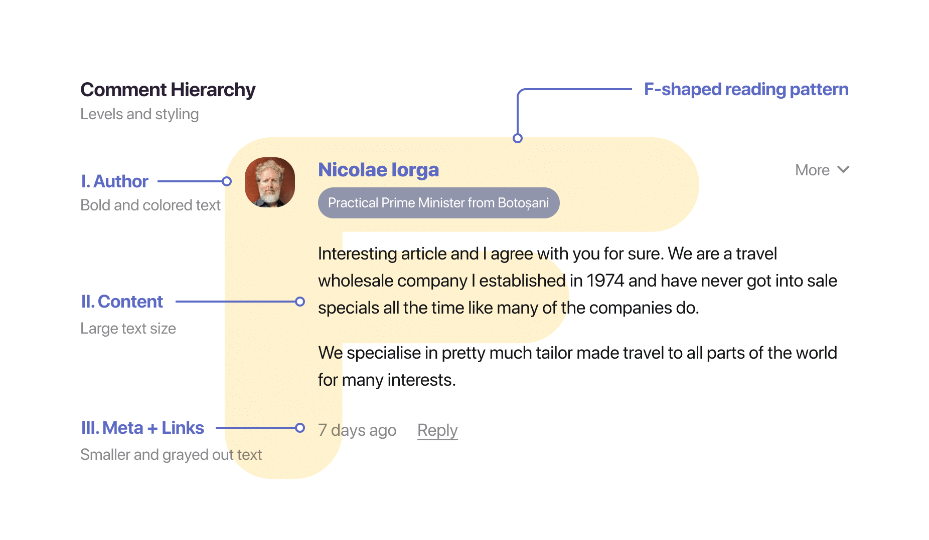
A prominent styling for the author’s name and its avatar helps the reader reference someone in a lengthy list of comments. A less noticeable emphasis should be placed on the secondary pieces of information like the publish date or reply link.
2. Adding a rich text editor for beautifully formatted text
Formatting the comment text makes their content easier to read, digest, and understand. Using bold or italics, visitors can emphasize the main points of an idea. Using lists or headings, they can better organize their thoughts.
The default WordPress comment form is pretty basic, and for everything else than plain text, you have to use HTML tags, which are not very accessible to the regular user.
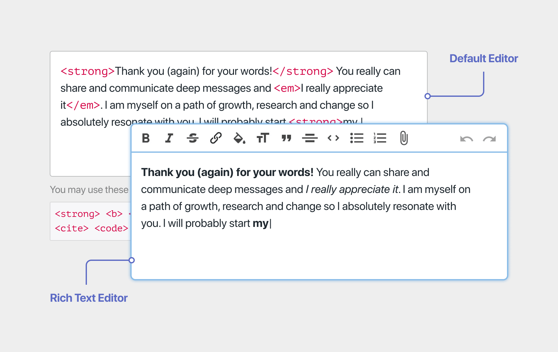
Therefore, we added a rich text editor to the comment form to help contributors organize their thoughts. To achieve this, we used Trix, a minimal and easy to use what-you-see-is-what-you-get editor.
3. Bringing more context about the commenters
Imagine an offline conversation with two of your friends, one’s a doctor and one’s a photographer. You are debating what’s the best way to back up your photos. Whose opinion weighs more in your eyes? Although the opinion of your doctor friend is valuable when talking about certain medicines or treatments, in this case, it might not matter that much.
So, why isn’t that behavior transposed online?
If you think about it, everyone’s opinion seems to be on equal footing online, and you can’t tell when someone is more knowledgeable. If you take the example above and move it to a comment section, who’s thoughts should matter more? It would be hard to tell.
Therefore, not all comments are created equal, just like in real life. That’s why having a way to showcase these credentials can help people differentiate among different opinions and have a better idea of who they are talking to.
These credentials can basically be anything that helps others better understand the perspective and experience on a specific topic. And they can change according to the topic at hand.
A great example of this is Quora, which asks people to add multiple credentials to their profile—handy when commenting on different topics.
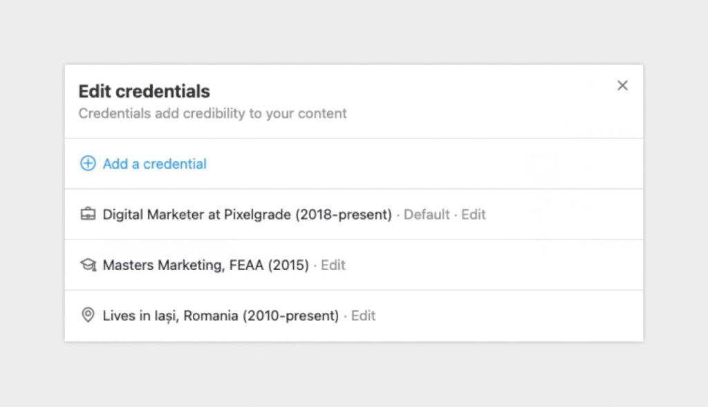
We experienced the same struggle when we built the Conversation System for our website and Rosa2, our restaurant WordPress theme. To address this issue, we added a Background field in the comment form that always shows up near the author’s name.
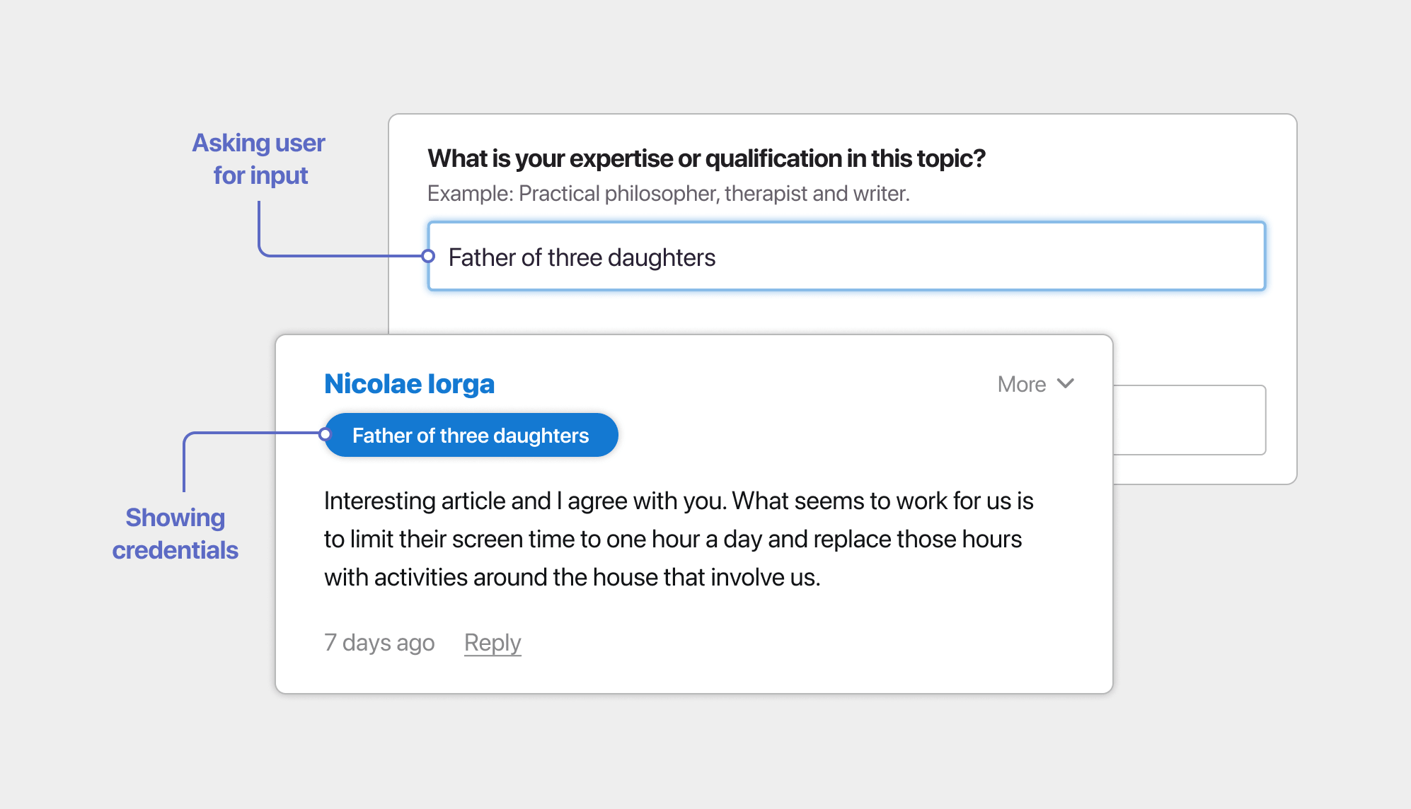
This helps because:
- People jumping into the conversation can add different credentials depending on the topic at hand to make their input more valuable;
- People reading those comments can add their thoughts, knowing who’s on the other end.
4. Kicking off the conversation with your readers
Last year, Oana, our CPO (Chief People Officer), organized an event for all of us at Pixelgrade called “Food is love.” The idea behind it was to gather the entire crew around a table with delicious food and drinks and use this as an opportunity to have meaningful conversations that would help us get to know each other better.
Food is a great connector among people, and this event took full advantage of this. But having the right context to gather people together is not enough to make us vulnerable and eager to share stories that few people ever heard before.
To achieve this goal of making us open on a deeper level, Oana had a great list of questions to guide us through. Each question was meant to peel one layer after another and help us bring our true selves to the surface.
She asked questions like, “How have your priorities changed over the years? What have you rebelled in the past, and what are you rebelling against now? How have you made and lost friendships, and what other kinds of friends would you like?”
When it comes to the online world, we should try and incorporate as much of the offline as possible.
As you know by now, writing a great article is not always enough to get people talking and expressing their views, just like gathering around a table does not make us instantly put our hearts out.
It would help if we gave people a chance to open up and contribute by asking them guiding questions. It’s crucial to lead by example and set the tone; as the article’s author, it makes perfect sense to kick off the conversation with a question that genuinely intrigues you; authenticity goes a long way and makes people feel more comfortable in joining the dialogue.
For our website, we wanted to draw as much attention as possible to the question so that visitors won’t miss it. At the end of the process, we came up with the Conversation Starter.
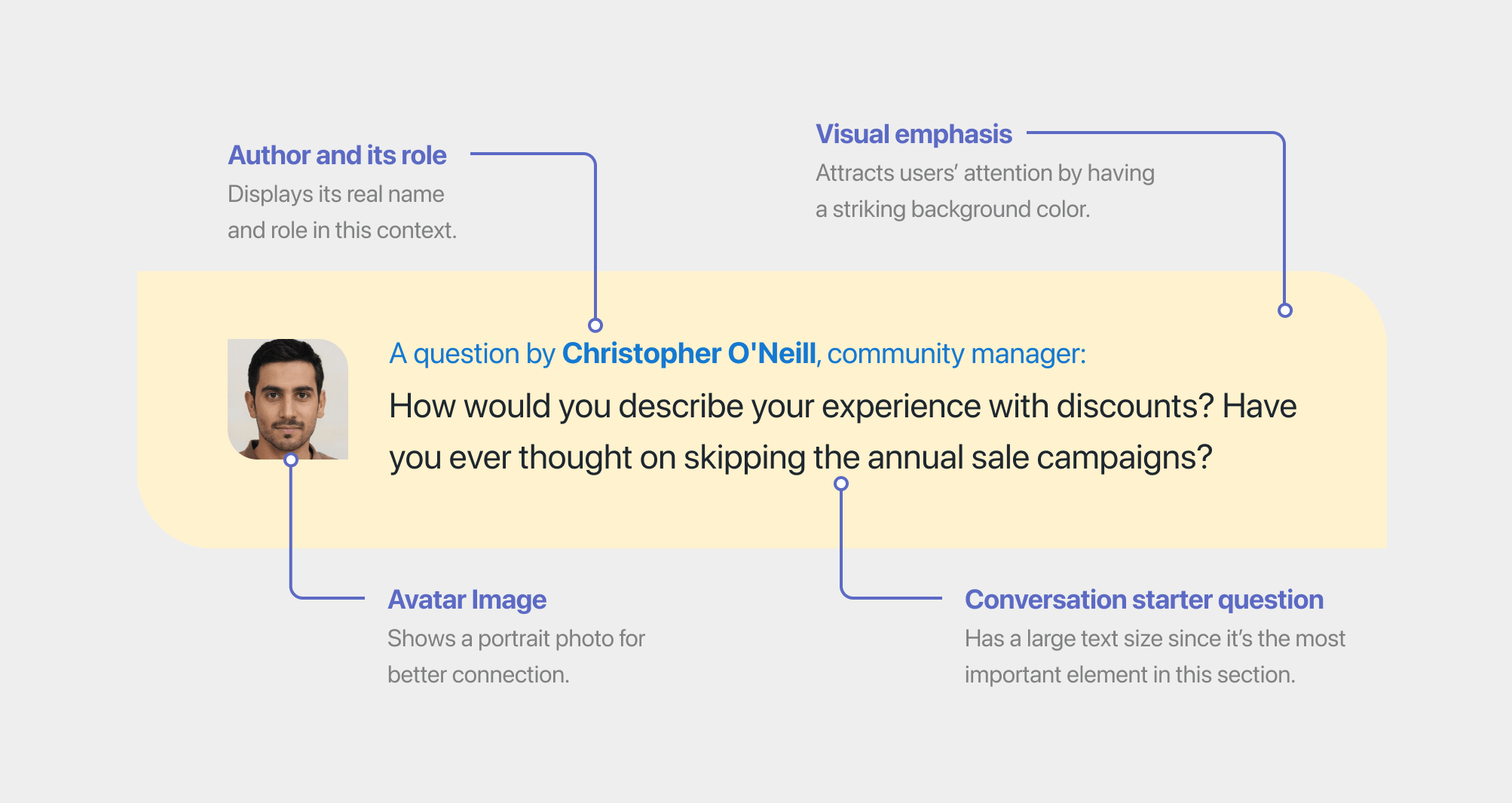
Displayed at the end of the blog post, the Conversation Starter clarifies who’s asking the question, puts a face to the name, so people know who they’re talking to, and, at the same time, brings attention to the question to start the conversation.

Do you have other ideas to bring more value to a conversation? We would love to hear about them in the comments below.
Maintaining a healthy community
The work does not stop here. Now we needed to manage the community that gathers around our content. It’s our job to make sure that the website conversation system does its job and that people feel like their contributions matter.
A great way is by interacting with those who comment, creating an environment that feels alive and active. Just like in real life, we didn’t want to be the one that asks a question and then checks their phone. We engage by replying to the comments you get, asking follow-up questions, and being genuinely interested in what your audience has to say.
A good example is in the blog post where we discuss our approach to discounts and why we decided not to practice them anymore. People came forward with their unique views and concerns to which we answered by offering more context about our decision and thinking.
Rewarding the most valuable comments
It helps to have a few tools in place through which we can reward certain contributions. People whose thoughts reach this level of recognition will feel special and are more likely to interact again in the future; plus, others will see it as an example to bring meaningful ideas to the table.
To achieve this, we build the ability to highlight certain comments right in the Conversation System. This helps us emphasize the interactions that bring the most value to a blog post.
Get access to the Conversation System
We built the system mentioned throughout this article because we needed it on our blog and the Upstairs Community—the place where we publish stories that make us better people.
Since adding it to our website, we managed to generate insightful conversations around various topics.

Because we believe in eating our own dog food and made a commitment to be at the forefront of using our products, we implemented this system in Rosa2, one of our WordPress themes—see it in action. With this tool under your belt, managing the conversations is as straightforward as possible. All customers who choose this product will have access to it.
This endeavor is one of the many ways in which we are now using the solutions for our shop to provide value to our customers and the other way around.
Having a conversation system is more than just a form at the bottom of the website—it is a process that requires a few exercises in understanding the audience and creating an environment where people feel safe to share.
Plus, it’s important to make the comment section feel alive. And the best way to achieve that is by guiding the conversations and having the right set of tools that allow you to bring attention to those willing to put in the work and share their insights.
The outcomes might surprise you and open gateways that you did not dare to imagine. At least that’s what happened to us.
Conversations 7 comments
Are you going to be releasing this as a premium plugin or even free? Curious 😉 I’ve been a customer of Patch and Silk themes for a while now.
Wait wait I am confused within Nova Blocks is the commenting system? I ask because I don’t see it.
I’m investigating which comments system to use for my blog, and while the default wordpress solution has a lot of great features (it’s tightly integrated into the admin dashboard, supports backup and restore, has comment likes, supports posting with a wordpress account so you don’t have to sign in every time), it’s missing the some key community engagement features which your system has (credentials, rich text formatting, highlighted comments).
I’m looking to understand whether the wordpress solution can be expanded with the features you’ve implemented, or whether it’s required to completely switch out the systems (so only get benefits of one or the other).
Helⅼo! Someone in my Ϝacebook group shared this site with us so I came to take a looк. I’m definitely enjoүing the information. I’m bookmarking and will be tweeting this to my followers! Exceptional blog and amazing desiցn and styⅼe.