We want to help you start with the right foot in order to fully enjoy our WordPress theme. This is why you need to make sure you have a solid foundation for what’s next by installing the theme and the right plugins. We covered the basics to help you get ready and make the most out of this WordPress gem. The order of the following section is important, so please refer to it accordingly.
Install and Activate the Theme
One of the perks of WordPress in general and Rosa 2 Lite, in particular, is that you can start playing around with it in no time.
- Log into your WordPress Dashboard and navigate to Appearance → Themes.
- Click Add New button at the top of the page.
- Search for “Rosa 2 Lite” from the top right search field.
- Find the theme and click Install Now.
- Once the theme has been installed, click the Activate link.
Adding the Demo Content
With the demo content, you can get a sample of pages and posts that will help you get started. This content can help you figure out how Rosa 2 Lite is built and edit it until you make it your own.
Before you start
To get the right results, please validate once again these details:
- make sure you installed and activated the required plugins
- if your site is already filled with content, please note that importing demo data will cause mixed content and things might get messy
- double-check that you have no errors in Theme Dashboard → Status so that the process will run as smooth as possible
Loading Demo Content
To start importing the demo data you need to follow these steps: Website dashboard → Pixelgrade → Starter Content.
Click the Import button and wait until the process is finished. In about three minutes the process should be completed, but it depends on your Internet connection and speed.
What happens if the import process stops at some point?
If the import process seems to stop, then you should know that it might be just a common WordPress issue related to the maximum execution time exceeded. There is a plugin that you can use to fix this easily. If you still struggle with it, read our friendly article about what you need to do to finish the demo data import.
Updating the theme
There are three main areas where you can see the notification for a new update:
- Log into your WordPress Dashboard, click on Updates and update all of your outdated themes;
- Go to Appearance → Themes, and you will notice a badge with the New version available over the outdated theme. Just click on that message and hit the Update now button;
- Go to Appearance → Theme Dashboard, and you will see a banner with the New Theme Update is Available!
Editor Blocks
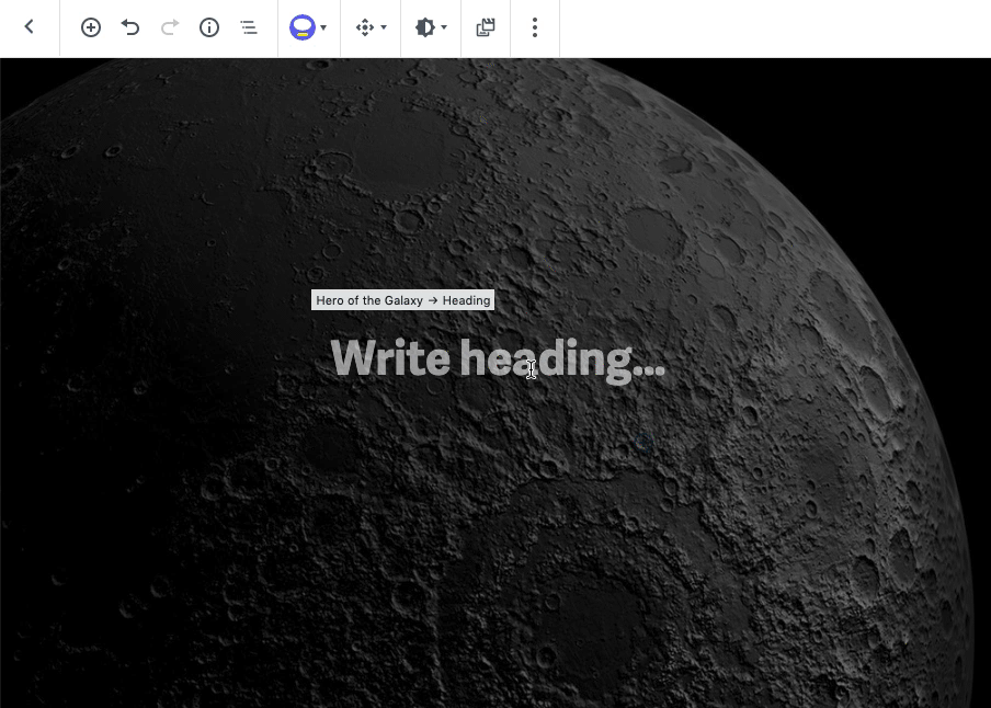
Hero of the Galaxy Block
A Hero block is usually the first thing your visitors see, making it a great spot to get them acquainted with your catchy content. Controlled by a smooth parallax scrolling and featuring a fullscreen background image or video, this is the perfect place to make a great first impression.
You can also find this block mentioned as Banner, Cover or Poster and it’s fundamentally the same concept. To learn how to use a Hero block on your site, follow the steps in this guide.
Add a Hero Block
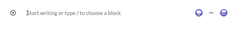
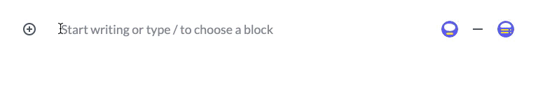
To add a Hero block to your content click the ⊕ inserter button inside the editor and search for “hero”. Alternatively, you can just type /hero and press enter.

Add Content
Use the area inside the Hero to insert content blocks like Headings, Paragraphs, Buttons or Separators. While you have the flexibility to insert any other blocks, we recommend you to keep a low profile and leave room for the images in the background to shine too.
🌇 Add a Background Image
Use the Swap Media button from Toolbar to add your own image. It’s best to use high-resolution images that are at least 1500 pixels wide.

Because the size and shape of the Hero depend on the size and shape of the visitor’s screen device, your images will be cropped on some screens. Use the Focal Point option (see below) to change the focus of the area background image and make its main subject visible.
🎬 Add a Background Video
If you’re into motion, you can insert a self-hosted video to create a looping visual element behind your content. To add a video:
- Use the Swap Media button to open the Media Library.
- Drag your video file from your computer to Upload.
- When you’re finished, click Select to insert.
Customize the Design
Both in the Toolbar above the selected block and in the Inspector sidebar, you can customize the design and behavior of the Hero blocks. To retain the overall logic and consistency of the Hero blocks design within a page, there are two different sets of options:
- Standard block-level options that apply to the selected block
- Page-level options that apply to all other blocks from that page
Below you can find more details on how to use those options.

To display more than one piece of content in a single space, you can use the Slideshow block instead.
Media Card Constellation Block
Use it to display media objects, like images or videos, alongside short pieces of content.
Add a Media Card Block
To add a Media Card block to your content click the ⊕ inserter button inside the editor and search for “Media Card”. Alternatively, you can just type /media and press enter.
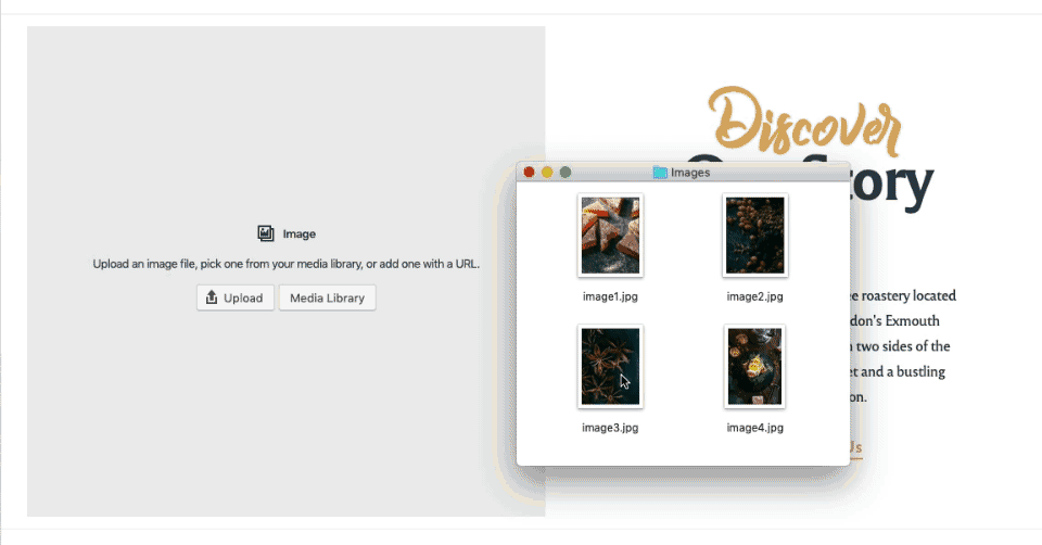
Add Media Images
To add images to the block, use the option provided to upload a file from your computer or select from your existing Media Library. You can add up to four images and the layout will adapt accordingly and still look awesome.
Add Content
Use the content area to insert blocks like Headings, Paragraphs, Buttons, Quotes or Separators. To make sure that it’s sizing nicely, the media area will adjust its height according to the amount of content.
Customize the Design
Both in the Toolbar above the selected block and in the Inspector sidebar, you can customize the design and behavior of the Media Card blocks.
Considering that you could have multiple Media Card blocks on a page and if you want to change their appearance, you can use the Emphasis Levels from the right sidebar.
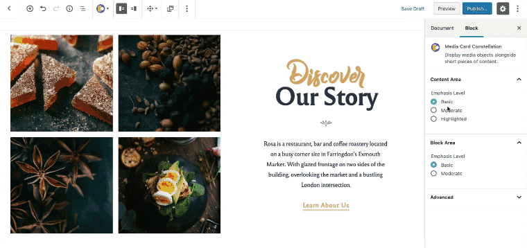
Organized in ascending order, they are available separately for the Content area and for the whole Block area, as follows:
- Basic: Default style, balanced emphasis on both media and content.
- Moderated: Increased emphasis of content by placing it inside a shadowed box
- Highlighted: Highlight the content by entirely switching the color scheme (eg. from light to dark).
Food Menu Block
Use the Food Menu block to display a list of food or drink items available at your venue.
The block is optimized to add specific structured data to your website and help you rank it more appropriately in search results (SEO) by using rich snippets.
Add a Food Menu Block
To add a Food Menu block to your content click the ⊕ inserter button inside the editor and search for “Food Menu”. Alternatively, you can just type /food and press enter.
To help you get started, the Food Menu block includes some sample content that you can use to configure your menu.
Add Menu Sections
You can organize your menu into sections like Starters, Main Course or Desserts. To create a section click the ⊕ Add Menu Section button from the bottom area of the block.
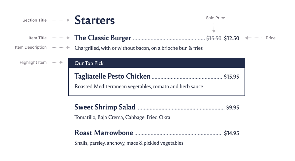
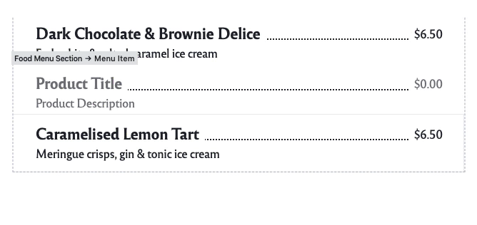
Add Menu Items
To add a menu item click the ⊕ Add Menu Item button corresponding to its section. Using the inline text editor enter details for the Title, Price and Description.
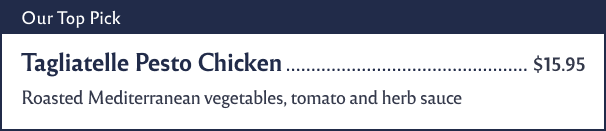
Highlight a Menu Item
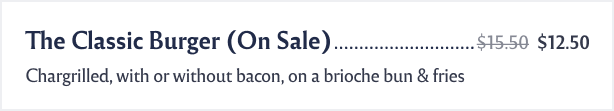
If you want to highlight some of the menu items and make them stand out, click on a Menu item and from the right sidebar check the Highlight item option. You can change the label text inline, straight from the block content. It is a great way to highlight what makes you special in the culinary world.
If you do not see the sidebar, click the “cog” icon next to the Publish button.
Set a Sale Price
Click on a Menu item and from the right sidebar click the On sale toggle. You can change the sale price inline, straight from the block content.
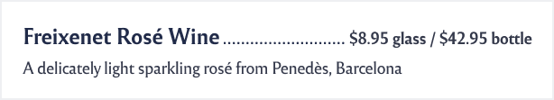
Set Pricing Variants
The “price” field is flexible enough so you can enter pricing variants whenever you need to split the quantity (eg. glass/bottle or full/half servings).
Customize the Design
The menu inherits the fonts and colors styles of your site to make sure everything is consistent with your brand.
To access the available block options, click on the parent block container (outside the menu sections) and then from the right sidebar choose whether to display your menu in one or two columns layout. Note that the number of columns depends on the width of your browser and most likely it will set on a single column on mobile devices.
If you want to build complex menus, you can use the Columns block and insert multiple Food Menu blocks inside.
Slideshow Me the Way Block
Use the Slideshow block to display a gallery of images in a single, coveted space.
Add a Slideshow Block
To add a Slideshow block to your content click the ⊕ inserter button inside the editor and search for “slideshow”. Alternatively, you can just type /slideshow and press enter.
Add and Reorder Images
Use the Change Media button from top Toolbar to select your images, then click “Add to gallery” button from the bottom right corner. It’s best to use high-resolution images that are at least 1500 pixels wide.
Once you have selected images, within the “Edit Gallery” view you can drag and drop them to reorder however you please.