Wrapping your head around the best way to display your work, could feel like a zombie attack, constantly trying to keep up with the right approach to follow and the best trends to consider. Yup, it’s no walk in the park.
However, we, the Pixelgrade crew, like to think that we do much more than to deliver design-driven WordPress themes for our beloved clients. We work really hard in order to provide an unforgettable experience for those who are eager to raise the bar in showcasing their work. Believe us, it’s not just a manner of speaking, we take this to heart and strive to live by it.
Embrace your unique self and what makes you an artist
If there is one thing that stuck with us from the start, is that you can’t go general with creatives. No. Each of you has your own story to tell, your own unique perspective on this marvelous world around us. Could we have made things harder for us? Probably not.
But we are not shaken in our determination to help you. And being a design focused team definitely, helps. That is design beyond pretty pixels and eye‐watering animations (though, who can resist those?).
A design-thinking team that asks the hard questions and digs deep for those basic principles, for those solutions that are dead simple (close to stupidity, but not quite).

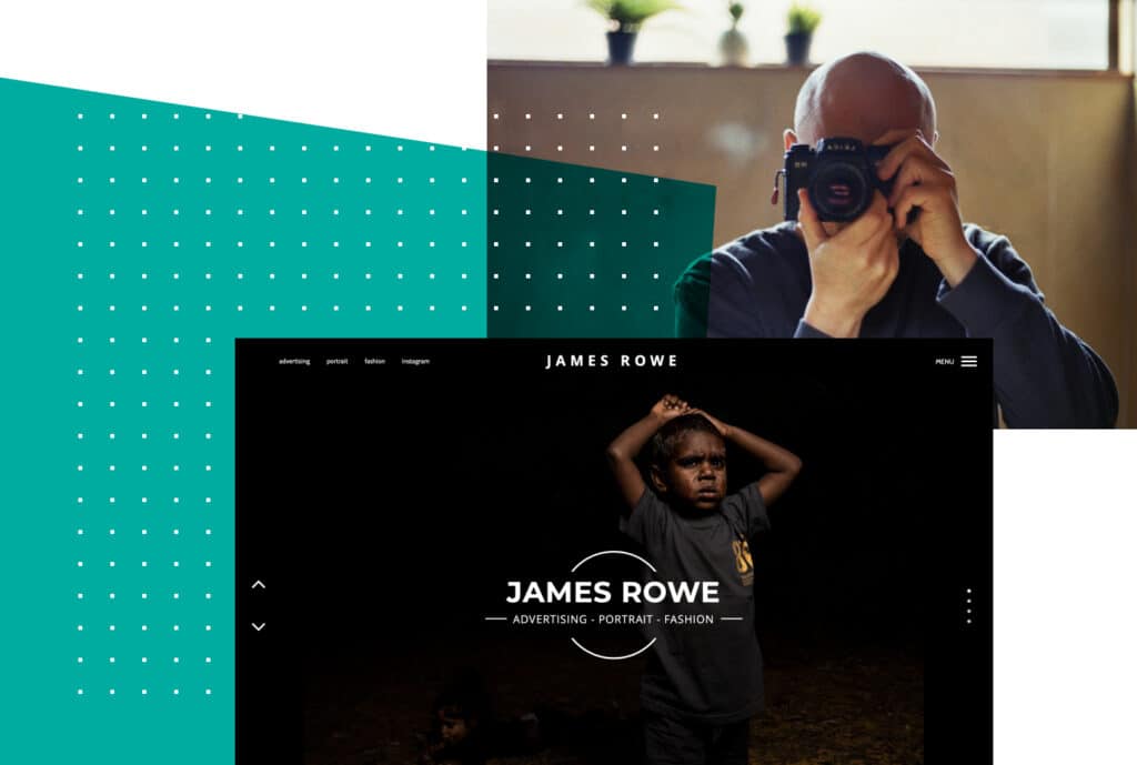
So, based on the numerous gatherings and interviews we’ve had with our clients – that are photographers or design artists – we’ve identified some problematic aspects artists face. For example, James Rowe, a freelancing photographer and producer from the US, explains how tedious it can be to identify the right theme fit for your website:
“I’ve set up over half a dozen websites over the years for my photography and production agency. Border has been, by far, the easiest and quickest to build theme, while not having to sacrifice on usability. Everything works straight out of the box and, the quick, easy access, pop-up, self-help box makes any hurdle easy to jump over.”
As a result, we’ve put together some useful steps to follow, along with a smart solution so that, the busy creatives out there, don’t have to struggle with design dilemmas.
What to look for in a photography theme?
With a myriad of choices, picking the best possible theme can be a rather daunting task. Why? Because you must consider the service you buy, how well it performs, and the list goes on.
However, we believe that the first thing you should seek is a cultural fit with the team behind a certain WordPress theme. You’re in this for some time to come, and you don’t want to be traveling with the wrong people.
Read about them, check out reviews or their public interactions with the existing customers, fire up a pre‐sale ticket to them. Get a feel about how you are treated as their partner.
For instance, here, at Pixelgrade, we send personalized “Thank you!” letters to our clients because of our awesome collaboration and respect for one another’s work.

The second crucial aspect to not overlook is finding the theme that speaks to you. For instance, does the design structure fit your portfolio, or does it naturally showcase your work in such a way that you feel giddy?
Also, play around with their demo, check out their documentation. Is there anything that sounds suspicious or too complex? Ask away — drop a line about your concerns and see how reliable is their answer. Do you sense a reluctance in the way they approach your issue or a sense they are hiding something? Move away. There are plenty of fish in the water.
We recommend you stay clear of those that over promise and make you think to yourself: “This sounds too good to be true! And look at that tiny price!”. It usually is just that — Something’s gotta give. There are no bargains, but overly priced products.
Do yourself a favor and don’t fall for that marketing crap: “look at our 100+ demos; look at how many ways you can use our theme; it’s perfect for anything you want”. It means they are net fishing, not fly fishing. Be a trout, not a shrimp.
Once you’ve decided on the theme and verified the company’s proactive approach and legitimacy, it’s time to focus on the theme’s features. Pay special attention and make sure that it has the following traits:
-
Focused on your needs.
You’re looking for a photography theme where its main purpose is to showcase your work visually. While you might be able to present your craft with a general multi-purpose theme, it’s in your best interest to choose one that’s focused solely on your photos and has a clean interface that brings them in the spotlight. -
Easy and intuitive navigation.
With so many elements that need to load, you’ll want a theme that doesn’t complicate things, but rather simplifies the whole process making it pleasurable and accessible to run through. -
Responsive design.
When you put your content together, check that the design nicely adapts to whatever piece of technology is displayed on (mobile devices, tables, desktop, etc.). -
Captivating visual experience.
The way users interact with your website is essential in determining the level of engagement and the confidence it transmits. So, double-check the loading time, pay attention to details — like the transitions between pages, or the design consistency across pages — and make sure the whole experience has a good feel to it.
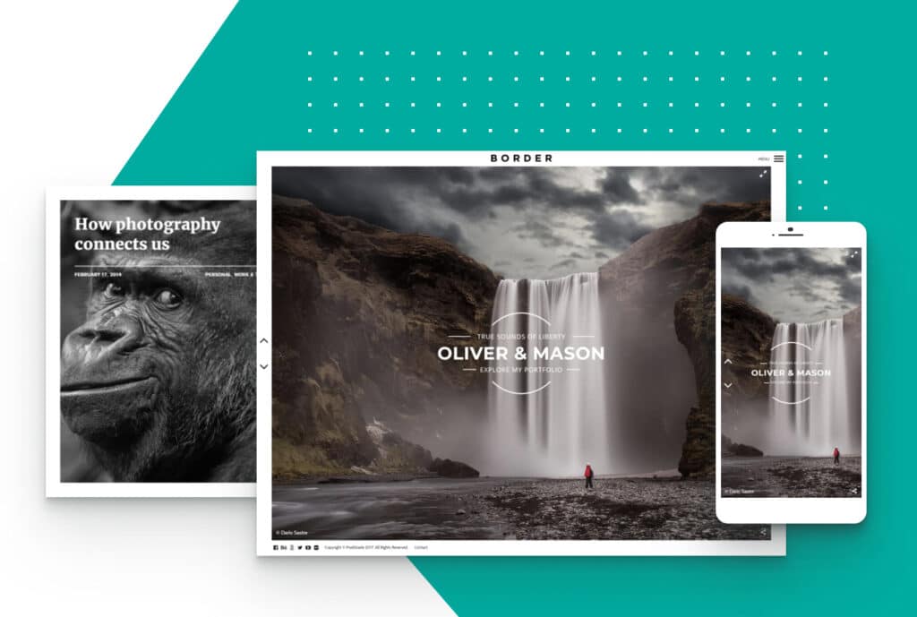
Next, from the cluster of photography and portfolio themes, we’ve selected Border because it stands out through its unique “framed” layout, minimal design language, and lively page transitions.

Why Border theme might be the right solution for you
Talk is cheap, right? So, here are some strong and to‐the‐point facts about how you could benefit from our work in order to emphasize yours.
#1 — Unique visual experience
Border is our response to all of you, frame loving photographers, out there. In favor of a captivating visual experience, our theme boasts lively and spirited page transitions in many unexpected, yet perfectly natural ways.
It embodies a minimal, beautiful design language that allows the photos to take the center stage. Plus, you will not only get the looks, but also the speed your websites deserves in order to make the entire user experience an awesome one.
#2 — Flexible design structure
Whether you shoot people, landscapes, food, or weddings and you’d like to keep a journal with your vision and thoughts, present your bio and services, Border’s got you covered!
It is fully packed with slideshows and grid based galleries, and it also lets you mix images with videos,so you only focus on the way your reflect your talent.
#3 — Easy to use interface
Besides being a one of a kind photography WordPress theme, we’ve made it super easy for you to handle all those wonderful shots that crave for that full‐screen glory. And they should.
Want to slap a title on it? Again, easy. Just type it in and look out for those fancy animations (we are suckers for those).
#4 — Mobile ready and fully responsive
The theme features an off-canvas multi-level push menu to make it easy for your mobile users to discover your site. We extensively tested it on many devices both iOS and Android, and made sure it’s fully responsive.
Pics or it didn’t happen
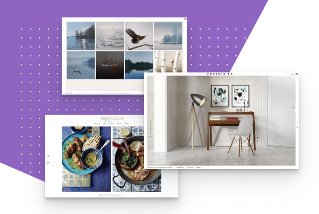
Furthermore, feel free to take a tour and admire some websites built with Border. Each of them is a boundless source of inspiration and empowerment as well.

Jennifer Haslam (Customized) / Susan Gosevitz (Visual Artist) / Phoenix Bay (3D Artist)
All in all, we’re happy to build useful and eye‐candy products, but we are far more driven by the fact that we help our clients spotlight their creative projects.
In the end, it’s all about bringing some joy and confidence to those who pick us from the crowd. Ready to join our growing community?
Start the conversation