Content is king 👑! Content is here to stay ✊! Write killer content 🦈! Content is king, but context is God ⛪️! If content is king, then context is queen 👸🏻!
This is my way of starting on a high emoji-note, getting you all flabbergasted by cliché bonanza, and clearing the air for a more down-to-earth conversation. Take a few moments… let the tons of memes play out in your head… get it out of your system…breathe.
Now join me on a “casual” walk through the narrow pass between the highlands of click-bait-SEO-Google-growth-hack “glory” and the lowlands of never-read-404-pretty-battery-hog “agony.” I can’t promise you a safe passage, but, at the very least, it will be fun.
A frame is worth zero words
I know for a fact 🤞that you’ve been keeping a close eye on this series of stories about web performance. But just in case you forgot, previously, you’ve made up your mind about what you absolutely need to put in your digital home to make everything work smoothly. You built up the structure of your website.
I guess it’s about time to do some plastering, some painting, some prettifying. You are about to create a beautiful frame worthy of your soon to be content. You are ready to let loose those fizzy creative juices– they’ve been brewing for far too long.
Stop it. Just hold it in. Remember ☝️: we are on a narrow mountain pass. We have come so far together, and I am not going to let you slip on me now.
A frame is just that: a frame, a necessary compromise to structure your site’s content.
Keep it as minimal as possible. Don’t let it sneak up on you and get center stage. Once it did, you are very unlikely to reign it in. After all, it is your creation.
Things like the site’s header, sidebars, footer are all part of the frame. They help create a consistent experience across your pages, they help your readers feel at ease with a sense of familiarity, they provide essential services like navigation, discoverability, contact and the almighty subscribe.
That is all your frame should be allowed to do. And do it very efficiently, performance-wise:
- No long personal “epitaph” in the sidebar – that is what about pages were invented for 🗿
- No images unless the gods demand that sacrifice 🙏
- No header background image – a color, or two will suffice 🌈
- No latest comments, tag clouds, Facebook or Twitter feed widgets… because it’s not 2015 anymore 🤦♀️
- No pop-ups, side-windows or bottom-bars (unless obliged by GDPR) – you might stumble and fall off the path 👋
If you can manage to construct everything in your site’s “frame” out of text and CSS styling (like borders, backgrounds, some icons), you should give yourself a nice, long hug 🤗Your site has wings now.
The frame is optional
There is an all-too-common bias when it comes to websites and their “frame”: all that planning and effort will payoff since “a frame is forever” – you built it once and then it will do its job over and over again.
Sorry to ruin it for you, but this is simply not the reality of the web. Not today, maybe it was 15 years ago. Actually, it was never the intention of the world wide web to become a gallery of carefully crafted frames filled with content – glorified containers if you like.
Slowly, but surely, the frame is made obsolete. Gone are the “classicist” days of the 19th-century art. Embrace the frameless modernists, the contemporary street-art.
Your content (pages, stories, photos, videos) is getting a life of its own. Your readers are increasingly all-mobile, they are trying to make sense and find balance in an increasingly noisy world through apps that curate or gather content from various sources, people are saving content for later read in note-taking apps and services.
At the same time, you are keener to distribute your content wherever your audience is, rather than shepherding them to your own site.
Think mobile screens, RSS feed readers, Google AMP, Facebook posts, Medium publications, Apple News, Pocket, Instapaper. The list is endless, and the direction is clear: content is all that matters, not the frame.
Take this as an extra incentive to be as frugal as possible with the decorations around your content. It’s a shame to waste precious resources on something your readers are trying to get rid of.
But what about ME?
Doesn’t this mean that I can’t express my individuality, my brand… my ME?
There, there. Shake it off. We are better than that. We are more confident than that. We are also on a narrow path and need to stay firm on our feet.
Embrace this new reality, these constraints, and focus all your branding efforts on your content. Fuse your personal or business style with your content. Make them inseparable.
Focus on typography, formatting, visuals and illustrations, consistency across the board.
Your readers will appreciate the effort invested into the actual work, and your brand will become that more pervasive and resilient to the dynamics of the web.
What does this have to do with performance, you may ask? Everything! Like I’ve previously said in this series, you don’t gain performance, you lose it, you spend your performance budget. With this attitude towards your content and its frame, you are much more likely to spend much of that in the area that matters most to you and your readers.
1000 words per image
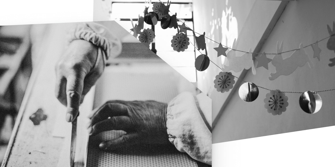
Actually, at the very least 1000 words per image. And since you are a really crafty image-maker, your’s are probably worth close to 2000 words, some even 2364. With the right alternation of images and textual content, you can say so much more. Much, much more…
After this healthy dose of not-so-subtle irony, let’s get real about images. There is photography where the image is the main content and text is secondary.
And then there is illustration/visualization where text is the main actor and the visuals are only there to reinforce and complement, secondary at best. There are rare cases where the two are on equal footing, but it is hardly the case online.
My focus is on the second case, that where we feel the need to add images to our “walls of text” to make them moodier, easier to swallow, funnier, or simply more professional looking.
I too have this feeling, this urge to do more for one’s crafted content, this desire to convey the message in multiple ways.
For the sake of your site’s performance, you and I both can do better, we can be more creative and subtle:
- Text can (also) have graphical properties: think about neatly styled quotes, expertly inserted forms or call-to-actions, drop caps (that big letter at the beginning of a paragraph), even the old fashioned bold and italics can do a lot if adequately considered.
- Achieve rhythm in your story through the proper use of headings and subheadings.
- A paragraph or a group of them can have a different background color – almost like a cover image.
- Play with empty space (colored or not), spacers and dividers
All these, and so many more are in the realm of what professional designers call: typography. It’s a realm of purity and ingenuity, of exploration into the subtleties of letters and graphics, of print-meet-your-pixel.
But, before I lose you to swirls of fonts or google searches, back to reality: using typography instead of images is decidedly more performant. Even with all the intricacies of downloading a couple of font files, extra CSS styling, the performance cost doesn’t come near a single full-width image.
I see you somewhat persuaded, but not by much. The allure of those 1000 words is deep. It feels like the safer bet, the thing that everybody is doing.
Consider this: an image may “speak” a 1000 words, but whose words are they? Your words? Or are they whatever the reader wants to see and hear?
When an image is a work of art (like artistic photography) that is the exact effect you are after – you count on that personal interpretation. But when an image is to be mere decoration, would you risk conveying the wrong message, in misalignment with your story?
No 👊! Images are just my thing
Hold on there, Mr. Frodo! You carry a great burden 💍.. We could share the load 🤫
If I need to make it any clearer, images are your site’s performance Achilles heel. 🦶With just a couple of clicks you can easily double, triple, quadruple your load time. But since you must, let’s explore some of the ways you could reign them in and maintain some performance balance.
First, you need to study and get to know this burden. Without a proper understanding of the powers at play when it comes to images, all our journey so far would have been for nothing.
As part of this series about web performance, I have written at length about the journey an image has to make before ending up on a screen near you. I won’t go into all that again, but I will give you the gist of it:
- An image file is nothing more than a long list of pixels and some extra metadata; a 1000×500 pixels image means 500K pixels adding up to at least 150-200 KB of data; this whole article’s text (in HTML) is around 10KB
- The format you use for your images makes a huge difference in file size; use JPEGs by default, PNGs when transparency is needed
- Pay close attention to the maximum pixel size of your image file and the size you use it at in your content; smaller is always better
- Use tools specially made to optimize images for use on the web
- Let go of picture-perfect and embrace as-perfect-as-possible.
Now, I couldn’t call myself a proper companion if I wouldn’t do a little pushback and share some trickery:
- If you use simple illustrations, like vector graphics, consider using the SVG format; it is very efficient in terms of size (it’s just text); there are tools that can (try to) convert regular images into SVGs; here is a simple how-to related to WordPress and some tools
- If you want your visitors to look at photos in as much detail as possible, consider using a lightbox system where you would include a smallish thumbnail in the content and, on click, a full-screen modal would open up with the full-size image; here is a WordPress plugin just for this
- Videos are surprisingly performant when taking into account their complexity; due to the explosive growth of online video distribution, video player technology is very much at the cutting-edge of performance; generally, video players load the actual video only when it’s needed, they don’t drag down the loading of the page
- Consider using lazy-loading for images on your site; at least, this way each image will be loaded only when it’s time to display it, on scroll
- Use automatic image optimization so you can get an extra performance layer; there are various WordPress plugins that provide this with ease (Imagify, Smush, Compress JPEG & PNG Images).
So, add images in your content if you must, but make sure you give them their due attention and optimization. Don’t let them burn through all of your performance budget and then some.
Want to learn more about web performance? 🚀
Download our free eBook and learn how to improve your website and make it shine.
We’ve made it! Though shaky or overly enthusiastic at times, you and I managed to find our way.
Craft your site’s content with performance in mind, and it will be well equipped to live up to its full potential – however big or small that is. If you manage also to create good writing to start with, you and your site are a thing of beauty. 🤩🙇♀️🙇♂
This article is the fifth one in our series about web performance in general, and WordPress in particular. Even if I know for a fact 🤞 that you’ve kept a watchful eye on this series, here are the topics covered previously: a holistic view on web performance, decisive steps to choose your site’s hosting service, getting intimate with the journey of an image on the web, and setting up your website for top performance and Zen (or Jedi) mastery.


Start the conversation