Here’s a confession from my side: I would love to take these interviews in-person. I am aware I might miss plenty of details that could bring more value to such dialogues. And that’s just because there’s a screen between the customer I’m asking questions and me.
However, I genuinely admire those who give the best chances to narrow this gap and give me the comfortable impression that a digital medium is not the worst communication blocker after all.
Sophie is one of those creatives who is so in love with her work that I couldn’t feel any longer the detachment given automatically by the e-mail as a medium. She accomplished to spread her authentic joy around what she’s doing as a graphic designer and illustrator despite all the ping-pong we had across a few weeks. Thank you!
I encourage you to take the time to read our conversation and get some inspiration from a lovely gal. She is brave enough to do things the way she wants and at her own pace, and that’s quite a lot in the difficult times we live.
Let’s kick it off!
Q: Who are you, and what’s your story?
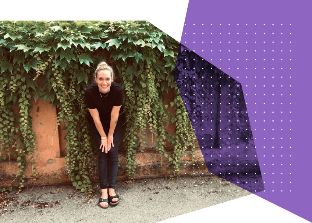
Sophie: I’m Sophie, a freelancing graphic designer and illustrator from Munich. Because I did not enjoy school, I dropped out when I was 18 to pursue a creative path. Luckily, straight away, I got into a technical secondary school for design in Munich.
Afterwards, a few designers I knew independently, advised me to attend a design college in the tiny German town of Schwäbisch Gmünd. I studied there for three and a half years, where I had learned valuable lessons and had useful, essential experiences.
However, the two lessons which shape my work the most, are the ones I learned when I was abroad. During my practical semester in Vienna, I discovered my love for details. Up to this day, it’s one of the things I heavily focus on in all of my projects.
In Zwolle, Netherlands, I experienced a critical moment when I asked one of my classmates about the backstory of his design, and he said: “It simply looks great.”
It made me think and so I established my motto: Never random.
Q: What does a communication designer do daily?
Sophie: My natural, creative mood begins when my workday ends, and my kids come home from school and kindergarten. In that time I know to always have a pen and paper in my handbag. Generally, my daily routine depends on the stage I’m at with a project.

You can divide it into four stages:
“Research”: I read a lot about the client and their specific industry, I also check out the competition to see what else is already there, what works, what doesn’t, and why. That’s when the concept, in terms of content, comes about.
“Creative work”: Now I start visualizing the content. Most of the time, I develop two different lines of the design. For example, 1. Variation: Light typo with an illustration in sober colors. 2. Variation: Bold typo without illustration, everything kept in black and white.
I discuss these two drafts with my client to find out which direction they want me to take further. This phase is exciting, both for me and the clients, because it’s their first interaction with my work.
“Development”: Once we’ve agreed on and defined design, I start expanding it on all the necessary materials. Most of the time, the elements must be conveyed onto magazines, books, CDs, booklets, business equipment (such as letterheads, business cards, stickers, posters, flyers), packaging, tags, websites, even cars.
“Final artwork”: Finally, everything gets checked out from both a textual and a creative viewpoint. Do the colors work with one another, is the spacing correct and the format excellent? When it’s all done, I send it to the printers to bring them to reality.
Q: You do graphic and illustration as well – which do you like most?
Sophie: Seeing that my clients are from incredibly different industries, I’ve been learning a lot along the way as each project has its challenges.
On the other hand, when I do illustrations, I usually have more freedom to play around. People approach me because of my style, so they just let me do my work without much interference. So, both have their advantages.
Q: Where do you get your inspiration?
Sophie: A professor at college once said to me: “Sophie, you don’t always have to invent something entirely new. Good design is an old one, but better.”
I keep my design book collection (ordered by color) right next to my desk. Before starting a new project, I look through a couple of them to get in the mood and trigger my creativity. One of my favorites is “Turning Pages — Editorial Design for Print Media.”
Q: What do you think sets you apart?
Sophie: I once worked on a magazine with an author who, clearly surprised, said: “You seem to read the texts.” Well, of course, I do, I need to know what my task is about. But many designers don’t. By reading absolutely everything, I have a better understanding about the entire project, and therefore, I can deliver better work.
One example: I can assign quotes to the right person 😉 Knowing what the text is about, helps me decide what needs to be visualized. I can develop a general visual image and, take my pick regarding the pictures.
A “fabulous photo” is not enough once you know the subject matter. Perhaps the motive doesn’t even come up and you wouldn’t even notice it if you didn’t read the text as well.
Q: How would you describe your portfolio?
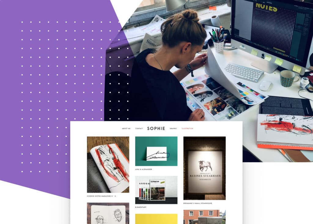
Sophie: I’ve created logos for the food truck “Herr Krause” and Erdmann’s small steak house, I’ve done the layout of magazines by Bayerischer Rundfunk, Kustermann and OutdoorInsider, designed the corporate identity of the music group Joely&Oliver, developed labels and packaging for spirits by Esterhazy, and illustrated Science Notes magazine and seek.
So, there’s a bit of everything in there. One thing, however, persists in all of the projects: my love and use of somber colors.
Q: How did you come across Noah, our WordPress theme?
Sophie: First, I tried some of the free versions on WordPress, and none of them looked the way I wanted.
I actually got so annoyed I almost decided that I don’t need a website after all. Then, I accidentally stumbled across Noah. It was love at first sight and my rescue.
I like for my work to speak for itself, without much explanation in written text. Noah leaves a lot of space for images, and shines my reduced designs so it fits perfectly.
I think what did it for me was the typo and the option of showing my portfolio mainly through images.
My sister says the website suits me as it looks just like the interior of my apartment. I believe she thinks of my website as my digital home. Just like an apartment, it reflects your personality.
For instance, in my case, there aren’t any decorative elements such as candles, angels, or hearts. I don’t like fiddly bits, I like it minimalistic and I love home design, in the form of furniture.
I have a huge shelf in my living room that consists of iron cubes which a friend of mine designed and built. It’s very special. I combined it with a fridge from the 80s that’s unplugged, so we can keep our red wine in there. I adore modern design in combination with retro elements.
Q: How do you engage with your audience?
Sophie: I don’t stress with that, so it’s a good thing I often get recommended. That is why my Instagram account is under way, but I plan to tend to it more once my current project is done.
But all things considered, I do not engage with my artistic audience very much. They say people are a lot quicker to click the poo emoji than they do expressing positive feedback. And knowing that, maybe it’s not such a bad thing that I keep my distance.
I know social media is incredibly important for business, but I enjoy real-life way too much – with actual people and honest feedback. I haven’t figured out how I want to use social channeles in the best possible way. Maybe that’s the retro element in my modern life.
Q: How would you describe your career until now?
Sophie: I’ve tried my hand at many different things: I’ve worked for various agencies in Munich and Vienna, and I was a lecturer at the design college in Munich.
However, just a few years ago, I discovered illustration. At the moment, I enjoy working as a freelancer – being independent is great.

From a designer’s point of view, Copenhagen would interest me very much. But I love my hometown, Munich, and I have a fantastic life with my family and friends here. Right now, I wouldn’t want to change anything.
In the end, nothing can beat the great feeling of doing what you love, and this brings you closer to the best version of yourself. Sophie is an example in that sense, but as you already noticed, there’s a cost she’s paying for having this kind of freedom.
But is there any other way to entirely fulfill your creative potential apart from taking bold risks?
Start the conversation