Media Card Block
Often a featured message is more readily remembered if complemented by a matching visual. The Media Card block helps you manage such areas with ease.
Use it to display media objects like images, alongside short pieces of content. It could be anything from a portrait image accompanying a summary of your About page; a visual promo from your project and some lines about it; or a testimonial from a client along with its photo to build trust. Choose whatever fits your goals and interests.
Add a Media Card Block
To add a Media Card block to your content click the ⊕ inserter button inside the editor and search for “Media Card”. Alternatively, you can just type /media and press enter.

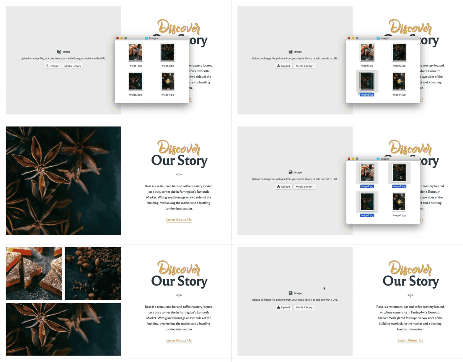
Add Media Images
To add images to the block, use the option provided to upload a file from your computer or select from your existing Media Library. You can add up to four images and the layout will adapt accordingly and still look awesome.

Add Content
Use the content area to insert blocks like Headings, Paragraphs, Buttons, Quotes or Separators. To make sure that it’s sizing nicely, the media area will adjust its height according to the amount of content.
Customize the Design
Both in the Toolbar above the selected block and in the Inspector sidebar, you can customize the design and behavior of the Media Card blocks.
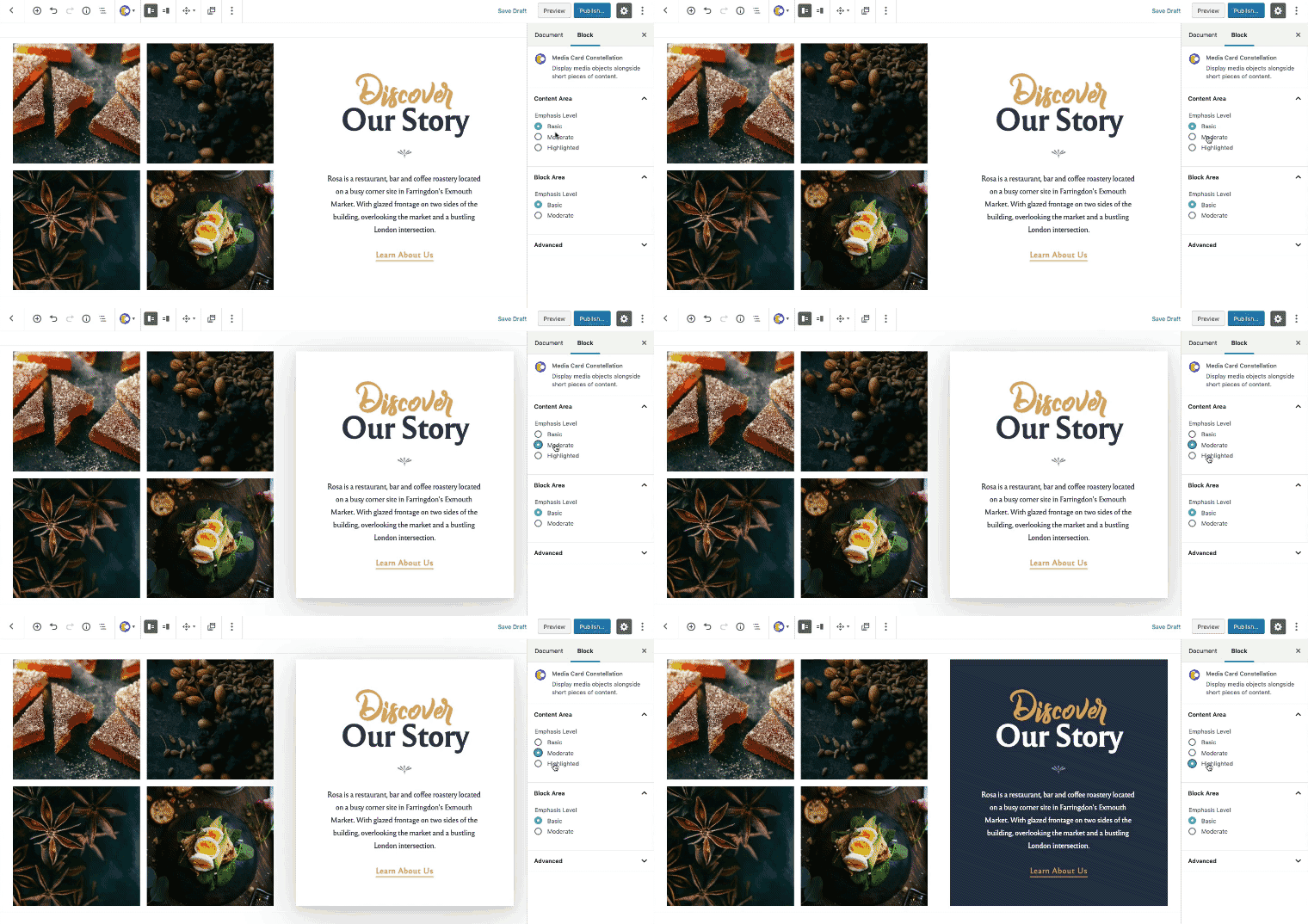
Considering that you could have multiple Media Card blocks on a page and if you want to change their appearance, you can use the Emphasis Levels from the right sidebar.

Organized in ascending order, they are available separately for the Content area and for the whole Block area, as follows:
- Basic: Default style, balanced emphasis on both media and content.
- Moderated: Increased emphasis of content by placing it inside a shadowed box
- Highlighted: Highlight the content by entirely switching the color scheme (eg. from light to dark).