Cards Collection Block
The Cards Collection block is designed to help you display related pieces of information in a coherent side-by-side layout. Due to its easy to use customization system, you can personalize it to fit a wide range of needs, from displaying your team members, to showcasing media appearances, listing your services, and much more.
Since this block can cover a wide variety of needs, you can also find it mentioned as Features, Services, Logos, but it’s fundamentally the same concept. In the steps below, you are going to learn how to use the Cards Collection block on your pages or blog posts and browse a few use cases that can act as an inspiration.
Add the Cards Collection Block
To add a Cards Collection block, all you have to do is open a page or blog post, click the ⊕ inserter button inside the WordPress editor and search for “cards collection.” Alternatively, you can just type /cards and press enter.

Add Content
The Cards Collection block can have between two and four cards in each collection.
Adding and removing cards
- To add a new card, click the “⨁” button from the right side.
- To remove a card, you need to select it, and from the drop-down options, click “Remove Block.” As an alternative, you can also hit Delete/Backspace on your keyboard.
Keep in mind that the cards are visible side-by-side only in the desktop and tablet versions. On mobile, they will display one after the other.
Using the Cards Collection elements
Each Cards Collection block has eight different elements that you can add or remove according to your needs. You can find them explained below.
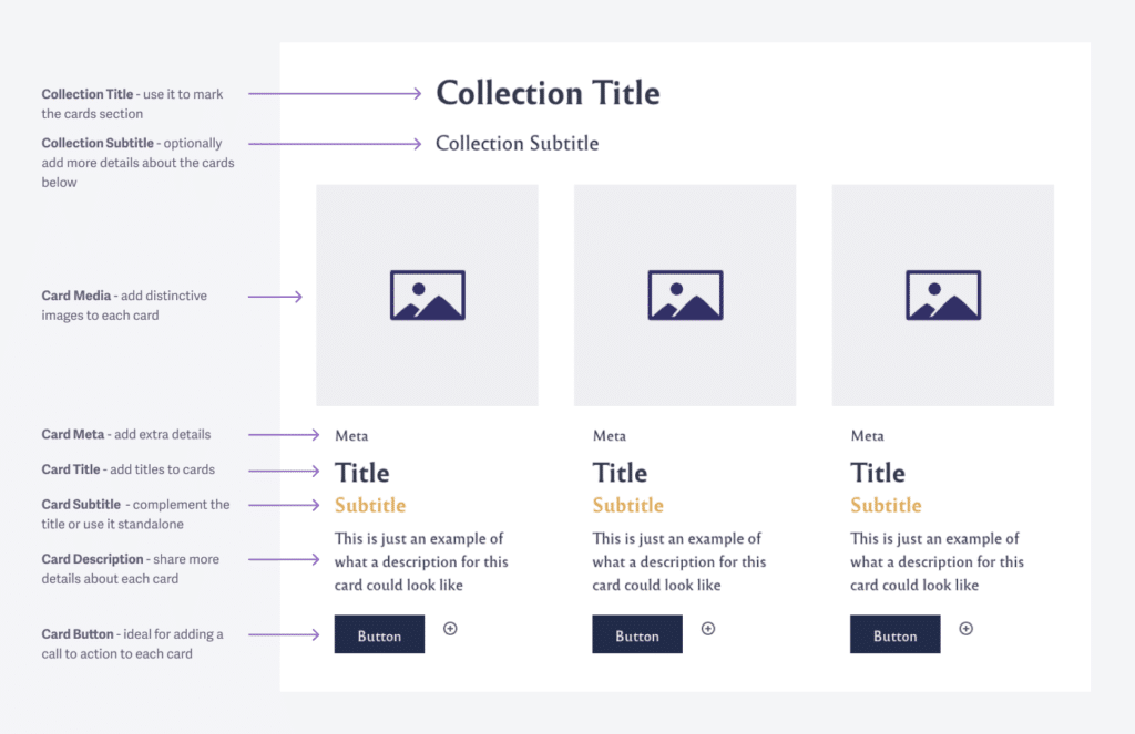
Choosing which elements to show up:
- Select the Cards Collection block.
- Enable or disable elements from the Cards Manager in the right panel.
Now, let’s take them one by one and go through what they do and how you can use them.
Collection Title
This piece of information sits at the top of each Card Collection block you add to your website. It acts as the title for the entire cards section.
The title has two heading levels that you can assign to it, according to your on-page SEO needs: levels 2 and 3. You can switch between them with a simple click in the Title Level option.
The Collection Title heading level influences the heading level for each Card Title. If you select H2 for the Collection Title, then each Card Title will take the next available heading level, in this case, H3.
Collection Subtitle
As the name implies, you can use this area to add a short subtitle or a detailed description to help readers understand more about that section of the page.
Card Media
This area is perfect if you want to use images to showcase something relevant to your audience. You can use it to display team members, icons or logos, media appearances, sponsors, and everything else where images fit best.
To add an image, all you have to do is:
- Click the image placeholder.
- Select the image from the Media Library or upload a new one.
Card Title and Description
Use these sections in a way that complement each other, and organize the information hierarchal.
Card Meta and Subtitle
These two elements are optional and recommended when you need them to share extra details for each card that can’t fit anywhere else.
Card Button
This element can add a call to action to each card. Since the button can host any internal or external link, it’s up to your imagination and specific needs to decide what’s best.
The buttons come with three styles that you can easily change to fit all kinds of purposes. To change the button style you have to:
- Click the desired button.
- Go on the panel on the right side and choose the desired style.
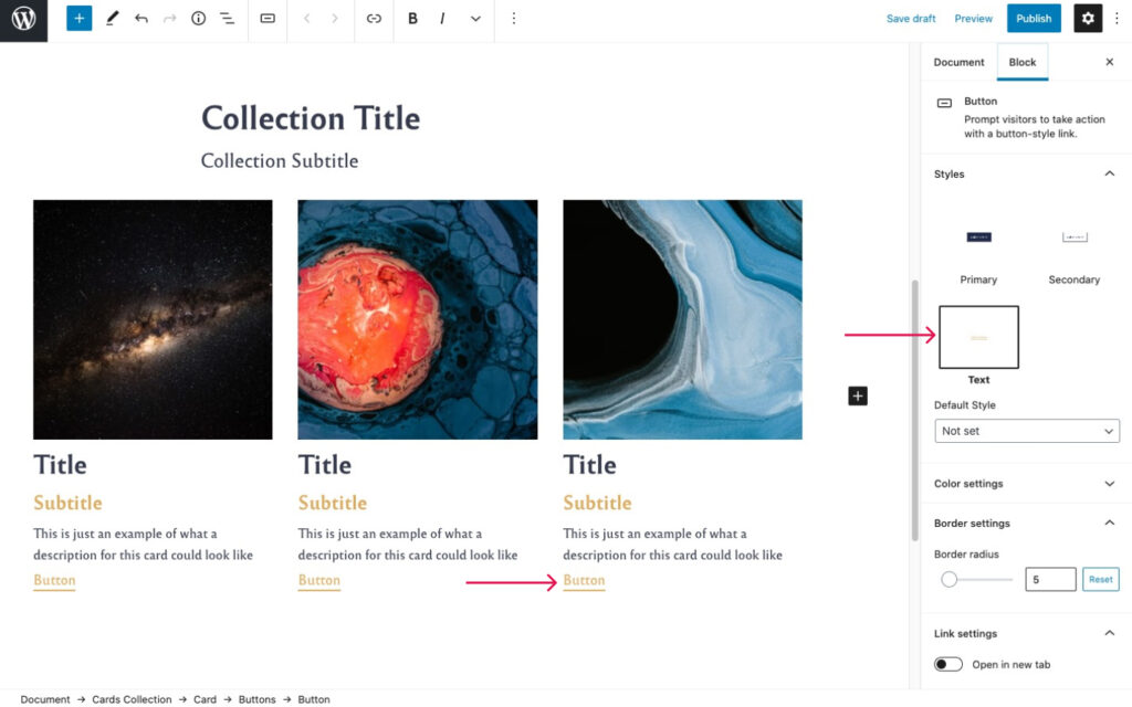
Besides these options, you can also:
- Manually change the button radius – how rounded you want the button corners.
- Choose if the button link will open in a new tab or not.
Customize the design
All text elements from each card (titles, subtitles, description, etc.) are customizable by using the Toolbar that shows up once you select the text. The options available are bold, italic, link, highlight, strikethrough, and may others.
Cards Media Area
This option, found in the right panel, lets you choose between different settings for your Media (images) elements:
- Stretch to fill the container – all images will fill the container and have equal size, no matter their original aspect ratio
- Shrink to fit (no crop) – shows the images in their default aspect ration (landscape, portrait).
- Image container height – you can change the vertical height for your image container according to your needs.
Content Emphasis Levels
Use the Emphasis Levels options to draw more attention to this section. You can pick from three intensities: Basic, Moderate, and Highlight. There are two areas where you can apply them:
- Content Area – applies the emphasis level only to the cards in each collection.
- Block Area – applies the emphasis level to the entire Cards Collection block.
By combining these two options, you can get unique designs that can make this section stand out on your website.
Content alignment
With a single push of a button, you can choose how the cards collection elements (e.g., title, subtitle, description) will be aligned: left, center, or right.
Examples of how to use the Cards Collection block
Show off your customers or media appearances
To achieve this, all you have to do is:
- Enable only the Collection Title and Media elements.
- Use the Moderate emphasis level for the Block Area.
- In the Image Resizing settings area, check the “Shrink to fit (no crop)” option.

Feature your biggest advantages
By displaying only the Media, Title, and Description elements, you can list the main benefits your customers will get if they choose you.
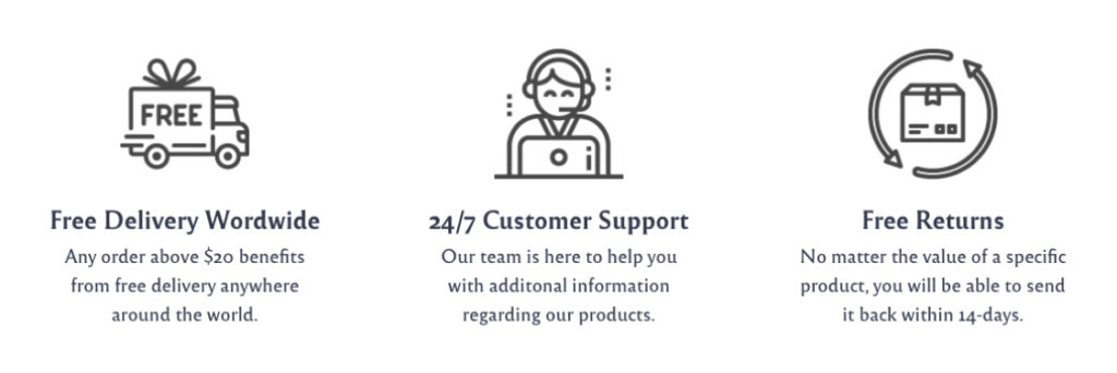
Let people know who’s on your team
Show off your team members and let everyone know that there are real, passionate people behind it all. With the help of the emphasis levels, you can make each team member stand out.
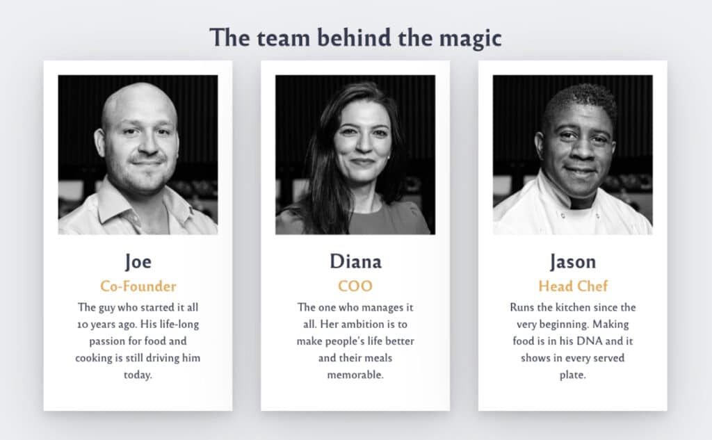
List your primary services, products, and other offerings
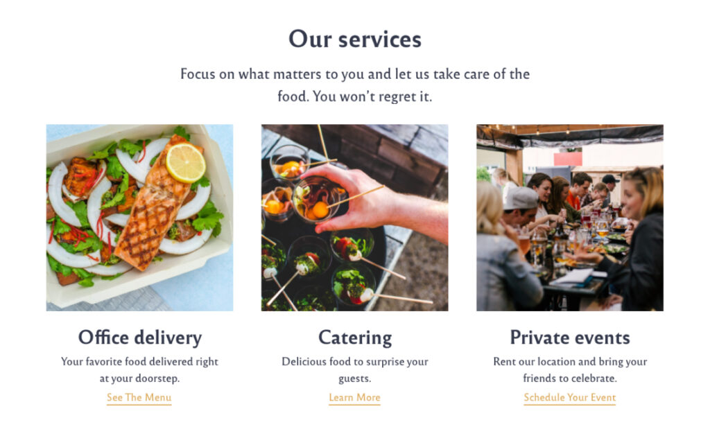
Another great way to use the Cards Collection block is for featuring your service packages, most popular products, eBooks you want people to download, and more. By using seven of the eight available card elements, you can get something like in the example below.
These are just a few ways you can customize and use the Cards Collection block. The rest depends on your specific needs and imagination.