
Microcopy is a piece of this puzzle. Often attributed to UX designers, this new area of interest got traction and captured other professions too. For instance, today, most people working on the web talk and write about microcopy as a standard playground owned by designers, copywriters, and marketers. It makes sense since the complementary abilities bring the best on the table, right?
Before digging into how to write it in alignment with your brand and your business goals, I would like to make sure we are on the same wavelength.
As always, I made my fair share of research while putting together this article. Once again, the world-wide-web walked me through a wide range of feelings. From enthusiasm and hope given by certain publications which cover the topic thoughtfully to frustration and sadness regarding the clickable headlines that are not backed with valuable information.
I guess this will be a de facto, and I should get used to it. However, this does not mean that I will embrace this approach. On the contrary, I will push back and write from what I’ve learned by having a direct experience. Not recipes. Not 10-steps-to-whatever. Not the ultimate guide.
In case you want to check a specific section, use the links below:
- Defining the notion of microcopy
- Where does microcopy matter (and why)
- Four elements that impact the microcopy
Defining the notion of microcopy
As a copywriter and storyteller myself, I have often been surprised about how people don’t pay attention to those tiny tidbits of the content found on their websites. They do invest a lot in eye-candy photographs, emerging transitions, and animations, but skip the little gestures that can reveal their real personality and professionalism.
Before kicking-off why you should pay more attention to the microcopy of your site, let me offer you a definition from Adobe. From what I’ve found, it’s the most explicit and straightforward:
These short sentences tell a user what to do, address user concerns, provide context to a situation, and help tell the greater story about your brand, product, and the way you do business. (…)
Microcopy is everywhere — from the words that comprise a call to action to the disclaimers that assure users that their email address won’t be shared or stored. While this may sound like the responsibility of marketers and content managers, these works mark a vital part of UX that cannot be underestimated.
I genuinely believe in the power of analogies, so imagine the GPS of your car. Its central role is to guide you through to make sure you arrive at the destination. Not anyhow, but on the fastest, and hopefully, the safest route. You rely on its instructions because the software knows best where you should go.
Once you know the itinerary well, because it’s a frequent area that you’ve been exploring for a while now, you don’t even use it. It makes no sense because you know what you need to do, which streets to avoid, where’s the police, when it is a traffic jam, and so on.
The same applies to microcopy on your website. Returning visitors who are in love with your brand, your products and services might know how to navigate through the information you are providing. But how about new people or people who are not accustomed to who you are and what you offer? They, too, need some instruction, some guidance to help them explore wisely. The microcopy is its GPS.
You can use it to augment their good emotions and help them achieve what they want or, on the contrary, you can mislead and confuse them. Read further to understand which are the most common places where microcopy can make it or break it.
Where does microcopy matter (and why)
There are dozens of spots on your site where you display microcopy. Usually, when you create your site, you treat these areas poorly. If you work with a copywriter who knows his stuff, he should highlight the importance of them and come with solutions.
Let’s take it one by one and notice how microcopy affects the experience, and what you can do to make it better. Just for the sake of transparency and clarity, I will exemplify everything on our site — pixelgrade.com.
It’s not only the place I know inside-out, but it’s also a way of showing you that we have the skin in the game. We don’t talk theories, and we neither play around with big words. What you see is what you get.
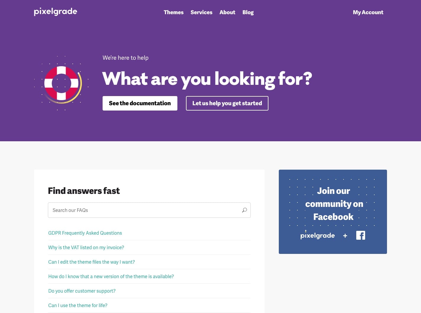
#1 — Themes Archive Page
We redesigned this page almost a year ago because we had a specific need: to help visitors quickly skim through our portfolio of products and choose the right one for their goals. We started the shop by having only a cluster of blogging WordPress themes, but once we brought back all our items from other marketplaces, we needed an improved way of searching.
We started by reinforcing a part of our unique selling proposition “Choose a simple WordPress theme” — because this is what we are offering, and it asks a specific question “What’s the purpose of your site?” — because you need to have a goal when you create a www.
On top of that, we even took a step further and offered an example for the search bar that prompts visitors to try — Promote a local business. This way, we help them with a clue about what could be the destination of a site. However, you can also type different intents, such as:
- Write a personal blog
- Showcase my portfolio work
- Display my photographs
- Sell products and services
- Create an online magazine
#2 — 404 Error Page
We’re a small gang of people at Pixelgrade (only eight creative souls), and there’s no surprise that we often think of Vlad’s and George’s dogs as part of our team. They are listed on our About page, next to the squad, they appear on the visuals we use on our blogs from time to time, and they are also in the spotlight on the 404 error page.
This specific page comes with irritations and sensitivities de facto. In the end, it tells you that you did not get what you wanted, that something is wrong, that there’s an error of some kind. However, this does not imply that you cannot tam the expectations and, therefore, the behavior.
We did that following our tone-of-voice and general attitude. We fine-tuned the microcopy to be funny, witty, and contextual for that specific scenario. Arlo and Paco sniff around and encourage you to do the same and browse our themes to find out the one that fits you.
This way, not only did we reveal a bit of our personality in front of the visitors, but we also brought a smile on their faces. You got to love this Yin and Yang of Pixelgrade, right?
You can do a similar thing on your site. You don’t need to buy cockapoo dogs from England (yap, they deserve to be called with Sir) to show a human touch on your 404 error page. You can express your style by adapting the microcopy to your specific universe.
For instance, if you are part of a young architecture studio, this page can show some good humor by writing a message that divulges your rebel spirit. Here’s an example:
Ooops, mate! The digital building you are looking after is non-existent. But you know what? We can build a real one for you only. And yes, it will stay still and sexy.
As long as you keep your message in tune with the way you usually communicate across the site, you are safe. Make sure you keep this coherence up and kicking, and visitors will feel that they are in good company.
As in real life, you have your way of saying Hi when you enter the office and meet your teammates, and you do it the same every day, right?
#3 — Thank You Page
This page can be put in good use within a wide range of situations. We love such occasions as showing gratitude towards our customers because this is another value that we have at Pixelgrade. Each endeavor that enables us to manifest it, makes us happy. We do it because it’s ingrained in our inner-why, not because we want to amplify a marketing tactic.
You can have a thank you page after someone has bought something from you, but also after a visitor made a specific action on your site. For instance, he pushed the subscribe button to your newsletter.
Whatever your situation, the microcopy should be clear in terms of intention — how do you want to transmit your appreciation, and lined up with your tone-of-voice — if you are a business where joking is essential, don’t be afraid to show it. It’s not the only area where you will reveal it, so there’s no need to hold back. On the contrary.
At Pixelgrade, we wanted to thank customers for trusting our WordPress themes and spending their money on our work. Our way of showing this gratitude is by writing down the name of the client — we want to acknowledge that everyone is essential — and give a few tips about some questions that might pop-up, such as ‘where is the invoice?’, ‘how can I access customer support?’, etc.
The simple fact that we prevent some real concerns and then address them brings value and consolidates the trust.
If I was to bring the GPS analogy I mentioned earlier, don’t you feel good when you are announced that some streets are blocked or under construction? It’s a nice gesture of care that brings peace of mind and a little bit of joy.
Well, the same is valid and accurate when it comes to the thank you pages. It’s yet another chance to treat your visitors with kindness and clarity through well-written microcopy.
#4 — Customer Support Page
Customer support weighs quite a lot these days. Not just because through assistance you can improve the relationships with your customers and transform them into ambassadors, but because it’s your chance to endorse who you are as a person, business, NGO, you-name-it.
There’s no debate that we’ve always put customer support at the core of our activity at Pixelgrade. This means that we worked on both sides of the spectrum.
On the one hand, we’ve been developing our products in such a way that you can get along on your own, with the right amount of freedom and constraints. On the other hand, we’ve been behaving as partners, comrades; and not as detached agents who don’t care about people’s feelings and treat each customer as just a customer support ticket.
Therefore, we created a dedicated customer support page where we make sure everything it’s obvious in terms of microcopy and the expected outcome.
First of all, we take the worry that you are alone out of the table and we let you know that our job is to help you, which is what we are going to do. Second of all, we offer you alternatives. You can either check our documentation and find the answer by yourself or get in touch with us directly to receive our in-depth answers.
No matter what your choice is, you will get answers to your concerns — even if the answer is not the one you might like, i.e. we need to test it on our side too. Since we’re selling software, some bugs and issues are unavoidable.
On top of that, we are upfront and vigilant and list a set of FAQs right from the start. In case you have one of those, you get the details you need in the blink of an eye.
Through this type of microcopy, we motivate our customers to take the right step, according to their journey. Whatever it is, we make it crystal clear what he/she needs to do next. No guessing around, no hidden email addresses, no annoying chats. We keep it real.
#5 — Sign Up Page
As the title is already explicit, I will skip stating the obvious. Thus, this does not mean that you cannot take advantage and cue visitors into functionality humanly and authentically. In this specific area, microcopy is even more crucial because it’s one of the first steps toward building a relationship.
Most of your visitors don’t land on this page from the beginning and don’t have a desire to leave their email address. Especially in a world where the focus on privacy is increasing, and the awareness about how big companies play around with our data is getting higher.
Most probably, they read your about page to understand who’s behind the scene, checking your blog articles to see what and how you write about stuff. Maybe they even went to your social media channels to have a feeling about what kind of content you are providing.
Therefore, when they arrive on a sign-up page, they already have bits and pieces of information along a certain feeling. It might have created a good impression determining them to proceed with filling the form, or the opposite, pushing them to drop the action.
At Pixelgrade, this page carries on the approach we’re having for the entire site. It clearly states what you get by signing up, plus it offers you direct links to relevant information (terms and conditions and our privacy policy). We bring a bit of our style across the microcopy by keeping the joyful tone-of-voice. Moreover, we try to dilute any side of worry or concern to guide our visitors to take the next action.
Four elements that impact the microcopy
I genuinely resonated with someone who defined microcopy as a voice leading and aiding users in their journey. I think it’s one of the most accurate descriptions of what’s the role of it and why it is so important to find the right balance between tone and rhythm. Too much microcopy can create harmful consequences just as much as too little can lead to confusion.
My two cents is that there are a few key elements that you need to take into consideration about microcopy to make it clear, smart, and meaningful. They are universal and legitimate for every type of site you have or plan to create, regardless if it’s a blog, a photography portfolio, a restaurant, or any kind of destination.
Allow me to present the core of each and every one of them to help you adjust them to your universe without hassle.
#1 — Communication
Create microcopy in alignment with the way you communicate in general.
To continue with our example at Pixelgrade, it would feel strange, even hilarious, to write the microcopy of the thank you page, in a very formal tone. We’re not official, we’re not corporate, nor we are 50+ folks around here. Instead, we are a young team of passionate and hardworking fellows who sign their email with “Stay awesome.”
It’s not that it’s terrible to be academic and posh in how you craft the microcopy, just make sure you maintain the style from the get-go.
Tip: By using the same tone-of-voice, language, even rhythm, you create consistency and highlight an attitude that’s distinctive.
#2 — Context
As with the GPS, the context when you are using it matters quite a lot. If you are super familiar with the streets and how to get to the destination, well, it makes no sense to use it. On the contrary, if you are new in the hood and need to be on time for an important meeting, it’s smart to turn it on.
The same happens with microcopy. If it’s clear for our customers how to take a specific action, we make sure we don’t stay in their way. Imagine how it would be for them to be asked to sign-up in a way that creates confusion or alters the trust.
Tip: The place where you add the microcopy influences how you write it, so make sure you consider its constraints.
#3 — Clarity
No matter how creative you are as a person or company (advertising agencies included), your microcopy needs to be clear and truthful. Avoid being creative and stepping out the boundaries just to play around with words.
For instance, on our archive of themes, we auto-filled the search bar with real intentions that our customers might have when they want to build a site. We’re not fooling around by playing smart, and we genuinely want to help them get the right product for their needs.
Tip: Action matters most and to take the right one people need to understand what implies and how to do it.
#4 — Customer
Even though it’s your microcopy and it needs to be evocative (for your particular brand), don’t forget that, in the end, it should be customer-oriented.
When we created the thank you page, not only did we aim to express some humanity and kindness, but we also wanted to show our customers that they are safe next to us. So, the first concerns that kick-off in their minds are already addressed, for instance: where to find the invoice, how to log in, how to get in touch with us.
Tip: Its purpose is to help them take a particular action, to move to a specific area, to address their situation.
Microcopy has a huge potential in shaping a memorable digital experience for your visitors. It’s up to you to ensure that you’ll use it to amplify good intentions, directed to the right destinations, and show care and attention to their needs.
As anything out there, it can be used to accomplish good or bad, but I hope that this article helps you move the needle to reinforces good behaviors. In the end, we want a better web, where the relationships we are nurturing are valuable and thoughtful, right?
Take a closer look at your current site to determine how you can guide your visitors. Do they have the right address noted on their GPS? And if they do, what’s the safest and most pleasant route for them to take?

Start the conversation