The web is full of so-called education articles. They are often labeled as case-studies, blueprints that help you follow some steps to achieve a particular goal. My opinion is that most of them lack meaning. They are empty in terms of value.
While doing my research for designing a website footer, I read thousands of words and remain with mostly nothing. Bold messages that shout out loud, full of emptiness. I thought that it must be a better way, a better alternative, one that fits our company’s culture.
We have three core values that stay at the forefront of everything we do at Pixelgrade. Excellence, gratitude, and care. We endorse them in each activity, no matter how big or small. They also drive the way we make decisions.
For this article, in particular, I want to help you save time, energy, and mental space but skipping the abundance of useless information that I found and teach you some ground rules on how to design your website footer.
What follows is not a mash-up of data tailored to fit search engine’s ranking needs nor any other algorithms. It’s our hands-on experience on how we actually did this at Pixelgrade, and I promise to walk you through the entire process.
For the sake of transparency and clarity, I am not going to talk too much about design as aesthetics; on the contrary, I dare to move the needle and take the conversation into a strategy and planning area first. Frequently, the designer-as-decorator out there miss this part and focus way too much on pretty pixels and external validation.
In case you want to read only a specific passage, here is the quick navigation:
- Framing the concept of the website Footer
- Phase #1 — Planning the Footer
- Phase #2 — Shaping the Footer
Let’s dive in!
Framing the concept of the website Footer
I will kick-off with a shortlist of comments to give my input on some frequently asked questions and to make sure we are on the same wavelength on this matter. Here I go.
What is a website footer, and what’s its role?
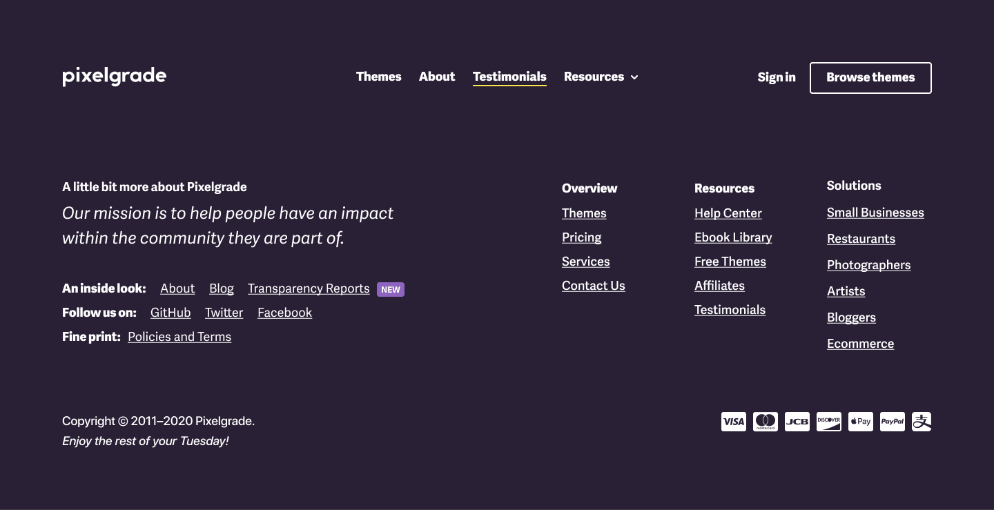
The website footer area is a section placed at the bottom of every page on a website. It provides users an easy way to access specific areas of a site, convey a sense of trust in your company service or give visitors a second chance to take the desired action (e.g., view a product demo or sign up for your mailing list). The footer should accomplish specific goals, it’s not placed there out of the blue.
Change the narrative of designing your website and draft the footer at the same time you plan the header.
Why do you need a footer on your website?
The hierarchical structure of a website can hinder the path to other information about your company, be it internal pages or external links to your social profiles. In addition to the header area that could handle only a small amount of data, the footer gives you enough room to lay down everything you need, while still keeping the advantage of being present on every page.
Besides, the footer is often the place where visitors look first to find links that leads them to important information, such as Contact, FAQ, or Privacy. Think about the “Medical Kit” from a rented car — you know it should be in the rear trunk, right?
When is a website footer poorly made?
Footers are by-design at the end of a website, and many people falsely believe that not so many visitors reach them. Designers are usually focusing their effort and energy on the first part of the page and work to get it as good as possible (remember “above the fold” concept that’s still haunting us?).
Consequently, little effort and motivation are remaining on the table when the designers land at the end of the page. What happens is that they start making rash decisions that usually spoil their good overall intentions.
How could a website footer be better built?
By changing the narrative of designing your website and draft the footer at the same time you plan the header. It might sound obvious that way; however, the reality reveals that few people do that.
Because those two elements are strictly related to the information architecture that you’re establishing throughout your website, by grasping them at once, you will draw better decisions in organizing your content and make it more accessible to your visitors.
Now that we both have a very much alike idea on what is a good footer, next I will present you some techniques that I used throughout the building process, techniques that you can apply in your own way to your own process.
Phase #1 — Planning the Footer
Before we start making any wireframes or specific visual decisions and get stuck on unnecessary details, I suggest to take a step back and start the creative process with a solid planning phase. It’s not a playful time, but I think you will enjoy it stronger because it’s more of a design-thinking approach to make sure you came out with the right decision for this project.
For Pixelgrade.com, we decided to change the footer once we noticed that the entire site went on a different path, and this area remained behind. To be more precise, we observed that:
- There were new sections on the site that were not accessible for the readers (such as the free themes or the affiliates pages).
- There were sections on the actual footer that was no longer relevant and suitable for our marketing and communication strategy (the newsletter form, for instance).
So, what better way to show you how to plan your footer than a pilgrimage through our process? Read further to find out more what that means.
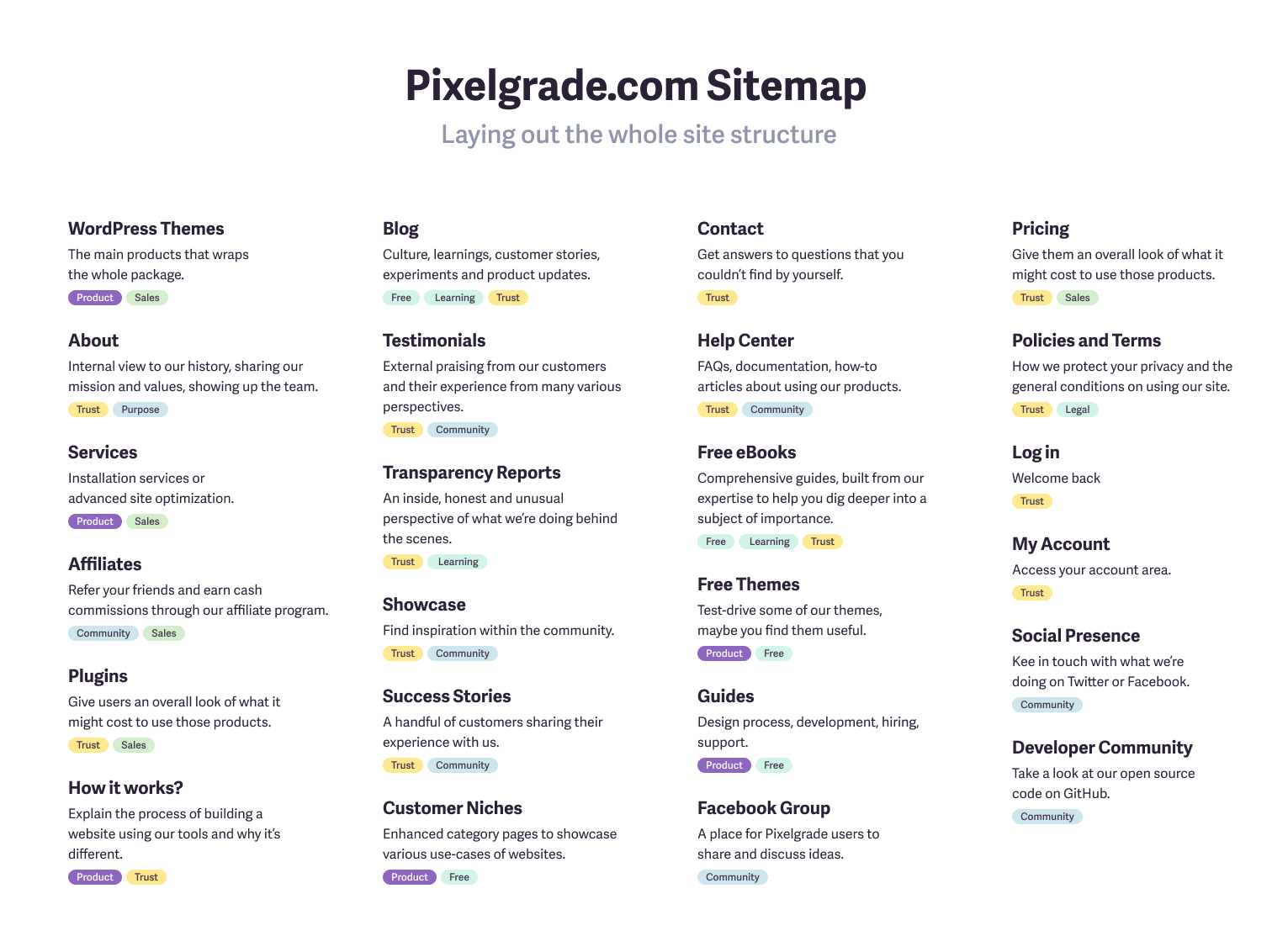
1. Create a Sitemap for your website
Start with a brainstorming session with your team to lay out the whole site structure and arrange each item in a series of columns so you can have a good overview. It’s important to get different perspectives and let the mind wander — there are always blind spots that you do not see by yourself. Gather different input from people who cover various business needs within your team and lay them on the table.
Tip: While most of the items from this list will have a direct correlation to a page from your site, it’s not necessary nor possible to do that for each of them. Instead, try to wrap them under a higher scope and place it under a label (e.g., Social Presence will include all the links relevant to your business).
In the following screenshot, I captured the new ideas that popped-up, such as writing down our mission and links to our Transparency Reports. Both are core for what we do at Pixelgrade and how we like to run this company. We wanted them to be on the spotlight not because they sound smart, but because they are key factors from our DNA.
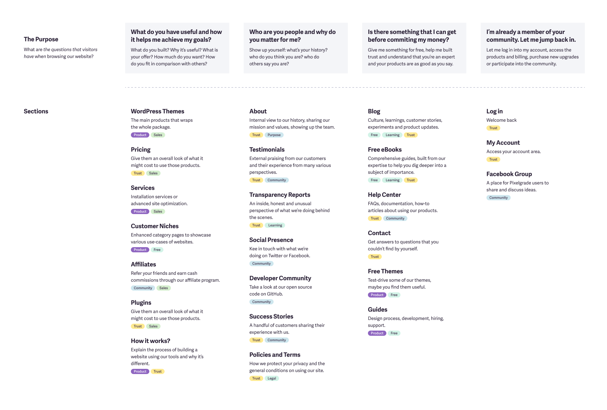
2. Organize the list vertically by a purpose
Now it’s the time to take an in-depth look at your website and put on your user shoes. It’s something you need to do regularly, otherwise, you will get trapped in all kinds of biases, which will guide you towards making poor decisions.
So, ask yourself: “What are the questions that visitors have when browsing our website?” Considering your goal, think of both broad and specific questions. Here are a few:
- What do you have useful to me? A: Your product or service
- Who are your people? A: About page or a testimonials
- How can I reach you? A: Contact page
- Why do you do what you do? A: About page or a manifesto
- How long have you been in business? A: About page or a dedicate page with a history timeline
- Is there something that I can get before committing my money? A: Free resources
You can get a feeling of how we compiled the answers to these questions in the screenshot below:
This could be a moment where you realize that your website lacks more than a footer. It might have some trouble in explaining your offer, you might notice some misalignments, or there is information available that it doesn’t make sense to be listed anymore.
Don’t worry too much, it’s better to find such gaps in due time rather than keeping it hidden in all sorts of nooks and crannies of your website.
Keep reading, and you will have a chance to take the first step in cleaning up your space and get a more explicit structure of where you want to go next.
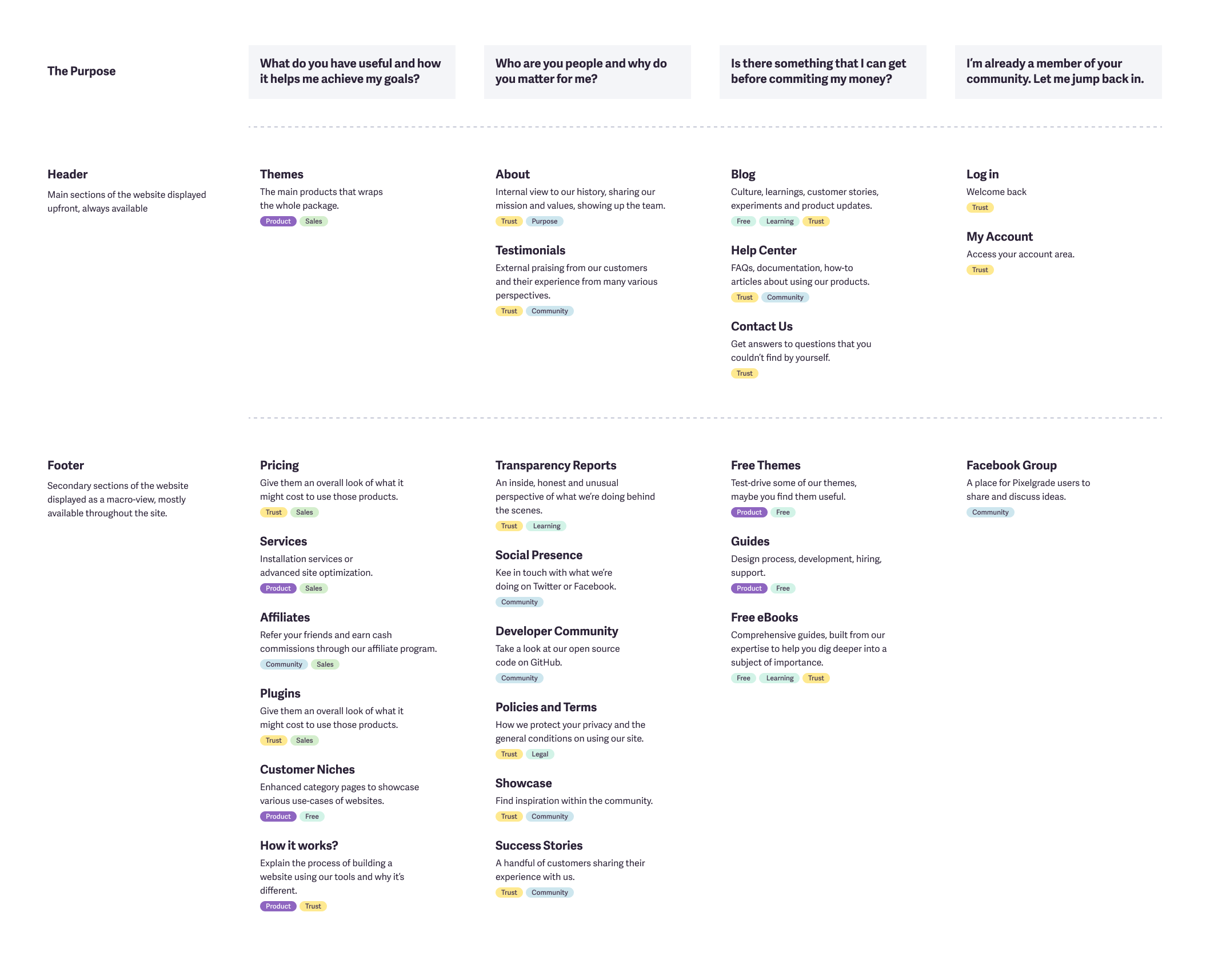
3. Organize the list horizontally by Header and Footer
Now you have a chance to communicate your intent and put the most important pages at the top of your website (header), and the next at the bottom (footer). To do that, keep the vertical lists in place and reorder the items to prioritize between only two levels of significance:
- Header: the primary level of important act as a place for your global navigation; you can also include here submenus.
- Footer: the second level contains the rest of the items that are of interest to your user, but might not be present in other areas.
Take a look at the screenshot to have a better understanding of how we manage it:
4. Decide what you will let go
As you already are well aware that not everything should be packed in the header, the same principle applies to the footer, which is the subsequent level of organizing your content.
If you notice that there are too many links that you need to add to the footer, I would suggest to prioritize them and limit their number. Even if you think that adding all those links you will make the site accessible for people, it will cripple their attention, and they might not even observe the essential anchors that you want them to see.
As a rule of thumb, the first level of header navigation should have a maximum of 7 items, and while the footer space could accommodate more items, I would suggest not to exceed three times the number of items placed in the header, up to 21 items.
Introduce a new horizontal section called “Others” to drop all the remaining items that you will decide whether to link them through internal pages or get rid of them altogether.
Phase #2 — Shaping the Footer
Now that we have a well thought out plan in place, we can dive into the shaping of the visual design.
1. A smart layout solution
The first question that arises is “How do I lay out all the elements that I have?” Of course, it’s a legit concern, whether if you are a designer or not. I will show you the groundwork that I ended up using and put together all the elements and how it could make perfect sense for your site too.
While there might be an abundance of elements that you need to put in the footer, I suggest a simple set of constraints to limit your options and make things easier to figure it out.
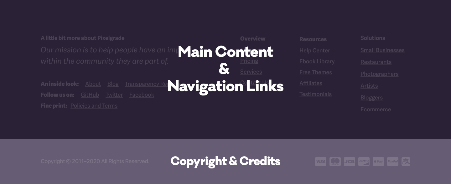
It starts as a set of two broad sections:
- Main Content and Navigation Links: The first row is for the main content and the navigation links.
- Copyright and Credits: The second row is for the copyright text and entities that you need to add credits for.
Then the first row is split into two uneven columns as follows:
- Central information: The first column contains specific details about your project and something that users should pay more attention to. It could be your mission, a quote that inspires you, or a newsletter form.
- Utility links: The second column is a division of sub-columns and its purpose is for the utility links that descend from your header structure to expose lower-level subcategories. It supports up to three sub-columns, but it works beautifully if it has only one. The less, the better.
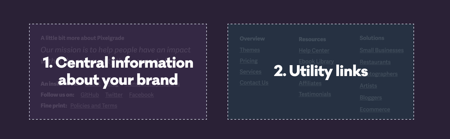
For Pixelgrade.com, in the left column, we chose to highlight our mission and, to build more trust, we added a link to our “Transparency Reports” category from the blog.
2. The power of constraints
This layout creates a hierarchical distribution of information and leads the user to scan and navigate the entire area easily. It also helps you prioritize (again) the information and raise the visibility of what you’re trying to convey first.
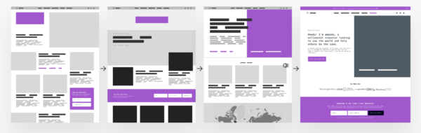
It’s a flexible system that works beautifully for most of the situations, from simple personal blogs to complicated business sites. Based on this structure and the content that you need to put there, the footer can take a lot of tension and adapt to your needs. See below its versatility on adapting to various level of content and intentions:
3. Make it memorable
We believe in adding a pinch of “human touch” whenever it would make sense to do the same in a real-life situation. In the end, why should all the rules in the real world be different when it comes to applying them on the web? In the end, we address human beings on both sides.
A way that we addressed this authenticity is by welcoming users with “Good morning, {name}!” through their “My Account” section. It may not mean much, but we would have done the same if we would have met them in the real world.
Reaching the end of a long (and exhausting) page, paying attention to a footer, and trying to figure out the entire website structure is a small grateful moment that we feel it should be celebrated. We choose to do that by wishing “Enjoy the rest of your {day}!” but we might change it to a message that better reflects our values.
When I’m thinking about #gratitude the message could go like “Thanks for taking the time to reach that far!” or referring to #caring with the following message “We know it was hard to arrive here. Back to top easy.” There are a bunch of ways to let your personality shine and initiate a more genuine liaison with your visitors.
If you decide to add a similar flavor, remember to keep it short and in the same tone as the rest of the website. Even if just a few people notice it, their experience will be memorable.
I hope this article brings you valuable insights that you will consider putting in practice on your website or the ones you are creating for different people out there. I tried to make all the information swallowable but also friendly and meaningful.

As I mentioned at the beginning, we do practice what we preach across the board. To help our customers start on the right foot and give them a head start, we created a similar footer setup within all our LT WordPress themes.
As with many other decisions that we’ve been taking throughout our digital products, I assume that you already know you are in good hands with us. You just need to bring your content, and we will place it within a coherent and beautiful layout. Make it shine!


Start the conversation