Using the Color Signal
We are all psychologically affected by colors, and they hold power to influence our feelings and behaviors. Therefore, colors can be enough to make a design feel distinctive and make it stand out.
On a website, it’s a real challenge to use the right colors and shades for each element. Due to the number of elements stacked together and the requirement to always provide optimal contrast between them, the complexity involved in setting up the colors usually requires a professional designer to get it right.
Have no worries. We have built a color system that allows you to easily retrieve and apply color across your website in a way that automatically ensures legibility standards and aesthetically pleasing results.
Meet the Color Signal
Color Signal is a new way to intentionally use color to support the purpose of your content. Unlike the usual color pickers you’re used to, the Color Signal provides you with a structured way to signal attention to important information on your website.
The goal of this tool is to lower the cognitive effort in using colors while achieving professional results without being a professional designer. You will get to focus on the big picture, experiment with the best way to present your ideas, and let the system figure out the technicalities on how to get the right shades of color and maintain the proper contrast. It should be a fun and safe experience!
How does the Color Signal work?
Instead of customizing each element’s color (e.g., button, headline, background, etc.), you will simply select one of the color signal levels. Color will automatically apply to all of your elements.
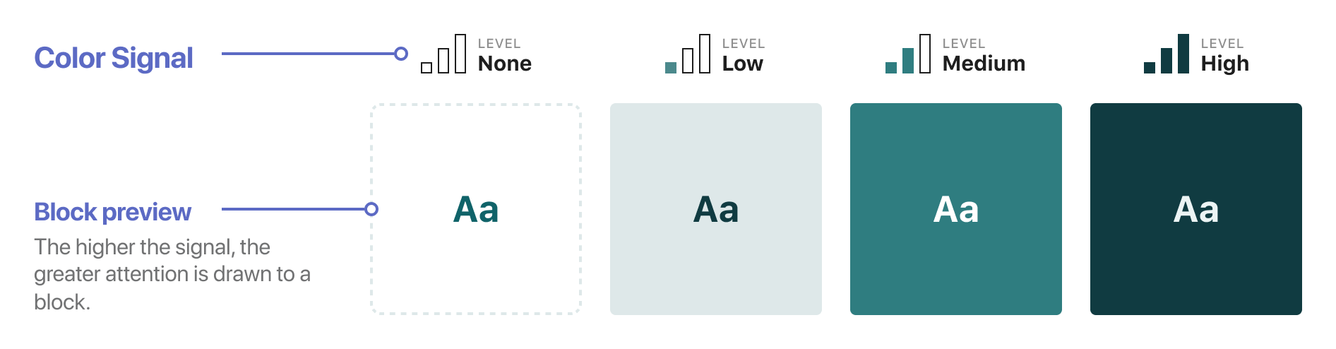
There are four color signal levels:
- None: a block with this signal level will blend with the background, and no greater attention will be drawn to it.
- Low: add a subtle color variation over the background.
- Medium: many times, your brand color intensity will match this level.
- High: the way to go when you want to call for the maximum attention of a particular content section.
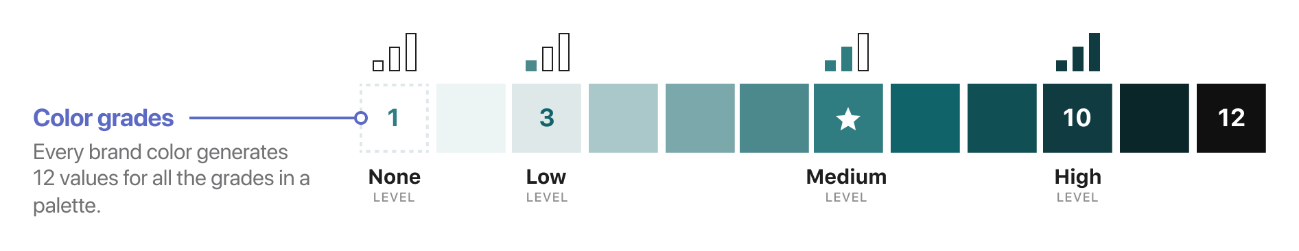
You may notice in the illustration above that the background color changes for each signal level, but on a closer inspection, you can see that the text overlay has different shades of green – it’s never pure black or white.
We call these color grades, and there are 12 of them to express how light or dark a color is. Pure white is the equivalent of grade 1, and almost black is the equivalent of grade 12.
It’s reasonable to ask now, “Why do I need so many color grades?” and it’s fair to give you a reason.
I won’t beat about the bush, but I want you to imagine your favorite sunset when the sun slips slowly away, and the flood of fading light spreads over the surroundings. Look around; it’s a color-changing spectacle, where every surface and object subtly turns into a warm yellow-gold scenery.
This is a natural phenomenon and a simple example of how colored light assists in creating a beautiful and harmonious environment. Something similar should happen in the digital world when using your brand colors on your website.
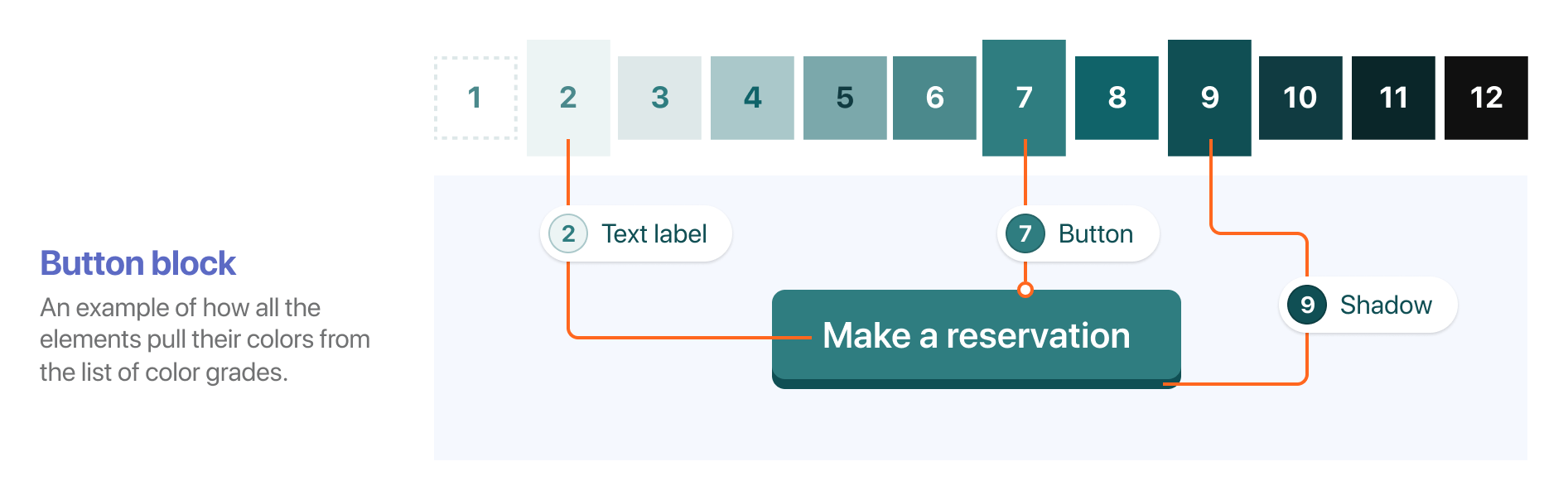
How does color apply to a block?
An interface is composed of many small elements like text, background, and borders. To make them feel like they’re part of the same whole, all colors used for those elements should be subtle variances of the same base color.
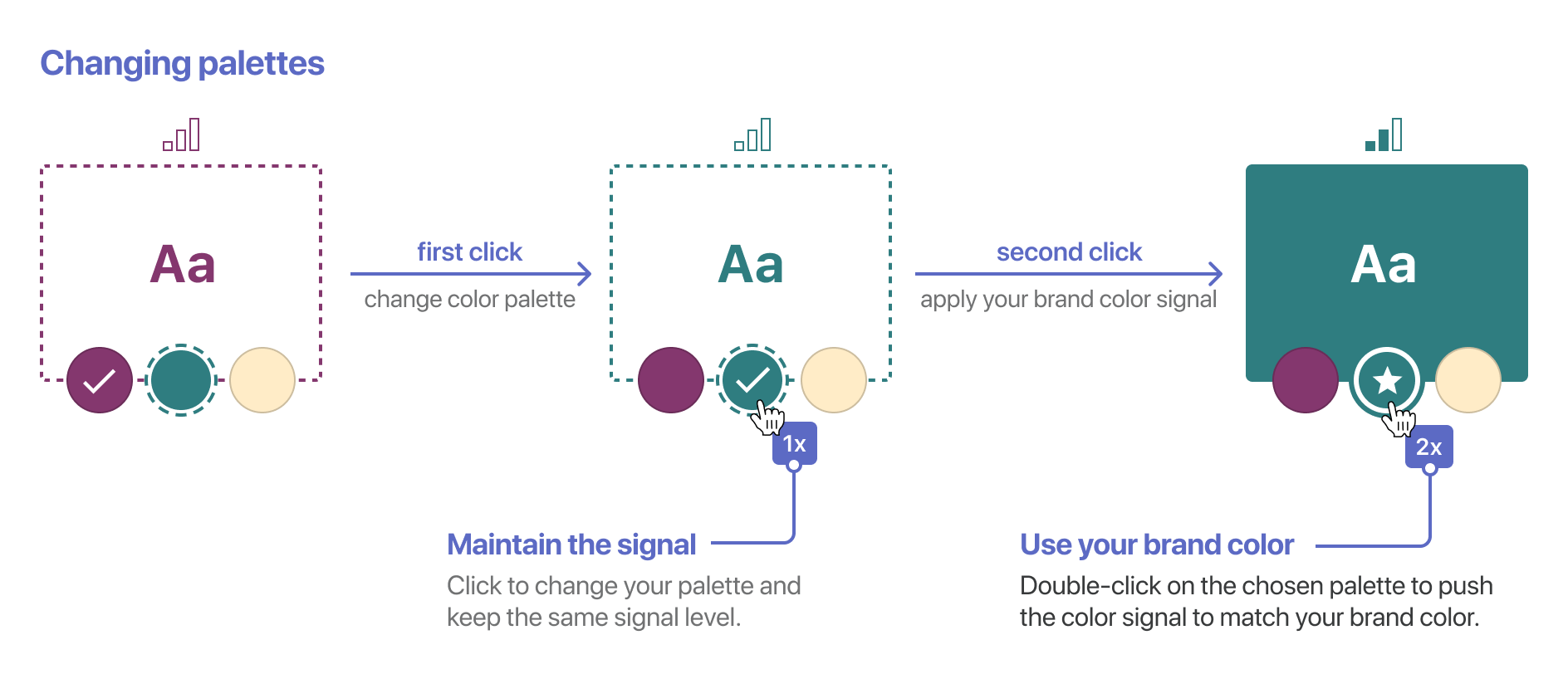
Changing between color palettes
A brand often uses more than one primary color as part of its identity, and it’s important to use those colors throughout any medium that brand is present, including the website. Sometimes those colors have a certain meaning, and sometimes it’s just to suggest some joyful creativity to the viewer.
All your brand colors are defined and managed using a central Color System. If you want to add a new color to your site, add it first to the Color System, and then you will be able to use it consistently across the website pages.
It’s important to know that for each of your brand colors, the color system will automatically standardize their intensity and assign a color signal level, usually marked with a star symbol (★) in the interface.
In the example below, we have three brand colors: the first two match the Medium color signal level, while the third one is lighter and matches the Low signal:
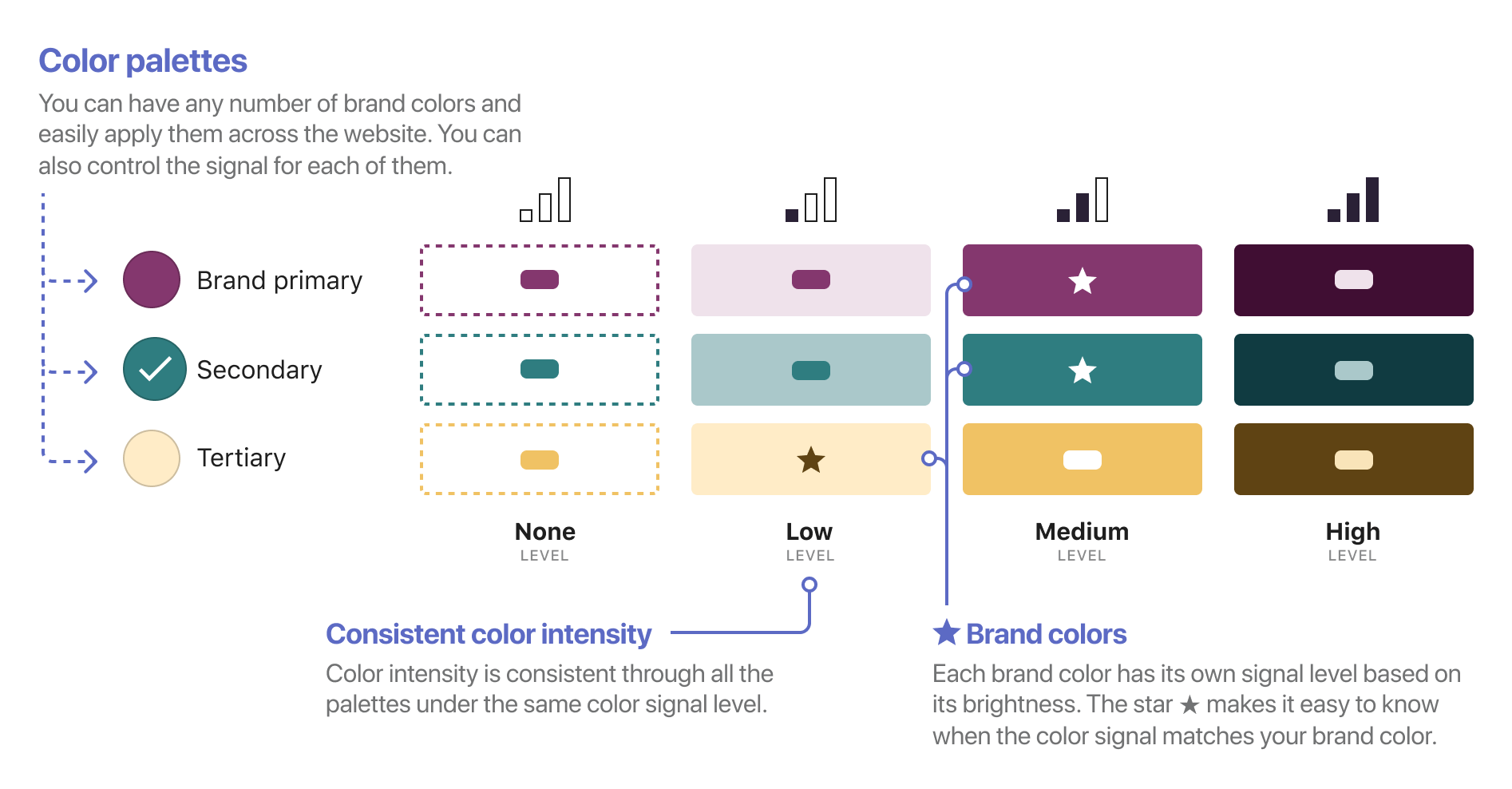
Whenever you click to change to a different color palette, the system’s first priority is to maintain the color signal level and not affect the page hierarchy.
If you intend to use your brand color precisely, a secondary click to the same color palette will activate your brand color by adjusting the color signal level to match.
The Color Signal in action
Until now, we’ve talked about blocks as an isolated piece on your page. But you can imagine that, throughout a page, those blocks live nearby or even inside other larger blocks.
One of the goals of the Color Signal tool is to help you easily signal attention to important information within a page using the power of color. This means that you should first prioritize your content and then use color to highlight the most important parts.
Note that the power of color to draw attention to essential parts of your content is heightened when used sparingly. If the majority of the page content gets a High signal, then this tool becomes less effective.
Below is an example of how blocks with various color signal levels stack together and create the page hierarchy. Note that all parts of a page support a certain color signal, including the Header and Footer.
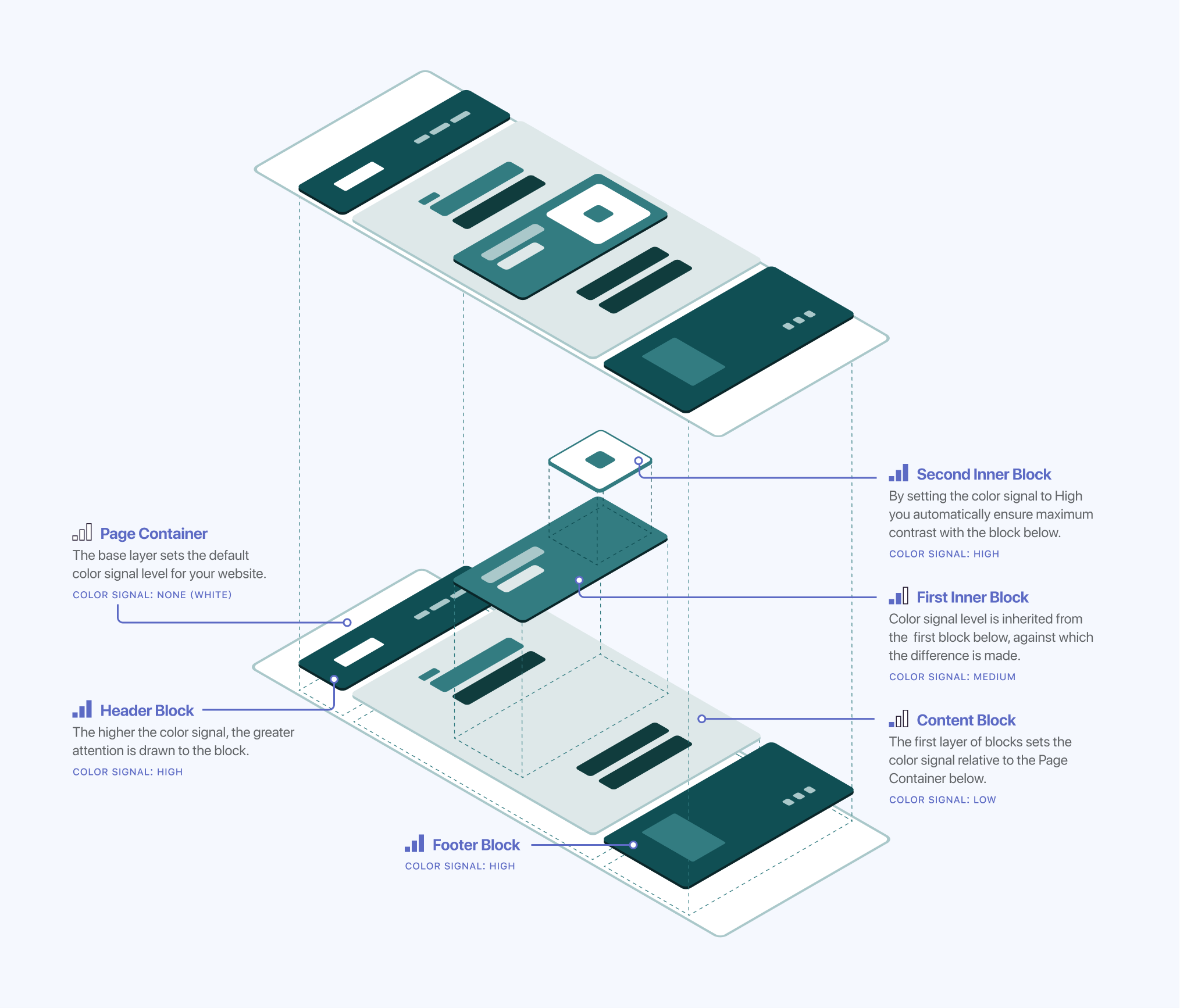
As you can see, a higher color signal level does not always mean a darker color but a higher contrast with the surrounding blocks (this is the case for the Second Inner Block featured in the image above). Since the color system considers all the elements nearby, its purpose is to use the color signal level as an indicator for how much attention you want to draw to an element. In cases where the block behind it uses a darker background, the system will use a lighter color to ensure maximum contrast and drive attention right where you want it.