How to Choose the Right Size for the Parallax Images?
All our WordPress themes are responsive and are adjusting their elements depending on the size of the browser, which means the background image is set to cover the hero area.
This implies that the image will zoom in on smaller screens (e.g., mobile or tablet) to avoid showing a blank space like in this example and manage to keep its aspect ratio resulting in this effect. This behavior is necessary to achieve the parallax effect and cover the entire screen of the device.
With that in mind, there’s no specific size for the images to guarantee that they will be displayed fully every time because this would mean they’ll stretch in most cases (e.g., when you have a wide image on a mobile portrait screen).
But what we can do is find an optimal size for the images, so the main subject will always stay in the viewport area. For that, I created an image that you can use to test out your ideal size for your particular case.
It’s a 2000 x 2000px image size, with a 200px gradation that you can download from here and set as the Featured Image. After that, you can play with the browser width and height by dragging it with your mouse (or by using Chrome DevTools) to find out where to place your main subject.
For the full-height hero case, it seems like the subject should stay inside the 6th circle which means your image subject should be in the 1200 x 1200px container:

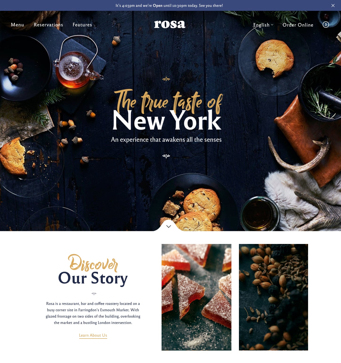
Looking for a parallax-ready WordPress theme?
Rosa 2, our new theme, features an awesome parallax effect to create a stunning website.