Adding a call and email bar for phones
Visitors on a phone often want just one thing: to call you or send you an email. Your Pixelgrade LT site (built on the Anima block theme) can keep those buttons pinned to the bottom of the screen on phones and tablets, so they stay within thumb reach while people scroll. It works great for kindergartens, clinics, restaurants, shops, and any business where a phone call is the main goal.
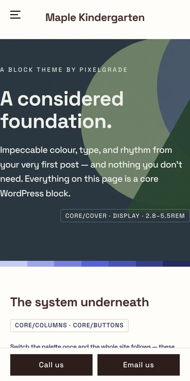
The bottom action bar is available from Anima LT 2.0.50. If you can't find the pattern described below, update your theme first.
Adding the bar
The bar lives in your Footer, so once you add it, it appears on every page of your site.
- In your WordPress dashboard, go to Appearance → Editor to open the Site Editor.
- Open your Footer (from Patterns → Template Parts → Footer, or click the footer at the bottom of any template).
- Click the + (Block Inserter) button in the top toolbar, open the Patterns tab and search for Bottom action bar (you'll also find it among the footer patterns).
- Insert Bottom action bar (call / email) at the end of your footer.
- Click Save.
Setting your phone number and email
The bar comes with two example buttons, Call us and Email us. Point them to your own details:
- Click the Call us button and type a new label if you like (for example Call now).
- With the button selected, click the Link icon in the block toolbar and enter your number as
tel:followed by the number, without spaces — for exampletel:+15555550100. - Do the same for Email us, using
mailto:followed by your address — for examplemailto:[email protected]. - Need a second phone number? Select a button, duplicate it (Ctrl/Cmd + Shift + D), then change its label and link.
- Click Save.
Tip: keep the labels short. Longer labels wrap onto two lines instead of being cut off, but two or three words look best on small phones.
Where your visitors see it
- On screens narrower than 1024 pixels — phones and most tablets held upright — the bar is pinned to the bottom of the screen. That's the same point where your site switches to its mobile menu.
- On wider screens the bar is hidden.
- It slides out of the way while the mobile menu is open.
- Your pages keep room for it at the end, so it never covers your footer or the last lines of your content.
In the Site Editor, the bar always shows as a regular row of buttons at the end of your footer, so you can edit it at any width. When you select it, a note in the block settings reminds you how your visitors see it.
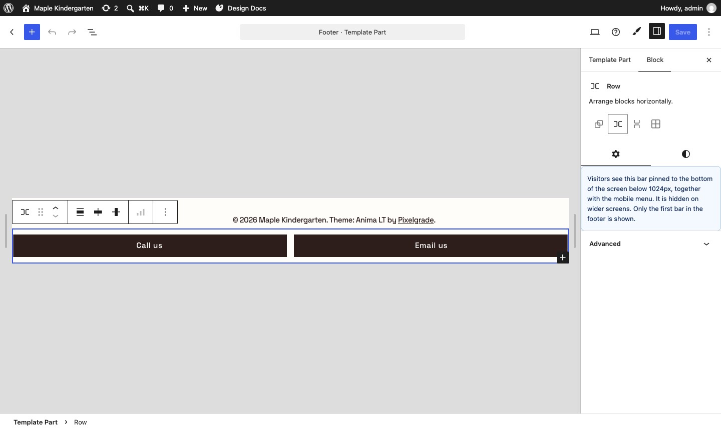
Turning your own buttons into a bar
You can also start from buttons you already have in your footer:
- In the Footer, select the Group (or Row) that holds your buttons.
- In the block settings on the right, open the Styles tab.
- Choose Bottom action bar (mobile) and click Save.
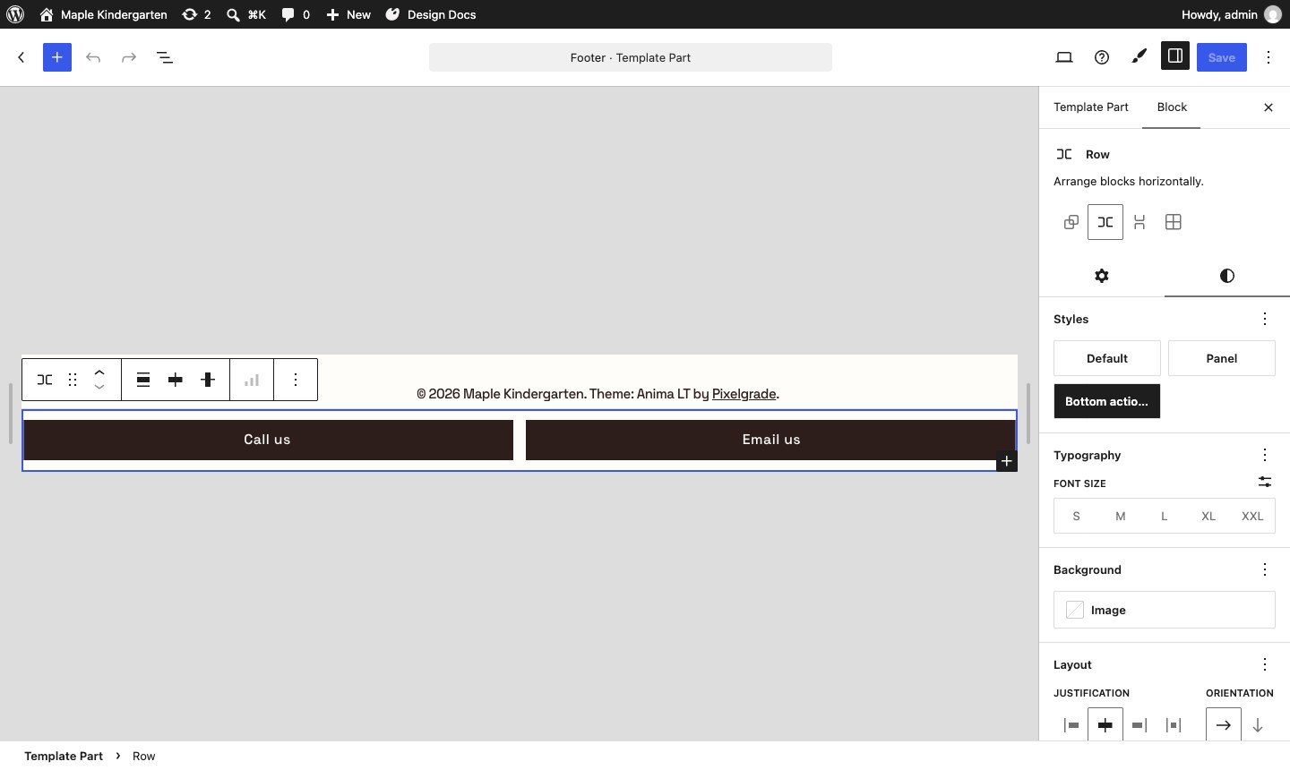
Changing its colors
The bar uses your site's colors from Style Manager and follows the palette of your footer, and its buttons keep your theme's button style. To make the bar stand out — for example a dark bar with light text — select it and give it a stronger Color Signal in the block settings.
Good to know
- The bar only works inside the Footer template part. The Bottom action bar (mobile) style is only offered there, and if a bar ends up somewhere else (for example inside a page), it shows as a regular row of buttons and the block settings warn you.
- Only one bar is shown per page. If your footer holds more than one, visitors see the first.
- Screen readers announce the bar as a region called Quick contact, so it's easy to find with a keyboard or assistive technology.
- To remove it, select the bar in your footer and delete it, or switch its style back to Default.
Looking for a call-to-action in your header instead? See Customizing your menu items.