Customizing your menu items
Beyond the standard menu links, your Pixelgrade LT site (built on the Anima block theme) gives your header menu a few extra touches — badges, a search box, a cart, a light/dark switch, and more. This guide covers all of them in one place.
Two ways to edit your menu — pick the one that matches your site.
The newest versions of Pixelgrade LT let you edit the header menu directly in the Site Editor, as blocks. If you open Appearance → Editor, select your header, and see the menu with a Badge panel and a + button that offers Search / Cart / Dark Mode items, you're on the block-based flow — follow the steps below.
If you don't see those options there, your site is on an earlier build and you edit the menu the classic way, in Appearance → Menus. Skip to Editing in Appearance → Menus at the end — every feature is covered there too.
Either way, your visitors see exactly the same result.
Opening your header menu (Site Editor)
- In your WordPress dashboard, go to Appearance → Editor to open the Site Editor.
- Open your Header (from Patterns → Template Parts → Header, or click the header at the top of any template).
- Click the navigation in the header to select it. Use the List View (the list icon in the top toolbar) to see every menu item and expand submenus.
From here you can add, reorder, and remove items — and apply the extra touches below. Your changes save and go live when you click Save.
Badges
A badge is a small piece of text wrapped in a bold and colorful style intended to draw attention to a particular menu item — to signal a new section, a special sale, or anything else that helps you achieve a specific goal.
- In the header navigation, select the menu item you want to highlight.
- In the block settings on the right, open the Badge panel and type your text (for example, New, Popular, Free, or Sales).
- Click Save. The badge shows up as a small, styled label next to that item.
Search
Having search in your navigation is a fast way to bridge the gap between what your visitors want and your content — and it's especially handy on smaller screens.
- With the header navigation selected, click the + (block inserter) inside it and add the Search Item block.
- Select it and choose a Visual style — Label, Icon, or Label with icon.
- Click Save.
Cart (WooCommerce)
If you have an online shop, quick access to the Cart helps customers complete their purchase.
- With the header navigation selected, click the + inside it and add the Cart Item block.
- Select it and choose a Visual style (Label, Icon, or Label with icon).
- Click Save. The item links to your shop's cart automatically.
Light / Dark mode switch
Let visitors switch between light and dark appearance right from the menu.
- With the header navigation selected, click the + inside it and add the Dark Mode Item block.
- (Optional) Select it and choose a Visual style.
- Click Save.
For setting up the light, dark, and auto color scheme itself, see Adding dark mode on your website.
Submenu descriptions
Descriptions give more context under a menu item label. They're meant for submenu items, to keep the top navigation bar clutter-free.
- In the List View, expand a submenu and select one of its items.
- In the block settings on the right, add your text in the Description field.
- Click Save.
Social icons
Linking your social profiles is a friendly, welcoming way to encourage visitors to follow and connect with you — and the theme shows the right icon for each network automatically.
- In the header navigation, add a link pointing to your profile (for example,
https://instagram.com/yourname). - Click Save — the theme recognizes the network and shows the matching icon.
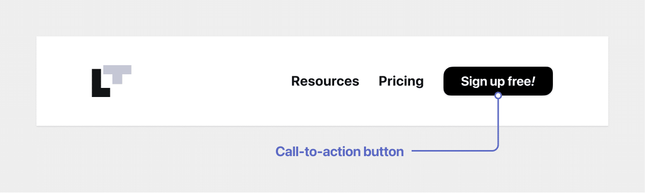
Call-to-action buttons & external-link markers
You can style a menu item as a bold call-to-action button (great for your shop, a reservation page, or a contact page) or flag an item as an external link so visitors know it leads off your site. Both use a small CSS class on the menu item — is-cta-button and is-external-link.
Set these in Appearance → Menus using the CSS Classes field (see the fallback section below). Add is-cta-button to turn an item into a button, or is-external-link to mark it as leading off-site.
<a id="fallback"></a>
Editing in Appearance → Menus (earlier builds & fallback)
If your site doesn't show the block-based menu editing described above, you edit the same menu in Appearance → Menus — and that's also where CTA buttons and external-link markers live today.
Good to know. A few of these use the CSS Classes field on a menu item. If you don't see it, click Screen Options at the top-right of the Menus screen and tick CSS Classes (and Description, for submenu descriptions).
- Badge — expand a menu or submenu item and type into its Badge field.
- Search / Cart / Light-Dark switch — open the Extras panel in the "Add menu items" column, add Search, Cart, or Light/Dark Mode, then pick a Visual Style.
- Call-to-action button — add
is-cta-buttonto the item's CSS Classes field. - External link — add
is-external-linkto the item's CSS Classes field. - Social icon — add a Custom Link pointing to your profile URL, and the theme shows the matching icon.
- Submenu description — enable Description via Screen Options, then fill it in on a submenu item.
Whichever route you use, click Save and get creative — these touches are there to guide your visitors where you want them to go.