Setting up the Color System
Setting up a color system for your website is key to a successful communication of your brand. Due to its complexity in creation and maintenance, a color system is rather embraced by large enterprises that can afford dedicated design teams and have the resources to invest in a design system.
Nevertheless, a color system's ability to create beautiful and harmonious experiences is worthwhile for everyone. Your Pixelgrade LT site — built on the Anima block theme — ships with a customizable color system, powered by Style Manager, that you can easily use and benefit from.
What you'll learn? After you've finished this article, you'll have learned the following:
- Why is it difficult to choose colors for a website?
- How does a color system help?
- The principles of a well-thought color system
- How is this different from any color palette generator?
- How to set up the color system using your favorite colors
- Manage how to apply color to your website
- Using colors in your website with the Color Signal tool
1. Coloring seems easy—why complicate it?
Choosing a color is easy and comes naturally to us as sensitive humans. Simply shuffle through a set of hues, be aware of yourself and choose the one that feels right. There isn't a good or right pick – it's your favorite personal color, and it's fine as it is.
Now go a step further and think of a secondary color to use on your design. Intuitively you will look for a way that the new color pairs well with the first, be it that they share the same intensity or their hues are complementary. You can recognize that there is a relation created between those two colors, beautiful in itself, but which adds a little more cognitive pressure on your freedom to choose any color you like.
To take the example further and closer to our use case, imagine a website interface composed of a variety of components like buttons and forms, where each one has its own set of inner elements like text, background, and borders. To color those elements, we need even more different shades of colors and even more relations to maintain at the same time.
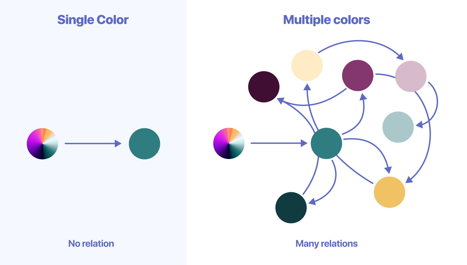
As you can see, the process of choosing colors is getting more complex once you need to pair more than one color and maintain tight relations between all of them.
The degree of which a website design becomes alive depends on how well you harmonize all the colors of its components and its subsequent elements. Manually maintaining a high number of relations is cumbersome even for a professional.
That's why we have built a system that takes your favorite brand colors, generates the necessary variants for each of them, and through the Color Signal tool, assists you to apply color across your website in a way that automatically ensures legibility standards and aesthetically pleasing results.
2. How does a color system help?
A system gathers all the colors together in a central place, standardizes and organizes them in a way so you can easily retrieve them, and creates visual consistency across different pages of your website.
A good system enhances your ability to choose and use the right colors in the right context, creates boundaries by limiting the color choice, helps you to avoid making mistakes, and gives you more room for creativity.
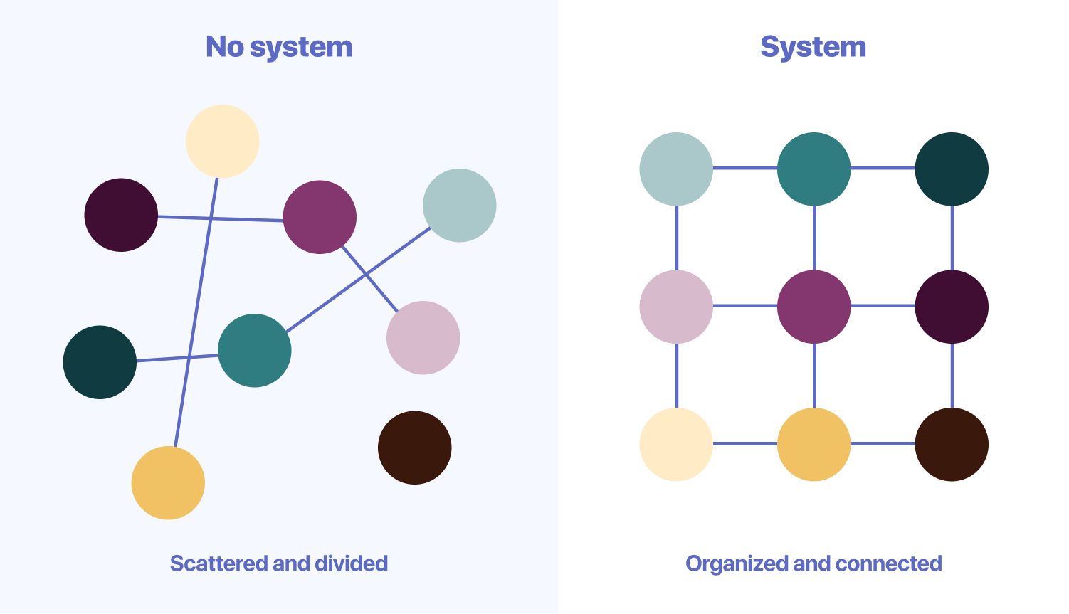
Colors in such a system are connected in many directions simultaneously, ensuring that it meets all the necessary guidelines such as optimal contrast and legibility standards. Thus a color system helps you manage multiple things at once without even being aware of all of them.
By using an automated system to outsource the jobs usually performed by a professional, you achieve superior results without learning and implementing all the underlying details of setting up a color palette. While you may not be a professional, using such a system will make you look like one.
3. The principles of the color system
We value the aesthetically pleasing effect of great use of colors. Still, we place an even higher value on how to intentionally use color to support the purpose of your content.
By following the set of guiding principles detailed below we managed to understand and create a reliable system.
Clear and effective communication through color Colors should direct the user's focus where it matters most, communicate the visual hierarchy of the page information, and signal interaction states through color change.
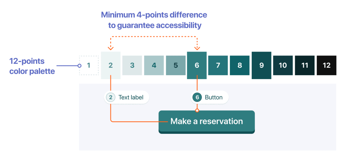
Follow contrast and color accessibility guidelines Approximately 0.5% of adult women and 8% of adult men (4.5% of the total population) have some kind of color insensitivity, and we have a responsibility to think as broadly and inclusively as possible. To guarantee contrast, we use a 12-points color grading system to pick accessible color combinations and automatically ensure optimal contrast and legibility standards to the elements inside.
Integrate brand color through the system Welcome any color provided by the user, analyze its characteristics and place it within the system according to its hue and relative luminance.
Simplify the complexity of color usage Embed a functional logic through the system to automatically manage all the relations between colors, so people can be intentional about how to direct the user's focus on the page.
4. Is this just another color palette generator?
There are a lot of fantastic tools on the internet that help you find inspiring color palettes. However, once you have decided on a set of colors that you like, the main question is still left unanswered: how do I apply those colors to my website?
Color palettes for a website or application interface are different and more complex than ones for a simple logo or illustration. An interface has a large variety of details that uses subtle shades of color in order to achieve cohesiveness and harmony.
The tool that we built takes any color you input, extracts the lightness and hue value, and generates a 12-points color palette, shifting the relative luminance from a very bright version of the color at 1 to almost black at 12.
Next, we ensure there's a minimum 4-points difference for all elements that overlap in order to guarantee accessibility and maintain a contrast ratio greater than 3:1.
You can get started by using the curated color presets to help you lay the foundations of the color system, or you can add your own custom colors.
5. How to set up the color system
Now that we have a common understanding of the color system, its usage should come naturally.
On your Pixelgrade LT site, colors and fonts live in Style Manager, which opens inside the Site Editor.
To open it:
- In your WordPress dashboard, go to Pixelgrade.
- Open the Design System tab and click Open Style Manager. This opens the Site Editor with the Style Manager panel ready. (On the same tab you can also click Edit the Color System on the Colors card to jump straight to colors. The hub's Home tab has an Open Design System quick link to the same place, and you can reach it directly via Appearance → Editor → Styles.)
- In the Style Manager panel, open the Color System section. It opens on the Palette sub-tab — the section also has Fine-tune and Usage sub-tabs.
Once you add a custom color the system generates a 12-points color palette for each of your brand colors, including a corresponding grade that matches the original color, usually marked with a star symbol (★) in the preview.
To change the colors from the Palette sub-tab, you can use any of the options below:
- Preset swatches — start from one of the curated preset swatches to lay the foundations of your color system quickly.
- Brand Colors — click any color in the Brand Colors section (your main color is Brand Primary) to open the color picker and enter a color code manually, or use the add Color option to add another brand color.
- Extract from Image — upload an image, and the tool will use the hues in the photo to generate color palettes.
To manage the colors individually, work with them in the Palette Source area:
- Rename a color by editing its label (for example, Brand Primary).
- Change a color by clicking its swatch and picking a new value.
- Add another brand color to the palette.
From each brand color, Style Manager automatically generates a full range of grades — including the in-between (interpolated) shades — so the whole palette stays balanced.
6. Manage how to apply color to your website
Keep in mind that the Color System is active on a site-wide level, and at this step, you're only setting up the colors that will be available when building the website, not how they apply to the content of a specific block within a page.
You can, however, set the default coloring rules for your site's elements. These live in Style Manager's Usage sub-tab — the third sub-tab of the Color System section, where you manage how the default colors are applied.
The Usage sub-tab gives you these controls:
- Palette Basis Offset. Increase Palette Basis Offset to bring more personality to your website. By default, the website background color is set to white which is also the first color grade from your palette. You can shift the starting position to:
- 2 or 3 to tone down the white contrast and add a slight touch of color for a welcoming atmosphere.
- 4 to 7 for a colorful look that shows a joyful attitude.
- above 8 for something closer to a dark mode.
Being part of a system, shifting the starting position will adjust all the color palette's structure, and subsequently, all the elements (e.g., headline, links, buttons, body text) will use this value as a reference.
- Coloration Level. Use the Coloration Level option to adjust how much color you want to add to your website's elements. The Low level will keep most of your elements closer to a neutral black and white state, while a High level will colorize as many elements as possible.
- Color Targets. Choose exactly which elements get colored — toggle individual elements (Page title, Body text, Body links, Navigation links, headings, and more) on or off so they pick up your brand color. This is how you colorize elements one by one; the actual palette variation is then managed per block with the Color Signal tool.
- Change the website Appearance (Dark Mode). You can change your website color scheme all at once using the Dark Mode option and even enable it to automatically switch to the light or dark mode, according to the visitor's system-wide setting. For the full walkthrough, see Adding dark mode on your website.
7. Using colors in your website with the Color Signal
Now that the color system is in place, you can go back to the Editor and use the Color Signal tool to help you easily signal attention to important information within a page using the power of color.
—
Notes for non-technical users
- Seeing "Anima" in Appearance → Themes is normal. Anima is the shared block theme behind every Pixelgrade LT design — the LT design you chose sits on top of it.
- Colors live in the Site Editor + Style Manager. On block themes like Anima, styling happens in the Site Editor + Style Manager, reached through Pixelgrade or Appearance → Editor.
- For licenses and premium features, use the Account tab and Pixelgrade Plus.