I hardly found good resources on designing a WordPress theme and it was a challenge to explore and go through a custom empirical process.
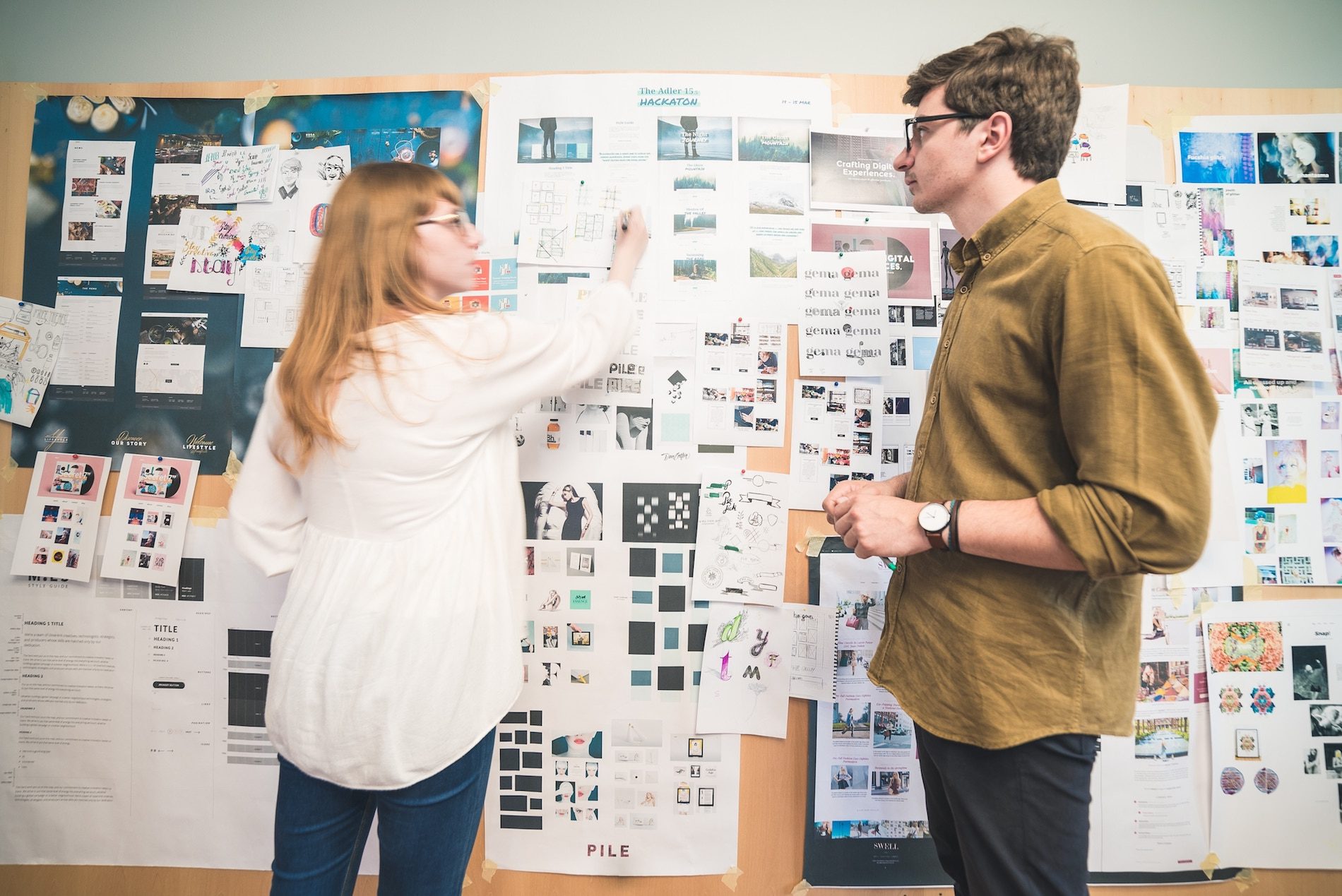
My playground was contoured by a generous amount of research (and a generous amount of open tabs), loads of sketches that were hoarded up in the drawers of my desk, a lot of ping-pong discussions with George, my fellow designer, nerve wrenching use case scenarios, the Grand Canyon between Photoshop and front-end reality and finally, the launch and how the feedback surprised me day by day.
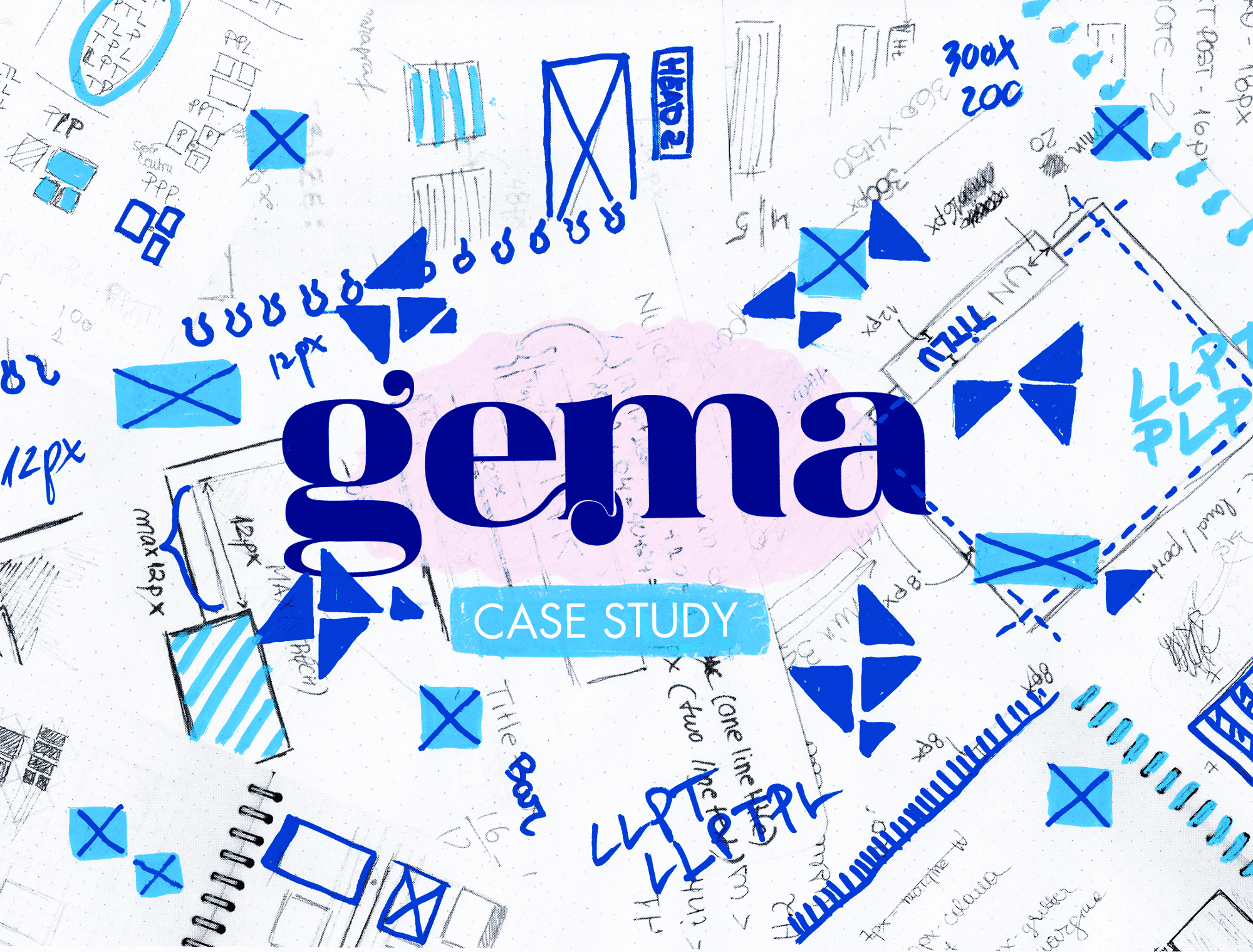
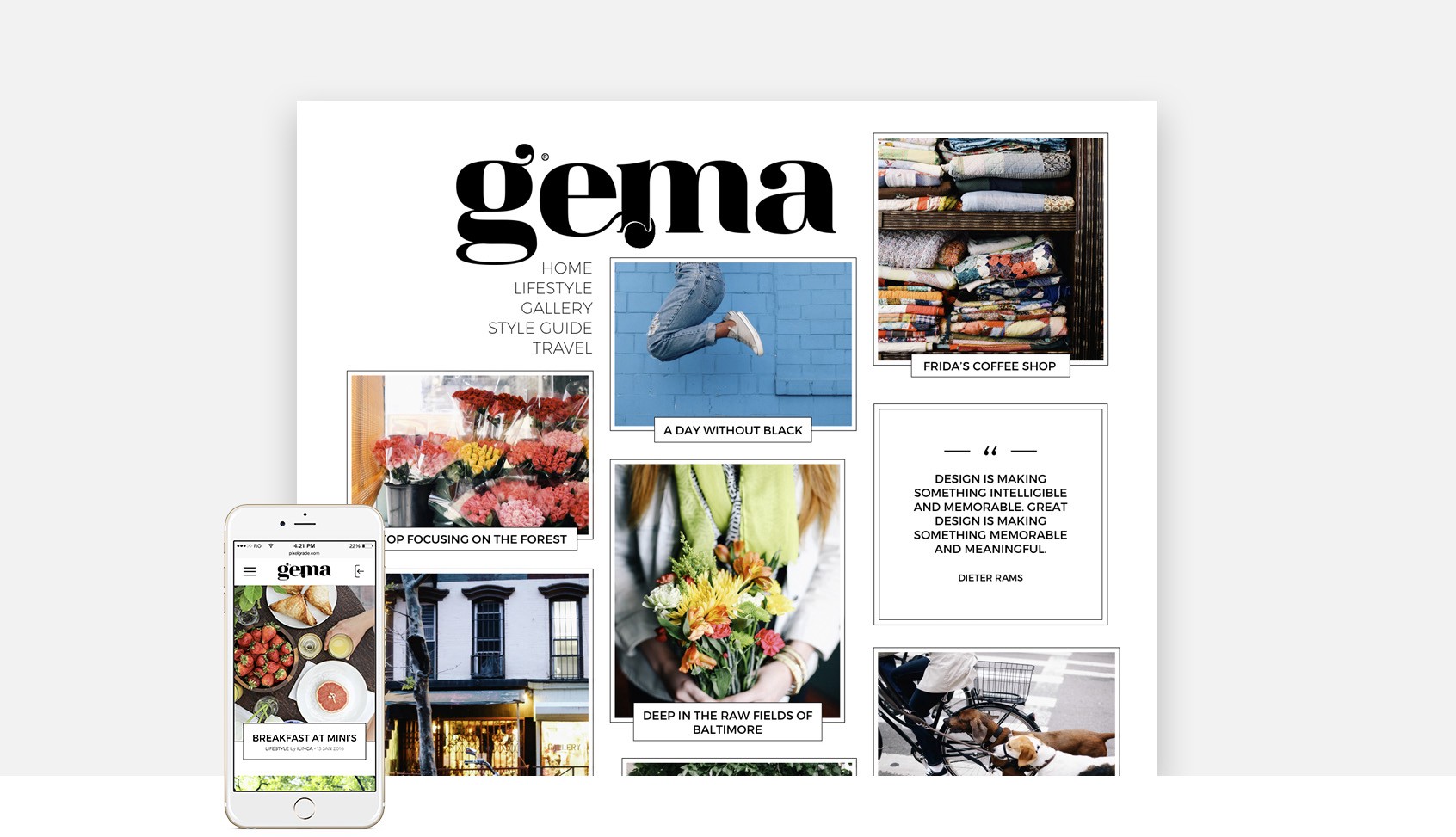
Let’s bring a glimpse inside Gema, a WordPress theme that is the child of broken rules and some sweet vibe I got from a perfume ad. The scene is yours!
Manifesto
As we did the research through bloggers’ sites and after observing their behaviours in crafting their posts, a silly but obvious behaviour emerged: they are not taking that much effort in choosing the perfect proportions for their images or they not carefully take into consideration the posts title length. Still, their stories are great and they are looking to make it even better together with how it’s showcased.
All our themes aim to have a little “wow” effect, something that made them different from day one, so the cherry on the top of the cake for Gema was to apply a solution to the problems above, on a coherent and harmonious aesthetic grid layout that adjusted depending on its content.
The Design Playground
Considering that I’m not having a mature design process in place and I cannot afford the time to set up one, George suggested to keep in mind these 3 things:
- Focus on my native instincts aka go back to my roots and trust my illustrator guts.
- Cultivate my sense of observation by reviewing well–done websites.
- Then challenge myself and push silly things forward as he will try to get myself back on track.
The 3x3x3 Research Mantra
I’ve never called my research “research”, but “inspiration hunting”. And I also gave it a name: the 3x3x3. George actually came with this idea that implied searching for inspirational websites as follows:
- 3 which have great use of font pairing,
- 3 that are chromatically satisfying and,
- 3 that nail it when it comes to layout.
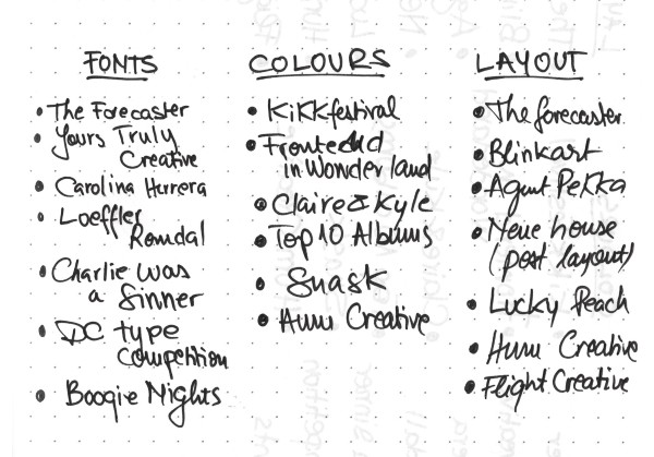
Typewolf is pure eye candy for any web designer, even if Jeremiah is hunting down only the beautiful use of fonts, but with great fonts come great expectations in layout design and color picking. Fast forward, I’m at page 124 (or so) and even if there were less than 70 to go (haha, like that is a piece of cake), I ended up with the list on the left.
*Ok, they’re not really 3 of them, the list was even bigger in my Bookmarks bar, but I took my time and Alt+Cmd+[Arrow] through the sites that were left and finally picked 3 of them.
Let the magic begin
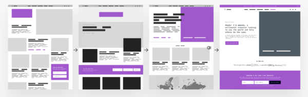
Now we’ve got 9 inspirations, 3 of those relating to layout being used later on. All in all, there was nothing left to do than fire up Photoshop and start mixing and matching colors, fonts and image placeholders. I was mindlessly combining all these resources that I found, without knowing that it was my first process of iteration that resulted into this:
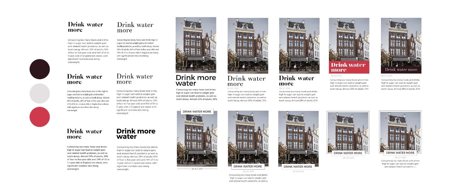
Style’s done, grid’s next.
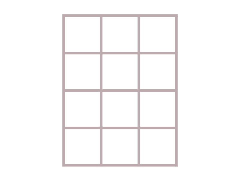
After searching through 124-ish pages of websites, you’d say I’ve seen my fair amount of grids. Not really actually. It turns out designers don’t play much with grids, so when you’re viewing masonry built websites or clean horizontal/vertical alignments, you’ll probably end up with a dull sketch of some squares 3×3. That’s what I even got from my 3x3x3 research, the layouts weren’t visually challenging or demanding much attention, so why bother with something new if people like this?
😅 All good, I’m happy — what’s the next step?
This was the moment when the manifesto kicks in along with George and, in his words:
“Not — that’s boring. Back to the drawing board and push some boundaries.”
George was this Waif (on Zen mode, thank God) that kept poking me with a stick whenever I was taking the short path instead of making my own. My first sketches that included the layout were no exception. Being two designers in the team turned out to be the beginning of a ping-pong that we are still practicing, so I slowly make my way back to the drawing board.
Iteration is my middle name
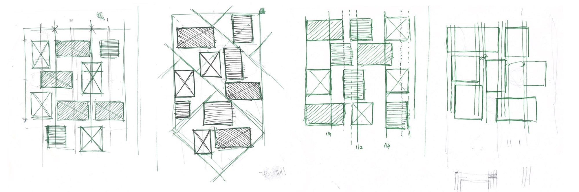
The (re)making of the grid started with well…Breaking the grid. Page after page, I bookmarked what I thought would be a new approach on blogging grids. My first attempts were kind of boring, never ending alternations of the good old Masonry that we dreaded so much — the shitty first drafts, as Max Temkin calls them.
But I finally got my hands on something “braver” and proudly presented my sketches to George.
“Nop — still boring. Try something more gutsy.”
Did I expect this response? No. Did I end up frustrated? Hell yeah, what would be design without it? It felt like someone asked me to invent a new color.
Shaping the workflow
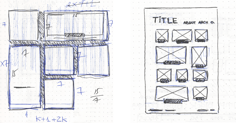
I decided to reverse the workflow and went from clearly defined layouts to doodling random tiles by personal appeal (yeah, I hear you frowning), only by keeping the initially defined problem in mind. My grid went from Plain Jane to something I proudly named Trigravity Masonry, or if fancy words aren’t your cup of tea, the Tetris T blocks.
Frustration worked like a charm and George agreed 😊.
This is what we’re looking for.
Finding the red thread behind the doodles
Blog posts were grouped 3 by 3, forming a T-shaped block that was 90 degrees rotated either to the left, or the right and the rest is…Tetris: the goal of it all was to fill in the possible gaps that would frustrate you to hell and never let you get a straight line a.k.a. avoiding awkward white spaces in the design.
Question everything in terms of use-cases
The grid was more of an experiment, so, before passing it to the front-end masters, I started a DIY prototype of the grid which used random strings of L’s (Landscape), P’s (Portrait), T’s (Text), each of them representing the posts types I had designed earlier. All those characters, bundled up, had to be use cases of blog posts that a possible user could have had. Looked pretty promising, eh?
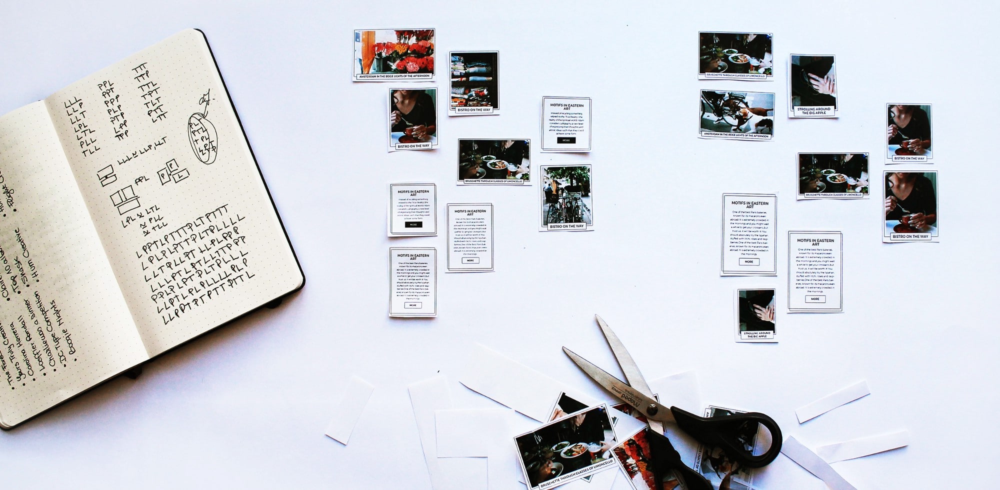
Keeping your wheels spinning when everything breaks
It turns out later that my Trigravity Grid was a white-space inducing monster and there are still many unfortunate cases that I didn’t cover. Here I am with Răzvan, one of the front-ends, that was the happy winner of a subscription to grid hell guided by an anxious designer. He’d been working on multiple variations of the grid following my algorithm, but it seemed like the thing that made it a pretentious little bitch was actually…my algorithm?!
😞 Upset moment — we might leave it behind and get back to start.
But.. giving up is not an option
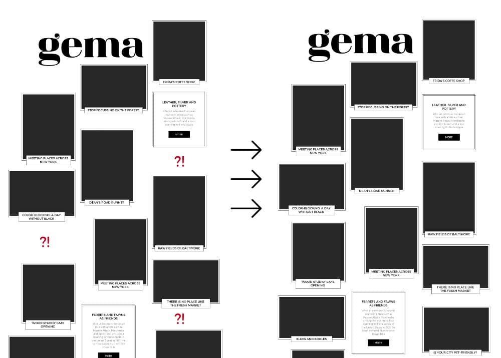
I was pretty disappointed, I wanted it to work because it looked so smart and yet so random, I just found order in chaos, but then I broke that order. I started downgrading all, making posts all square, trying good ol’ Masonry and even try to change the style. This was then followed by a deep discussion on Slack with George and, in a tl;dr manner, it all turned out to this: giving up is not an option.
While 🤔 brainstorming with Răzvan and George we decided to switch the algorithm from a block-based layout to a column-oriented one, which in most of the cases would give us the same result: a unique and adaptable layout based on the posts content + a balanced whitespace area around all the posts. It works!
🎉 Glee, party, and confetti!!!
Single Page, they say
After the archive layout was confirmed, I had to go to the other important section of the blog: the single post page. The thing about single pages is that there is not much more to improve as they all emerge from a few known patterns.
Going the fast way and things are done — so easy!
“Not — let’s dig deeper.”
Iteration is my full name now
Oh, hi, haven’t heard this for a long time. Again I’m trapped in some kind of circle of what users have been used to until now, but as if Newton’s apple was reincarnated somewhere in my head, I thought: “Why not use my Trigravity grid algorithm?”. Eureka! An idea that will make the whole site more consistent has been born.
Things were looking great, and there were no many things left to do.
Finishing the journey
Menus, widgets, comment sections and responsive layouts, these elements were the last milestones that I passed through. I am sure this was my “Aha!” moment as a designer when I noticed how important micro-interactions and a responsive layout are. This was about to get even more significant while implementing the new styles with Cristi, front-end master no.2.
Things were going pretty smooth and after 3 months from the start, we submit the theme for review.
Let’s open that champagne 🍾
Lucky us for, the WordPress.com guys have a really thorough review system and boy, did they REVIEW it.
Within another 3 months of fixes and enhancements, based on the back-and-forth with the review team, Gema was launched on 2nd of June 2016.
🎉 Horaaay!
Honest takeaways
I thought I’d share a handful of lessons I’ve learned during this design process — as a helpful guide for those just starting out.
- Never settle on the first idea: nor on the second one, just keep searching, improving, learning and things will work out as they should.
- Don’t be afraid to break the rules: if you want to be a cutting-edge, inspiring agency or freelancer, always step aside when you’re happy with what you’ve done because it surely isn’t your final work. Or get yourself a George who will be somewhere in the background saying: “Try something more stunning”.
- Downs are good to get better and move forward: Ups and downs are good, but the best are the downs — I’m writing this with joy and a smile on my face — all the effort was so well deserved, I would have been probably emotionless if it all worked just as planned.
- Iterate, iterate, iterate: It’s like polishing a diamond — you need be patient and keep on scratching on a rock until you get to the shiny core. It’s not only a discovery of the intricateness of an idea but a self-journey where you explore how much your creativity can take.
- Shape your own workflow: the 3x3x3, the paper-generated grid, prototyping shouldn’t always be about site maps, user diagrams; go wild, things could end up so bad, but so good, you have the same 50/50 chance of doing it well in both cases — so why not have fun in the process?
- Be a team player: talk, discuss, be open, ideas aren’t good or bad, they’re ideas; fear and anxiety just consume time and energy. I expect that designers tend to be introverts rather than extroverts since they dedicate a lot of time to research and analysis, but the energy of a team that is prepared to implement your ideas and ready to discuss over it is surely something you can’t achieve on your own.

My conclusion
After all this struggle, I was finally having a warm fuzzy feeling while staring at Gema’s theme page. Now I have 2 notebooks full of sketches and an acre of my mind bundled up with Do’s and Dont’s, which I’ll be surely using on the next theme I am already designing.
This story was about the good, the bad and the ugly behind the design process of a WordPress theme that wanted to break the rules. Thank you so much, my lovely Pixelgrade crew, for letting me grow in such ways that I never expected and allowing me to contribute to our path. Cheers, let there be more ahead of us! 🍻


Start the conversation